Block Buttons
From Posstack.com Documentations
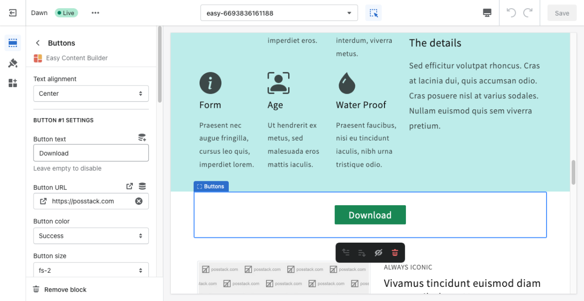
This content block helps you add predefined buttons for actions on a page.
From the Shopify theme editor, click on Button on the sidebar to view the details of settings.
(If you’re new to our Easy Content Builder, please refer to section Add App Sections and Add ECB Blocks for more details on how to create and edit a section or a block.)
| Section settings | Description |
|---|---|
| Text Alignment | Align text to the left, right, or center. |
| Button Text | Enter the button’s text. Leave this field empty to disable the button. |
| Button URL | Set the internal or external URL for the button’s link. |
| Button Color | Choose the color of the button (based on the predefined button styles) |
| Button Size | Set the button size that ranges from 'fs-1' to 'fs-6'. Use ‘fs-1’ for the largest button size. |
| Padding Top | Set the padding top (in px) of the button. |
| Padding Bottom | Set the padding bottom (in px) of the button. |
| Margin Top | Set the margin top (in px) of the button. |
| Margin Bottom | Set the margin bottom (in px) of the button. |

