Block: Button
This content block helps you add predefined buttons for actions on a page.
What is the Button section perfect for?
You have various options to use the Button section for your Shopify themes:
- Multiple buttons within a section: see an example here.

- Ghost button style: see an example here.

- Text link: see an example here.

How to add Buttons section
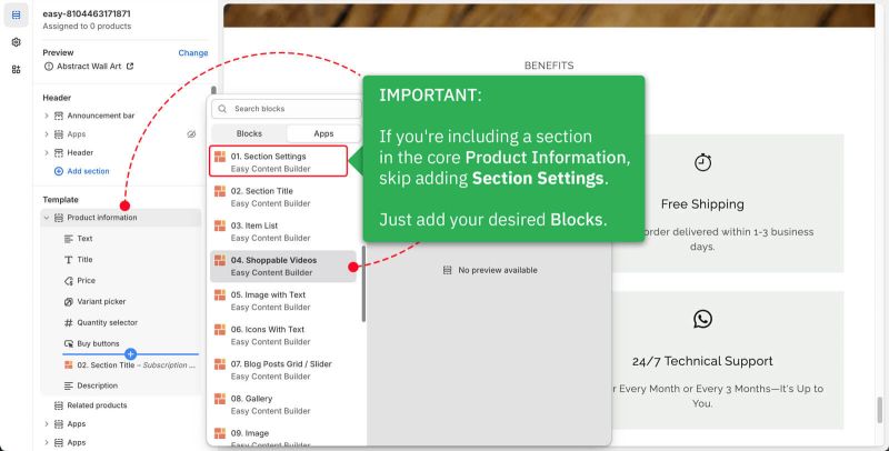
- Step 1: Add a Section Settings section that allows you to control the global settings of the Buttons section.
- In this special section, you can specify multi-column layouts, activate full width, determine the section's maximum width, choose a background color, and set global margins and padding, among other options.
- Note: If you include the Buttons in the core product information, skip the step for adding Section Settings. Just add the Buttons.


- Step 2: Add a Buttons section and customize the settings according to your preferences.

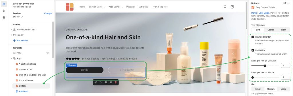
Button global settings
From the Shopify theme editor, click on Button on the sidebar to view the details of settings.
| Section settings | Description |
|---|---|
| Text Alignment | Align text to the left, right, or center. |
| Rounded Border | Enable this setting to apply rounded corners to the buttons. To increase the border radius of the button, you can use the Custom CSS option following this video tutorial. |
| Full-width | Enable responsive full-width button.
Tips: If you add multiple buttons on the Hero banner, you should enable full-width to create equal-width CTA buttons. If you want to set the width of the container where you display the CTAs, use the Container Max Width or Main Column Width under Section Settings, depending on which option best suits you. |
| Button Text | Enter the button’s text. Leave this field empty to disable the button. |
| Button URL | Set the internal or external URL for the button’s link. |
| Button Style | Apply a different look for the button. You can choose a Primary Button/Danger Button for the primary action button, a Default Button (outlined button)/Secondary Button for a medium emphasis, or a Text/Link Button for a low emphasis action button. |
| Button Size | Set the button size - Small, Default, or Large. |
| Target | Open the link in the same window, a new window, or modal.
Modal (Pro only): opens a link in a Lightbox. Useful for embedding content from YouTube, Vimeo, Instagram, TikTok, or Google Maps/Forms. |
| Animate On Scroll | This feature is only available for the Pro plan. It lets you apply different types of animation to elements within each section as you scroll down the page. Learn more about scrolling animations here. |
| Margin | Set the vertical spacing between elements. |
How to add multiple buttons
- Step 1: Add a Section Settings section that allows you to control the global settings of the Button section.
- Here you can define multi-column layouts, enable fullwidth, set the section's max-width, background color, global margin/padding, etc.
- Step 2: Add a Button section. This provides block-level configurations in addition to the global configuration level (via Section Settings above). Then configure as you wish:
- Rounded Border
- Full Width: we recommend enabling this setting to create equal-width CTA buttons (perfect for the Hero banner)
- Set the number of buttons per row on Desktop/Mobile.


In this example, we set this hero section with Two Col: First Block Right layout. Here is why we use this layout setup:
- The First Block on the right column is a blank Custom HTML section. We used this special Custom HTML section to create a blank column on the right.
- Then we can add multiple sections below the Custom HTML (all these sections are shown on the left column)
So, you simply resize the width of the Main column (which is the Custom HTML section) until you're happy with width for the left column.
How to enable the Modal for the CTAs
This feature allows you to open links in a lightbox, making it useful for embedding content from YouTube, Vimeo, Instagram, TikTok, or Google Maps/Forms (view the demo here).
- Step 1: Add a Section Settings section (to control the global settings of the Button section)
- Step 2: Add a Button section and configure it as you wish.
- Step 3: Under the Target field, choose Modal.
Add a Size Chart Link in the Product Information Section

If you want to add a Size Chart link in the Product Information section (Shopify product detail page) that opens in a modal popup, follow these steps:
- Step 1: Create a page for your size chart under Shopify > Pages. Add your size chart details or custom content.

- Step 2: Add a Button block in the Product Information section.
- If it's in the core product information, skip Section Settings and just add the Block you want.

- Step 3: Configure the button. Link to the page from Step 1 in the Button URL and set the Target to Modal.

Once done, clicking the button will show your size chart in a modal popup.
Add other content blocks
You can add many content blocks to a section you've created. These content blocks will be displayed in different positions within the section, depending on the Desktop/Mobile Layouts you configure.
