Block: Image
This section is great for displaying a single image, like an image within a modal or in a multi-column layout where you want to show one image in each column.
- Image Section (the current page you are viewing): Ideal for showcasing a single image.
- Images With Text: Great for presenting images alongside headings, descriptions, and CTA buttons, with the option to customize the ratio of image to text.
- Gallery: Perfect for creating a grid of photos and videos. Clicking on an image or video opens a lightbox popup to display related content.
- Icons With Text: Designed for displaying a slider or grid of images, icons, and text. This section can be used for showcasing Trust Badges, a scrolling announcement bar, logo lists, testimonials, or any text columns with icons.
What is the Image section perfect for?
You have various options to use the Image section for your Shopify themes:
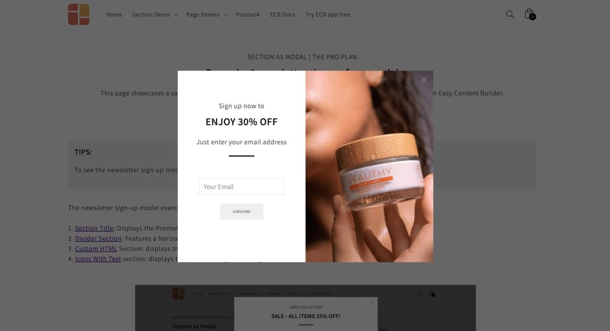
- Showcase a modal with two columns, featuring an image in one column and either a newsletter sign-up form or promotional information in the other column.
How to add Image section
- Step 1: Add a Section Settings section that allows you to control the global settings of the Image section.
- In this special section, you can specify multi-column layouts, activate full width, determine the section's maximum width, choose a background color, and set global margins and padding, among other options.
- Step 2: Add an Image section and customize the settings according to your preferences.
Image global settings
From the Shopify theme editor, click on Image on the sidebar to view the details of settings.
| Section settings | Description |
|---|---|
| Image | Add the image you want to feature in the block on Desktop |
| Image Mobile | Add the image you want to feature in the block on Mobile devices |
| Image Width (px) | Set the width (in pixel) of the collection’s featured image.
IMPORTANT: Make sure your original image width must be equal to or bigger than the width you specify here. |
| Image Height (px) | Set the height (in pixel) of the collection’s featured image.
IMPORTANT: Make sure your original image height must be equal to or bigger than the height you specify here. |
| Image Crop | Cut out a part of the image: Top, Left, Bottom, Right, Center. |
| Image Border | Adds rounded corners to the image. You can set your image with Circle, Rounded, or Pill values.
You can combine three fields - Image Width, Image Height, and Image Border - to create a wide variety of image shapes: circle, square, rectangular, and oval. |
| Scale Up effect | Activate this option to enable zooming of the image when hovered over. |
| Image Link | Please input the link you want to use. This will enable the icon to be clickable when hovering over the image. |
| Target | Choose whether you want the link to open in the same window or in a new window. |
| Image Alignment | Align image to the left, right, or center. |
| Vertical Alignment | Align the content to the vertical position: top, middle, or bottom. |
| Animate on Scroll | This feature is only available for the Pro plan. It lets you apply different types of animation to elements within each section as you scroll down the page. Learn more about scrolling animations here. |
| Margin | Set the vertical spacing between elements. |
| Padding | Set the padding around the image. |
Add other content blocks
You can add many content blocks to a section you've created. These content blocks will be displayed in different positions within the section, depending on the Desktop/Mobile Layouts you configure.


