Block: Image With Text
Overview
This block helps you create separate content blocks (Each block comes with its heading, tagline, description, featured image, and CTA button). You can easily position the image (left, right, center, or bottom) to pair with the description text.
- Image Section: Ideal for showcasing a single image.
- Images With Text (the current page you are viewing): Great for presenting images alongside headings, descriptions, and CTA buttons, with the option to customize the ratio of image to text.
- Gallery: Perfect for creating a grid of photos and videos. Clicking on an image or video opens a lightbox popup to display related content.
- Icons With Text: Designed for displaying a slider or grid of images, icons, and text. This section can be used for showcasing Trust Badges, a scrolling announcement bar, logo lists, testimonials, or any text columns with icons.
What is the Image With Text section perfect for?
You have various options to use the Image With Text section for your Shopify themes:
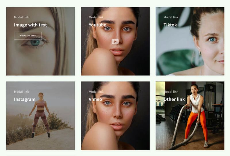
- Showcase social proof sections like Instagram, Tiktok, Youtube, or rich content such as Google Maps/Forms (the links will be opened in a lightbox)
- Call to Action: See an example here (the Take our size quiz block)


- Featured Collections/subcollections: here.
 Featured Collections - Example 2: here.


- Sale promotion: See an example here

- Related Blog Posts: See an example here

- How it works: See an example here


Watch video tutorial
Be sure to watch the step-by-step video tutorials demonstrating how to utilize the sections provided in Posstack Easy Content Builder, click here to watch the video.
How to add Image With Text section

- Step 1: Add a Section Settings section that allows you to control the global settings of the Image With Text section.
- Here you can define multi-column layouts, enable fullwidth, set the section's max-width, background color, global margin/padding, etc.
- Step 2: Add an Image With Text section (This provides you block-level configurations in addition to the global configuration level (via Section Settings above)
- Step 3: Set the Card Style. Generally, you can choose among three main styles:
- No card (Disable the card style)
- Card with text block outside the image: Default, Primary, Secondary
- Overlay (text block inside the image):
- Overlay - No mask
- Overlay - Text Center With Background
- Overlay - No mask + Text Center With Background
- Step 4: Insert the title, featured image, description, and CTA button.
- NOTE: Your original image width & height must be equal to or bigger than the width/height you specify under the Image With Text configuration.
- NOTE: For each section, Easy Content Builder lets you control the margin/padding at both the global level (via Section Settings) and block level (the Image With Text itself). Also, you might need to adjust the margin/padding of other sections you add before and after the Image With Text section too.
- Step 5: (Optional) Configure the animation and margin of the Image With Text section.
Image With Text global settings
From the Shopify theme editor, click on Image with text on the sidebar to view the details of settings.

| Section settings | Description |
|---|---|
| Card Style |
|
| Card Size | Decrease or increase the padding of the card body. |
| Box Shadow | Decrease or increase the box shadows of the card. |
| Rounded Border | Enable this setting to apply rounded corners to the background container and button. To increase the border radius of the button, you can use the Custom CSS option following this video tutorial. |
| Image | Add the image you want to feature in the block. |
| Image Width | Set the width (in pixel) of the collection’s featured image.
IMPORTANT: Make sure your original image width must be equal to or bigger than the width you specify here. |
| Image Height | Set the height (in pixel) of the collection’s featured image.
IMPORTANT: Make sure your original image height must be equal to or bigger than the height you specify here. |
| Image Crop | Cut out a part of the image: Top, Left, Bottom, Right, Center. |
| Image position | Position the image (left, right, center, bottom) to pair with the block’s main text content. This setting is only applied to Desktop devices.
Note: When you enable the Card Style with Overlay option, combine the Image Position and Text Alignment settings to control the position of your text and CTA buttons. Due to the current maximum number of settings per block (set by Shopify), we use the Image Position to define the position for the text and CTA buttons. Refer to the Use Case - Collection Grid here for more details. |
| Vertical Alignment | Align the content to the vertical position: top, middle, or bottom. |
| Text Alignment | Align text to the left, right, or center. |
| Title | Type a title for the content block. |
| Title Size | Change the heading to H1, H2, H3, H4, H5, or H6. |
| Badge | Create nice looking text badges. |
| Tagline | Type a short tagline for the content block. |
| Tagline Size | Set the tagline size - Small, Default, or Large |
| Description | Type the content of the block. |
| Description Size | Set the description size - Small, Default, or Large |
| Button Text | Enter the button’s text. Leave this field empty to disable the button. |
| Button URL | Set the internal or external URL for the button’s link. |
| Button Style | Apply a different look for the button:
|
| Button Size | Set the button size - Small, Default, or Large |
| Animate On Scroll | This feature is only available for the Pro plan. It lets you apply different types of animation to elements within each section as you scroll down the page. Learn more about scrolling animations here. |
| Margin | Set the vertical spacing between elements. |
Use cases
Use case 1: How to add an Instagram section
You can use Images With Text to display your Instagram posts in a lightbox.
- Step 1: Add a Section Settings section (to control the global settings of the Image With Text section)
- Step 2: Add an Image With Text section
- Step 3: Configure the Image With Text as follows:
- Card Style: Overlay (Pro)
- Image: upload an image
- Button URL: insert your Instagram post URL
- Target: choose Image + Modal link.
- Then configure other fields as you wish
Once done, this section will display an icon when hovering over the image and open the link in a lightbox.
Use case 2: 'Zigzag' layout style
We create a simple 'zigzag' grid by adding multiple Image With Text sections.
Here are the configurations for this 'zigzag' sample:
Step 1: the Section Settings configuration:
- Enabled 'Full Width Container'
- Layout: One Column

Step 2: the Image With Text configuration:
- Card Style: Default
- Card Size: Default
- Image Position: Left (for the 1st Image With Text section) and Right (for the 2nd Image with Text section)
- Image Column Width: 1/2
- Margin: No Margin

Use case 3: An overlayed text block on top of the background image
We create a section with one Image With Text section (using the overlay setting) and one Gallery section.
Here are the configurations for this gallery sample:
Step 1: the Section Settings configuration:
- Layout: Two Col: First Block Left, Remains Right

Step 2: The Image With Text configuration:
- Card Style: Overlay - No mask + Text Center
- Card Size: Default
- Margin: Medium

Step 3: The Gallery configuration
- Image width: 400
- Image height: 400
- (Items per row) Mobile: 2
- (Items per row) Tablet: 2
- (Items per row) Desktop: 2
- Gap: No gap

Use case 4: Hero banner with 3 CTAs buttons

We create a simple hero banner (view the live demo ) using Image With Text and Buttons blocks.
Here is the list of content blocks and associated configurations for this hero banner section:

Step 1: Add Section Settings block and configure as follows:
- Desktop Layout: Two Col: First Block Right, Remains Left.
- Mobile Layout: One Column
- Main Column Width: By default, you can start with a 50/50 layout for image and text elements or change this ratio by changing the Main Column Width value.
- Background image: Upload your hero banner (Recommended hero image width: between 1280 and 2500px; hero image height between 720 and 900px. Learn more about recommended image dimensions.)
- Parallax Animate: 450 (this setting is optional and available for the Pro plan only)
- Text Color: #FFFFFF
- Padding top: 250px
- Padding bottom: 150px
Step 2: Add Custom HTML block

Add a Custom HTML block and leave all configuration fields blank (no need to add any custom HTML code here).
The primary purpose of this step is to use this Custom HTML block as a blank column on the right of this hero banner section:
- The right column: an empty column (created by the Custom HTML block)
- The left column: displays the text and CTA button elements.
Step 3: Add Section Title block and fill in the Title, Tagline, and Description as you wish.

Step 4: Add a Button block and fill in the button's label, URL, and style.

Use case 5: Hero banner with a background color overlay

This simple hero banner uses the default Image With Text block.
Here is the list of content blocks and associated configurations for this hero banner example:
Step 1: Add Section Settings block and configure as follows:

- Desktop Layout: Two Col: First Block Left, Remains Right.
- Mobile Layout: One Column
- Main Column Width: By default, you can start with a 50/50 layout for image and text elements or change this ratio by changing the Main Column Width value.
- Main Column Width: 40px (change this value as you wish)
- Background image: Upload your hero banner (Recommended hero image width: between 1280 and 2500px; hero image height between 720 and 900px. Learn more about recommended image dimensions.)
- Parallax Animate: 400 (this setting is optional and available for the Pro plan only)
- Text Color: #121212
- Padding Top: 50px
- Padding Bottom: 50px
Step 2: Add Section Title block and with the configurations below:

- Fill in the Title, Tagline, Description, and button style as you wish.
- Note: The Image With Text block comes with one default CTA button. If you need multiple CTA button, you should use the Button block instead. Check out Use case 3: Hero banner with 3 CTAs buttons for more details.
- Background color: #ffffff
- Padding: Medium
Use case 6: Hero banner with CTAs buttons at the bottom

This simple hero banner uses the default Image With Text and Button blocks.
Here is the list of content blocks and associated configurations for this hero banner example:

Step 1: Add Section Settings block and configure as follows:
- Desktop Layout: One Column
- Background image: Upload your hero banner (Recommended hero image width: between 1280 and 2500px; hero image height between 720 and 900px. Learn more about recommended image dimensions.)
- Parallax Animate: 400 (this setting is optional and available for the Pro plan only)
- Mask color: #121212 (This setting is optional. It helps make the text more visible vs. the image background.)
- Text Color: #FFFFFF
- Padding top: 460px
- Padding bottom: 0px
Step 2: Add Button block and with the configurations below:
- Fill in the Button label, style, URL, and size as you wish.
- Margin: Medium
Use case 7: Hero banner with extra space between Headline/subheadline vs. CTAs buttons

This simple hero banner uses the default Image With Text, Button, and Custom HTML blocks.
Here is the list of content blocks and associated configurations for this hero banner example:

Step 1: Add Section Settings block and configure as follows:

- Desktop Layout: One Column
- Background image: Upload your hero banner (Recommended hero image width: between 1280 and 2500px; hero image height between 720 and 900px. Learn more about recommended image dimensions.)
- Parallax Animate: 300 (this setting is optional and available for the Pro plan only)
- Mask color: #121212 (This setting is optional. It helps make the text more visible vs. the image background.)
- Text Color: #FFFFFF
- Padding top: 250px
- Padding bottom: 0px
Step 2: Add Section Title block and with the configurations below:

- Fill in the Title, Tagline, Description, and button style as you wish.
- Margin: medium
Step 3: Add a Custom HTML block

Add a Custom HTML block and leave all configuration fields blank (no need to add any custom HTML code here) and just set the margin to adjust the spacing as you wish.
The primary purpose of this step is to use this Custom HTML block as a blank row between the Headline/subheadline vs. CTAs buttons of this hero banner section.
Step 4: Add a Button block with the configurations below:

- Fill in the Button label, style, URL, and size as you wish.
- Margin: Medium
Use case 8: Collection Grid
Below is an example of using two Image With Text blocks and a two-column grid to create a featured collection/subcollection section (view demo).

Here is the list of content blocks and associated configurations for this 2-col section:

Step 1: Add a Section Settings block and configure as follows:

- Desktop Layout: 2 Column
- Learn more about all Hierarchical Grid options that Easy Content Builder provides here.
- Mobile Layout: One Column
- Main Column Width: By default, you can start with a 50/50 layout for image and text elements or change this ratio by changing the Main Column Width value.
- Column Gap: 20
- Row Gap: 20
- Text Color: #FFFFFF (change to your desired color)
- Padding top: 50px
- Padding bottom: 50px
Step 2: Add the first Image With Text block with the configurations below:

- Card Style: Overlay - No Mask
- Card Size: Default
- Box Shadow: Small
- Image Position: Bottom
- Note: Due to the current maximum number of settings per block (set by Shopify), we use the Image Position to define the position for the text and CTA buttons. So, you can combine the Image Position and Text Alignment settings to control the position of your text and CTA buttons.
- Image: upload your own image
- (Image Settings) Image width: enter your image width here (our demo width is 800)
- (Image Settings) Image height: enter your image height here (our demo height is 800)
- Text Alignment: Right
- Title: Enter your title here.
- Tagline: Enter your tagline (the additional text above your title).
- Button Text: Enter your text here
- Button Text: Enter your button text
- Button Style: Primary
- Margin: No Margin
Step 3: You add the second Image With Text block, similar to Step 2 above, and configure each block your way.
To keep the text block on the bottom right corner, make sure you set:
- Image Position: Bottom
- Text Alignment: Left
Use case 9: Create a clickable image with text

You can add a link to an image using the Image With Text with the following configurations:
- Card Style: Overlay - no mask (Or 'Overlay' if you want a mask layer on top of the image)
- Button URL: insert the URL you want.
- Button style: Image Link.
Use case 10: Create an Image With Text with custom background color
To create an Image With Text section with a custom background color similar to the Trending Now section on this Home & Garden landing page, follow these steps:
Step 1: Add the Sections Setting and Images With Text blocks as outlined below.

Step 2: Access the Section Settings to configure the Background Color and Text Color as specified.

Step 3: Open the Image With Text settings; set Card Style to No Card and Box Shadow to No Shadow. This will ensure your section displays the background color set in Step 2.

Add other content blocks
You can add many content blocks to a section you've created. These content blocks will be displayed in different positions within the section, depending on the Desktop/Mobile Layouts you configure.
