Block: Table
The Table section lets you create comparison tables on any page, allowing your users to compare your product features and key differences side-by-side. The Table section is a great add-on to create Product feature comparisons, Pricing Table, or any custom data table.
What is the Table section perfect for?
You have various options to use the Table section for your Shopify themes:
- Product comparison charts - view the demo here.
- Pricing table with custom data - see an example here.


- Pricing table (Equal height) - see an example here.

- Pricing table (Flexible height)

- Comparison data table - see an example here.

- Long-form data table with a Search box, Sorting in ascending or descending order, and pagination - see an example here.

- Data table with the first row and column as the header

- Size chart & fit guide - see an example here.

How to add Table section
Watch video tutorial
Be sure to watch the step-by-step video tutorials demonstrating how to utilize the sections provided in Posstack Easy Content Builder, available here.
How to add Table section
- Step 1: Add a Section Settings section that allows you to control the global settings of the Table section.
- In this special section, you can specify multi-column layouts, activate full width, determine the section's maximum width, choose a background color, and set global margins and padding, among other options.
- Note: If you include the Table in the core product information, skip the step for adding Section Settings. Just add the Table.


- Step 2: Add a Table section and customize the settings according to your preferences.
Customize Table section
Table global settings
From the sidebar of your Shopify theme editor, click on the Table title to view the details of the settings.
| Table Type | Select the type you want - Normal Table, Separate Cards, Data Table. |
|---|---|
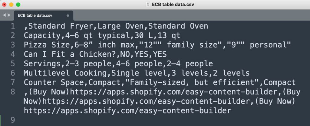
| Table Data | Add data in CSV (Comma Separated Values) format.
Steps to create and export CSV data from Google Spreadsheet:
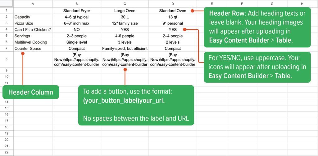
NOTE #1: Easy Content Builder lets you add images on the heading (the first row). Here are the CSV file format:
NOTE #2: If you want to keep specific elements (e.g. CTA buttons) in the same row in the comparison table, make sure you add the data in the same row in the sheet.
NOTE #3: To show the Yes/No icons, simply enter the 'YES' or 'NO' text (Must be in uppercase) into the sheet. NOTE #4: To add a CTA button, enter your sheet using this format: (your_button_label)your_url For example: (Buy Now)https://apps.shopify.com/easy-content-builder |
| Text Alignment | Align all elements of the Section title to the left, right, or center. |
| Header First Row | Display the first row as the header |
| Header First Column | Display the first column as the header |
| Table/Card style | Add CSS classes to change the table/card style. Please refer to the Use cases below to learn more about the predefined CSS class available in Easy Content Builder.
Here are some useful classes you can use (Feel free to add multiple classes, separating each with a space):
|
| Primary Column | Set a column to be the primary one that you want to attract the user's attention. E.g. enter '2' to set the 2nd column as the primary one. |
| Primary Column Style | Add CSS classes to change the primary column style. Please look at the helpful classes in the Table/Card Style field mentioned earlier or explore Use cases below to learn more about the predefined CSS class available in Easy Content Builder. |
| Link Style | Add CSS classes applied to links in the table. Here's the predefined CSS classes available in Easy Content Builder:
uk-button uk-button-primary uk-text-nowrap NOTE #1: You need to specify the button/link format in the CSV file following this format: (Buy Now)https://apps.shopify.com/easy-content-builder NOTE #2: You can change uk-button-primary to uk-button-default, uk-button-secondary, uk-button-link, or uk-button-text to change the look of the buttons. NOTE #3: the uk-text-nowrap class helps keep your button label on a single line, which is perfect for longer text labels. |
| Icon Yes | Upload the SVG icon to display in the Yes cell of the comparison table. |
| Icon No | Upload the SVG icon to display in the No cell of the comparison table. |
| Icon Width | Set the width (in pixel) of the YES/NO icons. |
| Image Width | Set the width (in pixels) of the featured images on the comparison table header. |
| Image Height | Set the height (in pixels) of the featured images on the comparison table header. |
| Image | Add the image you want to feature on the comparison table header. |
| Animate on scroll | This feature is only available for the Pro plan. It lets you apply different types of animation to elements within each section as you scroll down the page. Learn more about scrolling animations here. |
| Margin | Set the vertical spacing between elements. |


Adjust the width of the table columns
To adjust the width of each column, you can follow these steps:
1. Click on the App menu where you added the Table section.
 2. Enter this code in the Custom CSS field:
td:nth-child(1) {min-width: 150px;}
td:nth-child(2) {min-width: 150px;}
td:nth-child(3) {min-width: 150px;}
The numbers (1), (2), and (3) indicate the 1st, 2nd, and 3rd columns in your table. To tweak all columns in your table, just add similar code for each one, updating the number and the width value accordingly.

Add multiple images into the Table Header
By default, our Table section allows for up to 6 images in a product comparison chart, which you can upload directly in the Table configuration panel. If you need to display more than 6 images, you can follow this alternative method.

Step 1: Create a spreadsheet using tools like Google Docs or Excel.
Step 2: Input your data into the sheet and insert images into each cell above the heading text in this format:
(IMAGE)https://cdn.shopify.com/s/files/1/0683/5339/2927/files/tee_social2.jpg
Ensure there are no spaces between (IMAGE) and the image URL.

Step 3: Export the file as a CSV and copy the table content into the Table section. If you're unfamiliar with the Table section, please refer to this guide for more details.

Step 4 (optional): If your images have varying heights, you can maintain bottom alignment by adding this code in the Custom CSS field. For guidance on applying custom code to the Table section, refer to this guide.
.uk-table thead th {
    vertical-align: bottom;
}
Use Cases
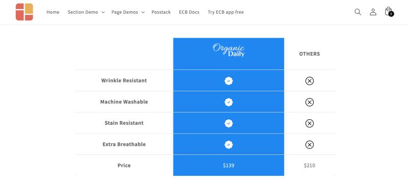
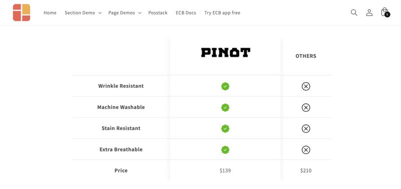
Use case 1: Product Feature Comparison Chart

Here are the configurations for this pricing table sample:
Step 1: Add Section Settings to specify the global configuration of this Pricing table (e.g. The column width, background color, etc.)

Step 2: Add a Table section and configure it as follows:
- Table Type: Normal Table
- Table Data: Insert your table data here:
- 1. Create your table in a spreadsheet (Google Docs, Excel, etc.) as shown in the example below.
- 2. Go to File > Download > Comma Separated Values (.csv).
- 3. Open the file in a text editor like Notepad or TextEdit, then copy the data and paste it into this field. This is what the table data in the CSV file looks like.


- Header First Row: enabled
- Header First Column: enabled
- Table Card Style: uk-table-large uk-table-rounded2
- Primary Column: 3 (you can change to the column you want)
- Primary Column Style: (Optional) Leave this field blank or use the CSS class uk-text-bold to make the primary column text bold.
- Link Style: enter these CSS classes uk-button uk-button-default uk-text-nowrap
- You can change uk-button-default to uk-button-primary, uk-button-secondary, uk-button-link, or uk-button-text to change the look of the buttons.
- Icon Yes: upload your own CSV icon
- Icon No: upload your own CSV icon
- Icon width: 24
- Image Width: 150
- Image Height: 150
- Image: upload the images that you want to display on the Header.
Use case 2: Equal height Pricing table

Here are the configurations for this pricing table sample:
Step 1: Add Section Settings to specify the global configuration of this Pricing table (e.g. The column width, background color, etc.)
Step 2: Add a Table section and configure it as follows:
- Table Type: Separate Cards
- Table Data: add your custom data following this sample CSV file. Please refer to the General Configuration guide for more details.
- Header First Row: enabled
- Table / Card style: enter these CSS classes uk-card-hover uk-card-secondary uk-height-1-1 uk-border-rounded.
- You can change uk-card-secondary to the uk-card-default or uk-card-primary to change the look of the cards.
- Primary Column: 2 (you can change to the column you want)
- Primary Column Style: enter these CSS classes uk-card-hover uk-card-primary uk-height-1-1.
- You can change uk-card-primary to the uk-card-default or uk-card-secondary to change the look of the cards.
- Link Style: enter these CSS classes uk-button uk-button-primary uk-text-nowrap
- You can change uk-button-primary to uk-button-default, uk-button-secondary, uk-button-link, or uk-button-text to change the look of the buttons.
- Icon Yes: upload your own CSV icon
- Icon No: upload your own CSV icon
- Image width: 24
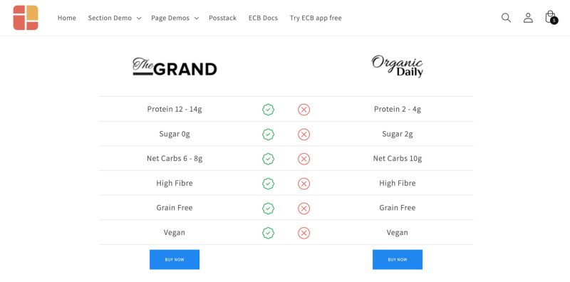
Use case 3: Comparison chart

Here are the configurations for this comparison table sample:
Step 1: Add Section Settings to specify the global configuration of this comparison table (e.g. The column width, background color, etc.)
Step 2: Add a Table section and configure it as follows:
- Table Type: Normal Table
- Table Data: add your custom data following this sample CSV file. Please refer to the General Configuration guide for more details.
- Header First Row: enabled
- Table / Card style: enter this CSS class uk-table-striped
- Primary Column: 1 (you can change to the column you want)
- Primary Column Style: enter these CSS classes uk-text-bold uk-text-success
- Link Style: enter these CSS classes uk-button uk-button-primary
- You can change uk-button-primary to uk-button-default, uk-button-secondary, uk-button-link, or uk-button-text to change the look of the buttons.
- Icon Yes: upload your own CSV icon
- Icon No: upload your own CSV icon
- Image width: 24
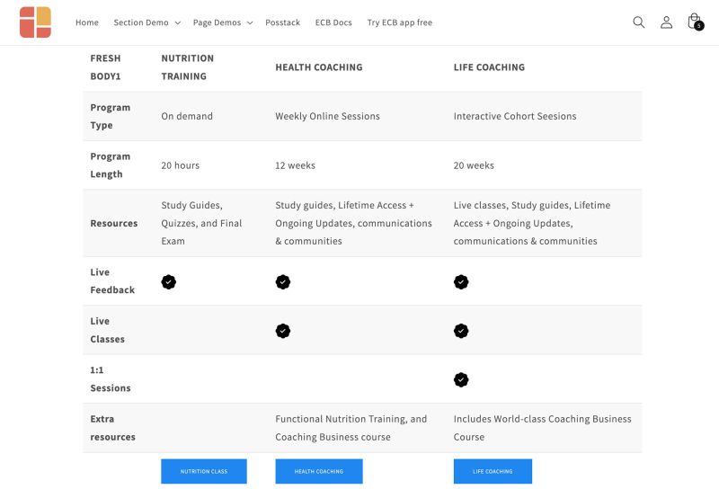
Use case 4: Long-form data table with a Search box, Sorting in ascending or descending order, and pagination.

Here are the configurations for this data table sample:
Step 1: Add Section Settings to specify the global configuration of this data table (e.g. The column width, background color, etc.)
Step 2: Add a Table section and configure it as follows:
- Table Type: Data Table
- Table Data: add your custom data following this sample CSV file. Please refer to the General Configuration guide for more details.
- Table / Card style: enter this CSS class uk-table-striped
- Link Style: enter these CSS classes uk-button uk-button-primary
- You can change uk-button-primary to uk-button-default, uk-button-secondary, uk-button-link, or uk-button-text to change the look of the buttons.
- Icon Yes: upload your own CSV icon
- Icon No: upload your own CSV icon
- Image width: 24
Add other content blocks
You can add many content blocks to a section you've created. These content blocks will be displayed in different positions within the section, depending on the Desktop/Mobile Layouts you configure.
