Block: Video Slider & Grid
Overview
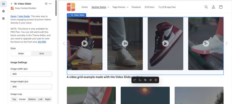
The Video Slider section (available for the Pro plan) allows you to design a sleek video slider or grid using your uploaded videos.
Easy Content Builder provides you with six options for video presentations:
1. Shoppable videos: Use this section to create interactive video carousels with clickable product links. Upload your videos, tag one product per video, making it easy for viewers to purchase items they see.
2. Video section: Add horizontal and vertical videos to your Shopify pages by uploading or using video URLs, perfect for product launches, announcements, and reviews. Supports TikTok, YouTube Shorts, Vimeo, and Instagram Reels for vertical videos.
3. Video Slider section (the current page): Create a sleek video slider or grid from your uploaded videos. Opens videos in a modal upon clicking.
4. Gallery Section: Showcase a grid of photos alongside a featured video.
5. Video Background: Add dynamic video background to your page.
6. Instagram/TikTok/YouTube Video Slider: Display an auto-scrolling video carousel. Opens links in a modal upon clicking.Video use cases
It's great to showcase a video slider made from your locally hosted videos on your Shopify store. This is ideal for product launch videos, important announcements, instructional content, user-generated content, unboxing videos, customer reviews, and more
 See the video slider example here.
Watch Video tutorial
You can watch the video tutorial below to learn about the Video Slider section.
The video explains three methods for adding videos to Shopify pages (using Easy Content Builder):
- Use a background video.
- Integrate video sliders from YouTube, TikTok, or Instagram (using the Video section).
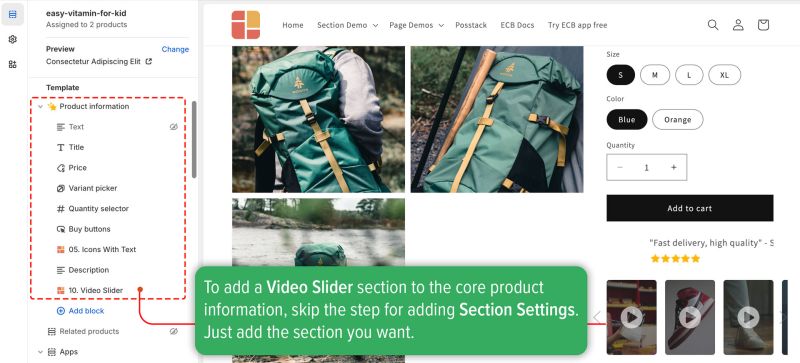
- Add a video slider next to the Add to Cart button (using the Video Slider section).
Feel free to jump to Part 3 for instructions on using the Video Slider section.
Click here to watch the video.
How to add Video Slider section
- Step 1: Add a Section Settings section that allows you to control the global settings of the Video Slider section.
- In this special section, you can specify multi-column layouts, activate full width, determine the section's maximum width, choose a background color, and set global margins and padding, among other options.
- Step 2: Add a Video Slider section and customize the settings according to your preferences.
Video Slider global settings
| Section Settings | Description |
|---|---|
| Style | Choose between grid layout or slider. |
| Image Width | Define the video thumbnail's width (in pixels). |
| Image Height | Define the video thumbnail's height (in pixels). |
| Image Crop | Crop the video thumbnail from Top, Left, Bottom, Right, or Center |
| Image Border | Adds rounded corners to the video thumbnail. You can set your video thumbnails with Normal, Circle, Rounded, or Pill values. |
| Lightbox gallery - Animation | Select animation mode (Slide, Fade, Scale) for video display in a responsive lightbox. |
| Show Video Icon | Options for hover or always visible. |
| Items per row on Mobile | Sets the number of videos displayed per row on Desktop devices (Less than 640px). |
| Items per row on Table | Sets the number of videos displayed per row on Desktop devices (Between 640px - 1200px). |
| Items per row on Desktop | Sets the number of videos displayed per row on Desktop devices (Less than 1200px and up). |
| Show Slider Arrows | Show or hide the slider arrows on the Desktop. |
| Show Navigation | Shows/hides the dot navigation. Set Mobile Only if you want to display just the dot navigation on mobile.
NOTE: If you enable the Margin Right, consider disabling the Show Navigation. |
| Margin Right | Sets the right margin to partly display the last video item (None, Small, Medium, Large) |
| Video | upload and host your video on your Shopify. |
| Video Title | Enter the title displayed below the video. |
| Animate on Scroll | This feature is only available for the Pro plan. It lets you apply different types of animation to the videos as you scroll down the page. Learn more about scrolling animations here. |
| Margin | Sets the vertical spacing between elements. |
Add other content blocks
You can add many content blocks to a section you've created. These content blocks will be displayed in different positions within the section, depending on the Desktop/Mobile Layouts you configure.


