Add section settings: Difference between revisions
| (16 intermediate revisions by the same user not shown) | |||
| Line 64: | Line 64: | ||
====Add the background video==== | ====Add the background video==== | ||
:In the '''Section Settings''' block, select a video to use as the section's background. After adding it, you can click the '''Change''' button below the video to delete or replace it.[[File:Section-settings-bg-video.jpg|frameless|1024x1024px]] | :In the '''Section Settings''' block, select a video to use as the section's background. After adding it, you can click the '''Change''' button below the video to delete or replace it.[[File:Section-settings-bg-video.jpg|frameless|1024x1024px]] | ||
:{{Note|Easy Content Builder has four more options for displaying your video carousel. Learn more [[Block_Video_Slider|here]].|reminder}} | |||
====Add the background color==== | ====Add the background color==== | ||
| Line 79: | Line 81: | ||
:[[File:Section-setting-text-color.jpg|frameless|1269x1269px]] | :[[File:Section-setting-text-color.jpg|frameless|1269x1269px]] | ||
==Next Step== | |||
Having added '''Section Settings''', you can now incorporate additional rich content blocks available in Easy Content Builder. To find the specific blocks you'd like to use, please look in the left sidebar menu of this page. | |||
==Extra Customizations== | |||
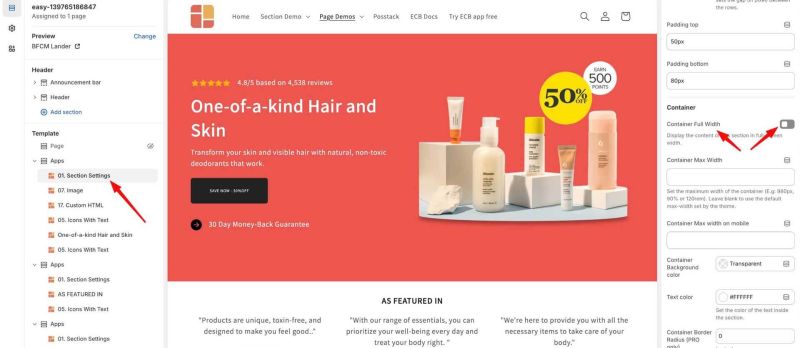
====How to set up a full-width section==== | |||
The Easy Content Builder makes it simple to activate full-width for any section. Follow these steps: | |||
# Access '''Section Settings''', where you can manage the overall configuration of the section, including the column layout, width, background color, and more. | |||
# Within the '''Section Settings''', turn on the '''Full Width Container''' option. | |||
[[File:Ecb-fullwidth.jpg|frameless|800x800px]] | |||
====Add Colorful Sections==== | |||
To achieve lively, colorful sections on a page, you can combine both background colors and images through the Section Settings. | |||
Here are two options for creating these vibrant sections: | |||
*Option 1: Use the [https://easy-content-builder-demo.myshopify.com/pages/section-image-with-text Image With Text] option along with '''Section Settings'''. | |||
*Option 2: Combine several sections with '''Section Settings'''. | |||
'''OPTION 1''': | |||
[[File:Ecb-bg-color-config1.jpg|800px|frameless]] | |||
'''STEP 1''': Configure '''Section Settings''' | |||
*Desktop Layout: 1 Column | |||
*Container Full Width: Enabled | |||
*Background Color: Set your desired color. | |||
'''STEP 2''': Add and configure '''Image With Text''' | |||
*Card Style: No Card | |||
*Card Size: Default | |||
*Box Shadow: No Shadow | |||
*Image Column Width: 3/4 (or change to your desired ratio) | |||
*Margin: No Margin | |||
{{Note|Note: When two sections have background images or colors, they will appear side by side with no spacing. To create space between two sections with background colors or images, follow [[Add_section_settings#Adjust_the_top/bottom_padding_and_margin_between_sections|this guide]].|reminder}} | |||
'''OPTION 2''': | |||
[[File:Ecb-bg-color-config3.jpg|800px|frameless]] | |||
'''STEP 1''': Configure '''Section Settings''' | |||
*Desktop Layout: Two Cols - First Block Left | |||
*Top/Bottom Padding: Adjust to fit your background image | |||
*Background Color: Set your desired color | |||
*Background Image: Upload your image for Desktop | |||
*Background Image for Mobile: Upload a mobile image | |||
*Background Position: Left | |||
*Background Width: 60 | |||
'''STEP 2''': Add '''Custom HTML''' Section | |||
Leave the configurations default to create the first blank column. | |||
Keep the configurations as default to create the first blank column. | |||
'''STEP 3''': Add Other Content Sections | |||
You can include any additional rich content sections you desire. In this example, we incorporated two '''Section Title''' sections with a '''Custom HTML''' in between to create ample space between them. | |||
====Create an overlapping layout==== | |||
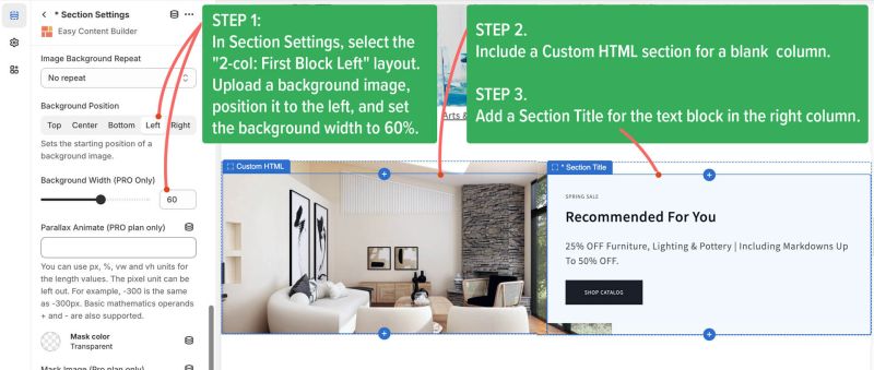
You can also set the background image width flexibly to create an overlapping layout like the example below: | |||
*STEP 1. In '''Section Settings''', select the "2-col: First Block Left" layout. Upload a background image, position it to the left, and set the background width to 60%. | |||
*STEP 2. Include a '''Custom HTML''' section for a blank column. | |||
*STEP 3. Add a '''Section Title''' for the text block in the right column. | |||
[[File:Ecb overlap bg.jpg|800px|frameless]] | |||
====Add space between columns and rows within a section==== | ====Add space between columns and rows within a section==== | ||
| Line 87: | Line 161: | ||
{{Note|'''Note''': Apart from adjusting the margin/padding in the '''Section Settings''' configuration, you can also open each block within that section to further adjust the padding/margin for each block (Each section may contain multiple blocks).|reminder}} | {{Note|'''Note''': Apart from adjusting the margin/padding in the '''Section Settings''' configuration, you can also open each block within that section to further adjust the padding/margin for each block (Each section may contain multiple blocks).|reminder}} | ||
==Adjust the top/bottom padding and margin between sections== | ===Adjust the top/bottom padding and margin between sections=== | ||
As you know, each section made with Easy Content Builder has Section Settings and one or more selectable content blocks (like Icons With Text or Circle Menu), as shown in the screenshot below. | As you know, each section made with Easy Content Builder has Section Settings and one or more selectable content blocks (like Icons With Text or Circle Menu), as shown in the screenshot below. | ||
[[File:Ecb section settings margin.jpg|800px|frameless]] | [[File:Ecb section settings margin.jpg|800px|frameless]] | ||
| Line 95: | Line 169: | ||
*Step 2: Adjust the '''Margin''' for each block within the section. | *Step 2: Adjust the '''Margin''' for each block within the section. | ||
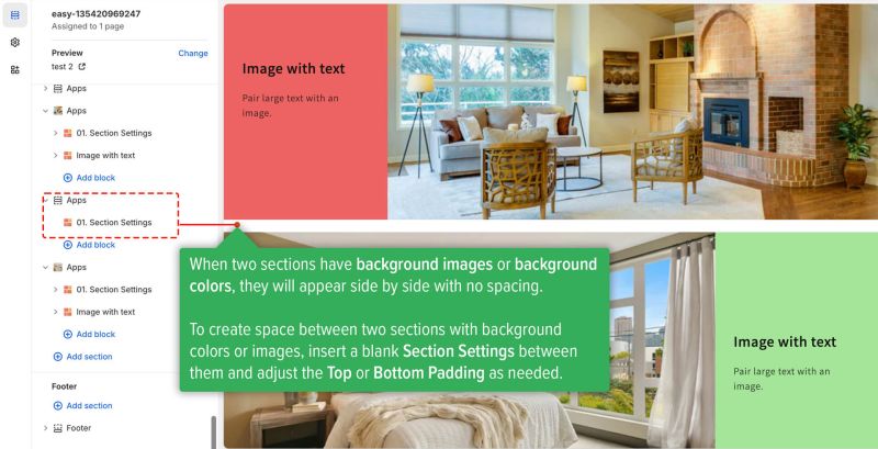
{{Note|SPECIAL CASES: | |||
When two sections have background images or colors, they will appear side by side with no spacing. | |||
To create space between two sections with background colors or images, insert a blank '''Section Settings''' between them and adjust the '''Top''' or '''Bottom Padding''' as needed. | |||
[[File:Ecb-bg-color-config2.jpg|800px|frameless]] | |||
|reminder}} | |||
Latest revision as of 01:43, 20 December 2024
This guide explains how to add new sections to a template. To create a new template, check out this guide: Create a template.
Steps Overview:
- Select a template.
- Add sections to the template.
Watch video tutorial
Be sure to watch the step-by-step video tutorials demonstrating how to utilize the sections provided in Posstack Easy Content Builder, available here.
Select a template
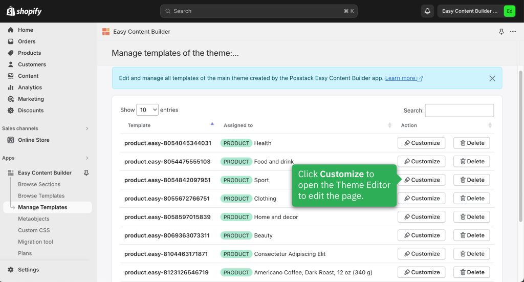
From the Manage Templates page:
- Click Apps > Easy Content Builder > Manage Templates.
- Find the template that you want to edit.
- Click Customize to edit the template.
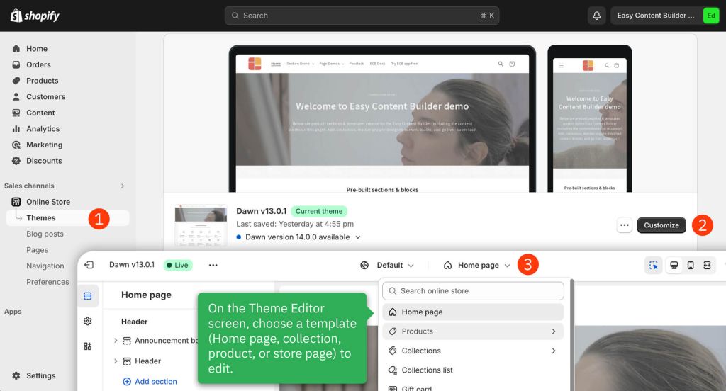
From the Shopify Theme Editor:
- Select Online Store > Themes.
- Next to the theme that you want to edit, click Customize.
- It will navigate to the Theme Editor.
- On the Theme Editor screen > Use the Template drop-down menu to select a template (Home page, collection, product or store page) that you want to edit.
Add Section
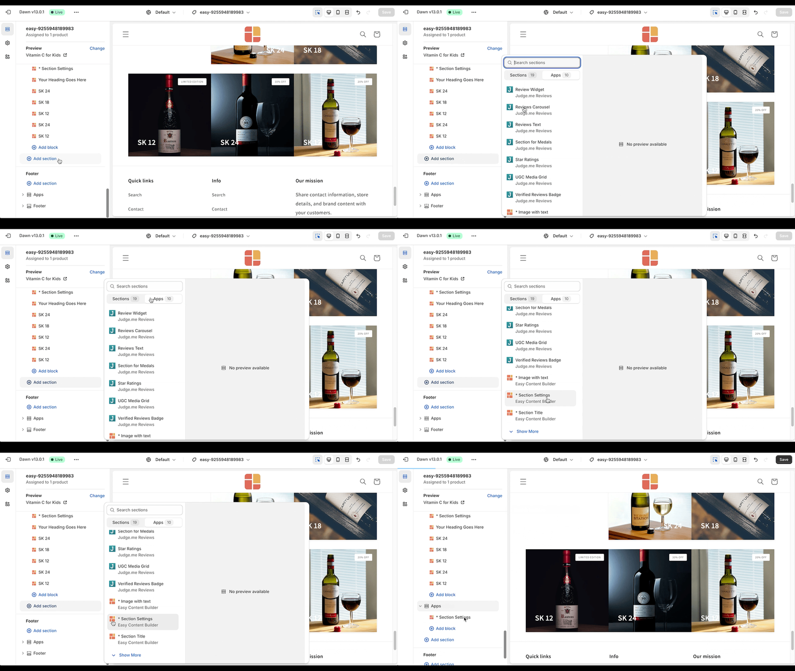
To add a new section, you need to add a special block called Section Settings.
This block allows you to manage the layouts of your section by choosing your preferred layouts (1-column, 2-column, 3-column, 4-column, or hierarchical layouts) and global configurations (full-width layout, mask color, mask image, background video, parallax animation, etc.).
This video provides instructions on adding your first section:
- After adding the Section Settings block, the theme editor preview will show a blank placeholder. Once you add the new content blocks as per the guide Add Blocks below, they will appear in the theme editor.
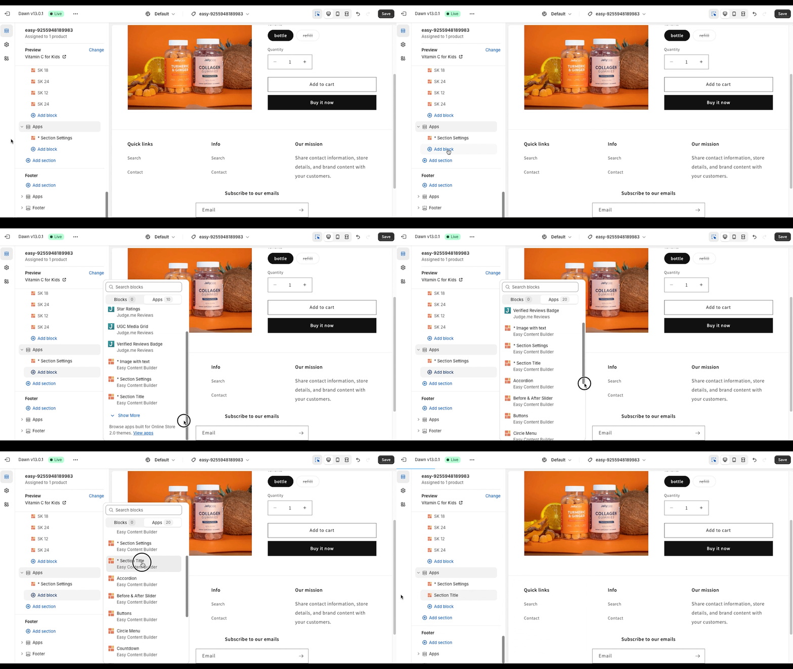
Add Blocks
After adding your first section, add the blocks you want for this section by following the video tutorial below:
Edit Section Settings
Now that you've added your first section, it's time to further customize this specific section by utilizing the advanced features available in the Section Settings block.
Add multi-column layouts
You can define your preferred section layouts (1-column, 2-column, 3-column, 4-column, or hierarchical layouts) by watching the video tutorial below:
- Check out this guide for various multi-column layouts that you can use to customize your Shopify theme.
Add the background image
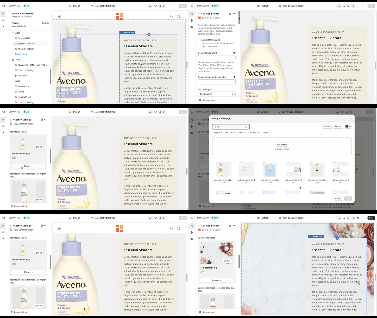
You can set the section's background image. Once added, you can click the Change button below the image to delete or change it.
Add the background video
- In the Section Settings block, select a video to use as the section's background. After adding it, you can click the Change button below the video to delete or replace it.
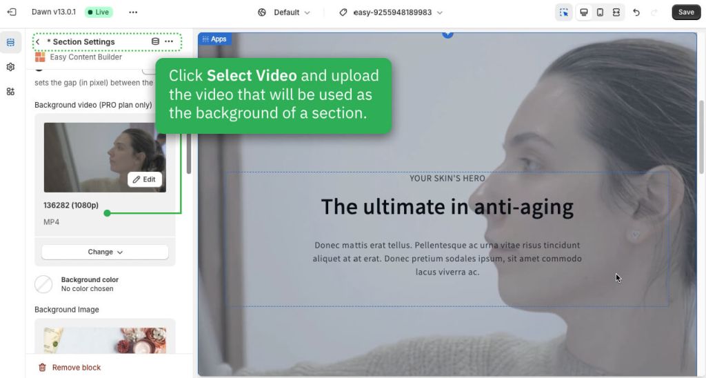
- Easy Content Builder has four more options for displaying your video carousel. Learn more here.
Add the background color
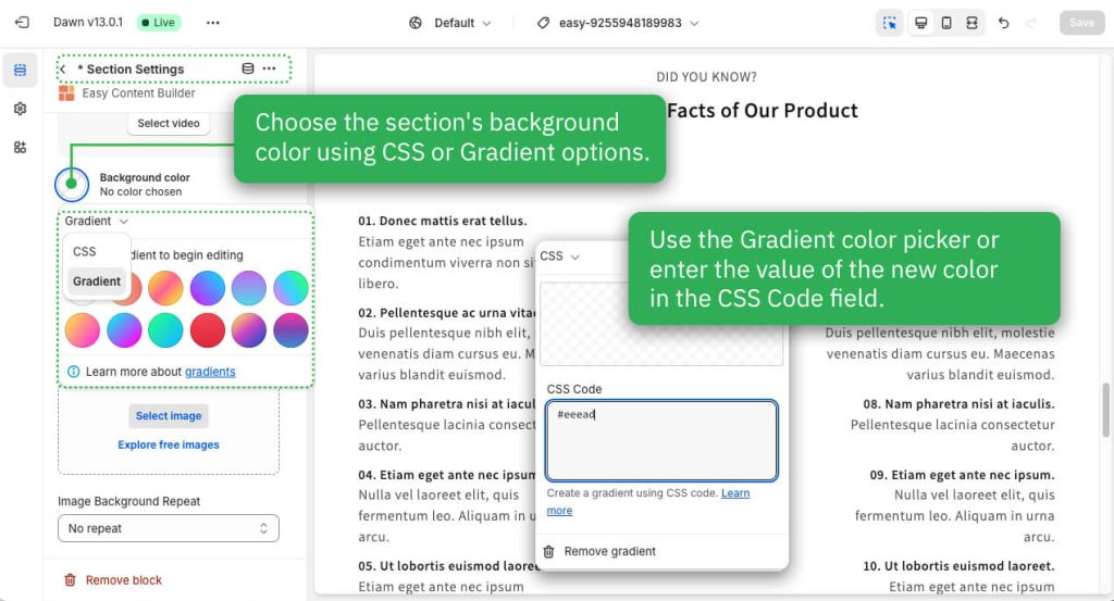
In the Section Settings block, you can customize the section's background color using CSS or Gradient options. Simply click the Background Color and use the Gradient color picker or enter the new color value in the CSS Code field.
Add the background container color
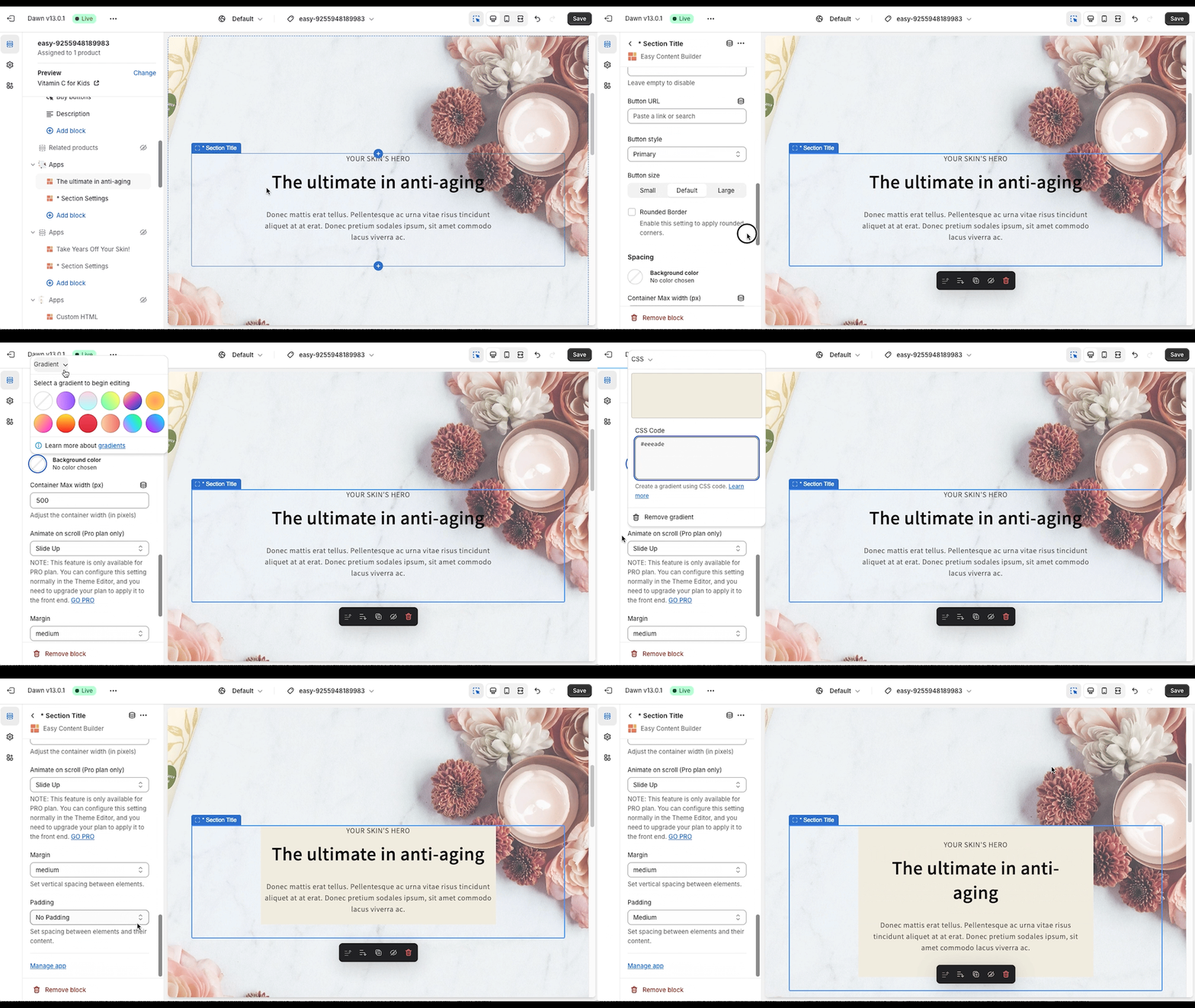
In Section Settings, you can customize the container's background color. You can also apply the background color of the container at the block level, such as with the Section Title block demonstrated in the video tutorial below:
Set text color
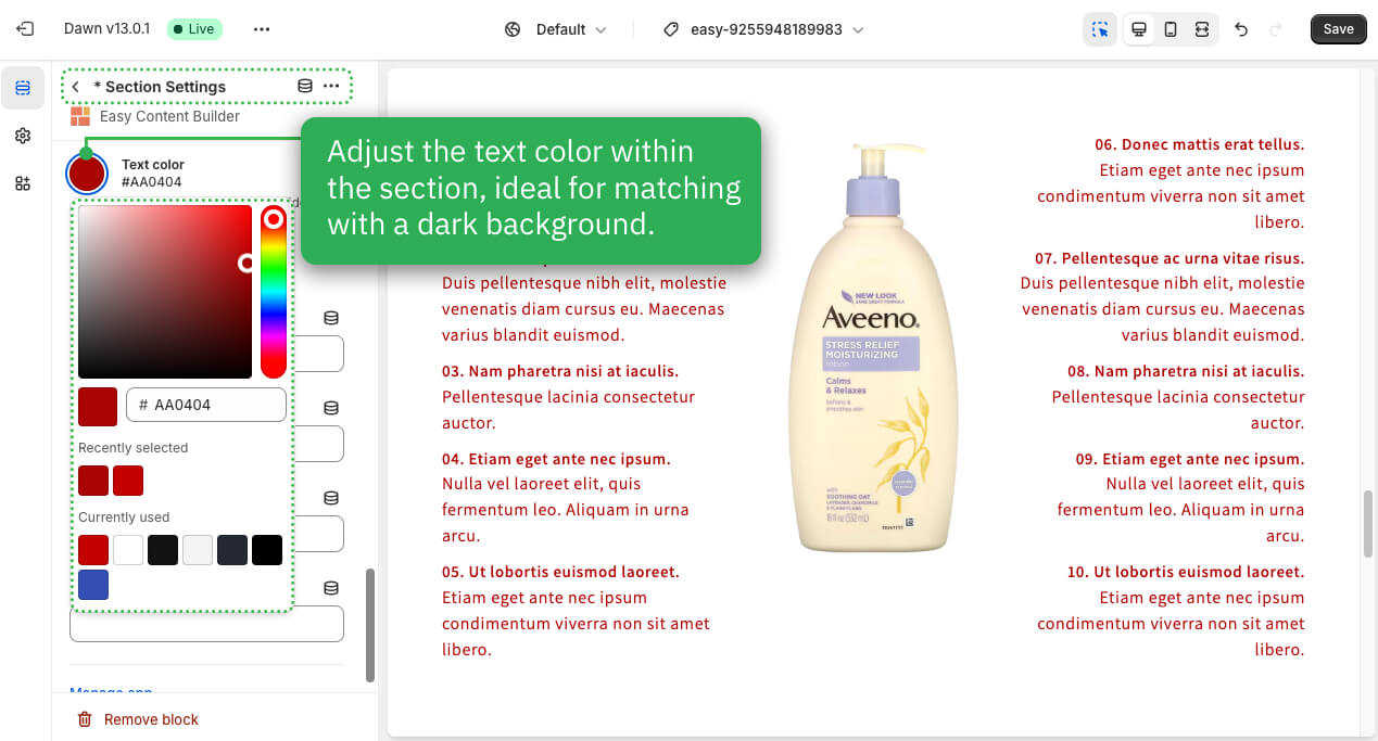
In the Section Settings block, customize the text color within the section, which is great for adjusting the text color when using a dark background.
Next Step
Having added Section Settings, you can now incorporate additional rich content blocks available in Easy Content Builder. To find the specific blocks you'd like to use, please look in the left sidebar menu of this page.
Extra Customizations
How to set up a full-width section
The Easy Content Builder makes it simple to activate full-width for any section. Follow these steps:
- Access Section Settings, where you can manage the overall configuration of the section, including the column layout, width, background color, and more.
- Within the Section Settings, turn on the Full Width Container option.
Add Colorful Sections
To achieve lively, colorful sections on a page, you can combine both background colors and images through the Section Settings.
Here are two options for creating these vibrant sections:
- Option 1: Use the Image With Text option along with Section Settings.
- Option 2: Combine several sections with Section Settings.
OPTION 1:
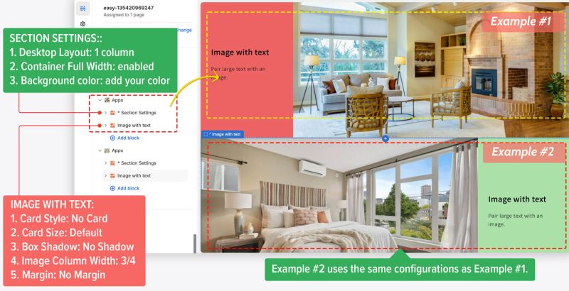 STEP 1: Configure Section Settings
- Desktop Layout: 1 Column
- Container Full Width: Enabled
- Background Color: Set your desired color.
STEP 2: Add and configure Image With Text
- Card Style: No Card
- Card Size: Default
- Box Shadow: No Shadow
- Image Column Width: 3/4 (or change to your desired ratio)
- Margin: No Margin
OPTION 2:
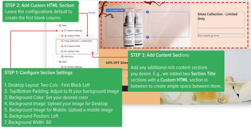 STEP 1: Configure Section Settings
- Desktop Layout: Two Cols - First Block Left
- Top/Bottom Padding: Adjust to fit your background image
- Background Color: Set your desired color
- Background Image: Upload your image for Desktop
- Background Image for Mobile: Upload a mobile image
- Background Position: Left
- Background Width: 60
STEP 2: Add Custom HTML Section Leave the configurations default to create the first blank column. Keep the configurations as default to create the first blank column.
STEP 3: Add Other Content Sections
You can include any additional rich content sections you desire. In this example, we incorporated two Section Title sections with a Custom HTML in between to create ample space between them.
Create an overlapping layout
You can also set the background image width flexibly to create an overlapping layout like the example below:
- STEP 1. In Section Settings, select the "2-col: First Block Left" layout. Upload a background image, position it to the left, and set the background width to 60%.
- STEP 2. Include a Custom HTML section for a blank column.
- STEP 3. Add a Section Title for the text block in the right column.
Add space between columns and rows within a section
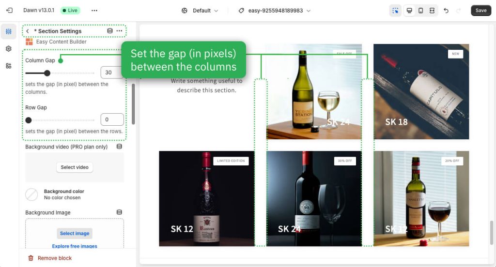
When configuring a section with multiple columns (ranging from 2 columns to 4 columns or utilizing a hierarchical grid), you may find it necessary to add padding between the columns or rows within that section. This can be accomplished by adjusting the Column gap or Row gap (in pixels) under the Section Settings.
Adjust the top/bottom padding and margin between sections
As you know, each section made with Easy Content Builder has Section Settings and one or more selectable content blocks (like Icons With Text or Circle Menu), as shown in the screenshot below.
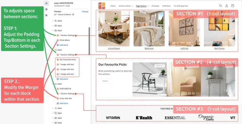 The example displays three sections. To adjust the space between them, follow these steps:
- Step 1: Change the Padding Top/Bottom in each section's Section Settings.
- Step 2: Adjust the Margin for each block within the section.
