Block: Blog Post Grid/Slider
The Blog Post Grid/Slider section allows you to show:
- Articles: Show a list of articles from a specific blog or display all your articles.
- Random Articles: Present a mixed selection of articles pulled randomly from your blog.
- Related Info: For each blog post, you can include a featured image, the publication date, post tags, article excerpts, and a "Read more" button.
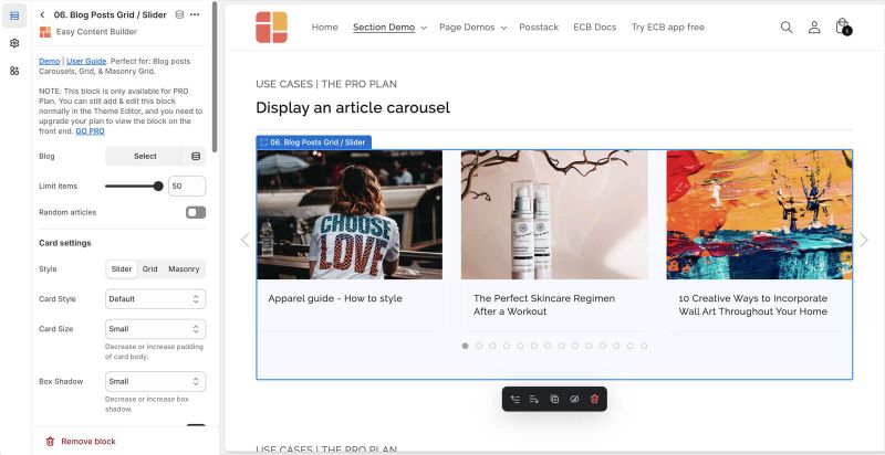
Blog Post grid/slider examples
Article carousel, grid, and mansory layouts


How to add Blog Post Grid/Slider section
- Step 1: Add a Section Settings section that allows you to control the global settings of the Blog Post Grid/Slider section.
- In this special section, you can specify multi-column layouts, activate full width, determine the section's maximum width, choose a background color, and set global margins and padding, among other options.
- Step 2: Add an Blog Post Grid/Slider section and customize the settings according to your preferences.

Customize Blog Post Grid/Slider
Blog Post Grid/Slider global settings
From the Shopify theme editor, click on Blog Post Grid/Slider on the sidebar to view the details of settings.
| Section settings | Description |
|---|---|
| Blog | Choose a specific blog, or leave this field blank to display all articles. |
| Filter by Tags | Display blog posts categorized by specific tags on a page. Enter multiple tags, separated with the comma. |
| Limit items | The maximum number of articles that you can feature in the Blog Post Grid/Slider section. |
| Style | Select the Slider/Grid/Mansory layouts |
| Card Style | Create layout boxes for each product item. Emphasize an item with a primary card style. |
| Card Size | Decrease or increase the padding of the card body. |
| Box Shadow | Decrease or increase the box shadows of the card. |
| Round Border | Enable this setting to apply rounded corners. |
| Image Width (px) | Set the width (in pixel) of the article's featured image.
NOTE: Just enter 0 for both the Image Width and Image Height fields if you want to hide the blog's featured image. |
| Image Height (px) | Set the height (in pixel) of the article's featured image.
NOTE: Just enter 0 for both the Image Width and Image Height fields if you want to hide the blog's featured image. |
| Text Alignment | Align text to the left, right, or center. |
| Title Size | Change the heading to H1, H2, H3, H4, H5, or H6. |
| Description Length | Keep your descriptions long enough that they're sufficiently descriptive. The "optimal" length will vary depending on your specific situation. The description will be trimmed to the number of characters you enter. Enter 0 to hide it. |
| Date | Show or hide the publication date. |
| Tags | Show or hide the article's tags |
| Read More button | Show or hide the Read More button |
| Item Width on Desktop | Define the Item width on desktop:
|
| Item Width on Mobile | Define the width of the article card.
|
| Gap | Set the gap between articles. |
| Show Slider Arrows | Show or hide the slider arrows on the Desktop. Place arrows inside or outside. |
| Show Navigation | Show or hide the dot navigation. |
| Slider Set | To loop through a set of slides instead of single article. |
| Animation On Scroll | It lets you apply different types of animation to elements within each section as you scroll down the page. Learn more about scrolling animations here. |
| Margin | Set the vertical spacing between elements. |
Use Cases

Check out the live demo of this section: here.
After adding the section, you'll be taken to the Theme Editor, where you'll see a list of blocks like in the screenshot below:

If you like to set up this section manually, here are the steps to follow:
Step 1: Add a Section Settings block

Set up the Section Settings block with the following configurations:
- Desktop Layout: Two Cols: First Block Left
- Main Column Width: 70
- Column Gap: 50
Feel free to adjust other settings as needed.
Step 2: Create a Blog Post Grid/Slider section with these settings:

- Blog: Select the desired blog. Your Shopify store has a default blog called News. You can edit any of the details of this blog, as well as create additional blogs.
- Filter by Tags: Enter specific tags to display only those blog posts (separated by commas).
- NOTE: Shopify lets you add tags (keywords) when creating or editing blog posts. These tags are not visible to customers and can be used to categorize your blog content.
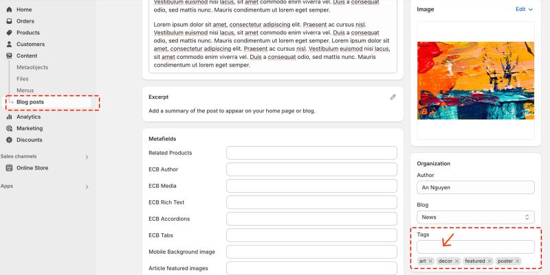
- In this example, we include a 'featured' tag because we only want to display articles that are marked with that tag.

- Limit Items: set to 1 to show only 1 featured article (increase if you want to show more articles)
- Style: Grid
- Card Style: No Card
- Card Size: No Padding
- Box Shadow: No Shadow
- Image Width: 800
- Image Height: 380
- Show Tags: disabled
- Read More button: disabled
- Item width on Desktop: 1/1
- Item width on mobile: 1/2
- Gap: medium
You can customize additional options as desired.
Step 3: Create a Section Title block with these settings:

- Title: enter your preferred heading (our example: Further Reading)
- Title size: choose your desired heading size
- Tagline: leave empty
- Description: leave empty
- Margin: No Margin
- Padding: No Padding
Step 4: Create a Divider block with these settings:

- Background Image: upload a 1x1px gray image; this small square image allows for fast loading with Background Image Repeat enabled.
- Image Height: set to 1px (adjust as needed)
- Background Image Repeat: enable Repeat.
- Margin: Small
Step 5: Create a Blog Post Grid/Slider section with these settings:

- Blog: Select the desired blog.
- Filter by Tags: Enter specific tags to display only those blog posts (separated by commas).
- NOTE: Shopify lets you add tags (keywords) when creating or editing blog posts. These tags are not visible to customers and can be used to categorize your blog content.
- Limit Items: set to 1 to show only 1 featured article (increase as needed)
- Limit Items: 3 (Feel free to increase this value if desired.)
- Style: Grid
- Card Style: No Card
- Card Size: No Padding
- Box Shadow: No Shadow
- Image Width: 0 (set to 0 to disable the blog post's featured image)
- Image Height: 0 (set to 0 to disable the blog post's featured image)
- Show Tags: disabled
- Read More button: disabled
- Item width on Desktop: 1/1
- Item width on mobile: 1/2
- Gap: Small
- Margin: Small
You can customize additional options as desired.
Add a Blog Post grid on a dark background
To display your blog posts on a dark background, follow these steps:
Step 1: Set up the Section Settings:

- Text Color: #ffffff (White)
- Background Color: #121212 (or any dark shade)
Feel free to adjust other settings as needed.
Step 2: Create a Blog Post Grid/Slider section with these settings:

- Card Style: No Card
- Card Size: No Padding
- Box Shadow: No Shadow
You can customize additional options as desired.
Add other content blocks
You can add many content blocks to a section you've created. These content blocks will be displayed in different positions within the section, depending on the Desktop/Mobile Layouts you configure.
