Block: Section Settings
What is the Section Setting for?
Easy Content Builder uses Section Settings as a special block to determine your ideal responsive layouts (1-column, 2-column, 3-column, 4-column, or hierarchical layouts) and global configurations (mask color, mask image, background video, parallax animation, etc.) within the section itself.
You can add as many sections on a page as you want. In each section, you create a Section Settings block to control the layout for that specific section.
Below are some examples of how you can use the Section Settings block for your Shopify themes:
- Set up multiple-column layouts:
- Add a full-width layout: see an example here.
- Add a background video: see an example here.
- Add a mask color: see an example here (a dark green color layer on top of the background image.)
- Add a mask image: see an example here (a subtle texture layer on top of the background image.)
- Add column/row gap: see an example here.
- Add animation on scrolling: see an example here.


Details of settings
From the Shopify theme editor, click on Section settings on the sidebar to view the details of settings.

General Configuration
| Section settings | Description |
|---|---|
| Full Width Container | Display content of this section in full screen width. |
| Set Max Width Container | Set the maximum width of the container in pixels, percentage, or rem (e.g: 980px, 90%, or 120rem). Leave blank to use the default max-width set by the theme. |
| Layout | Select a layout applied to the current app section:
|
| Main Column Width | Set the width of the first block in percentages. This setting is only applied to the layouts that have more than two columns. |
| Column Gap | Set the gap (in pixels) between the columns |
| Row Gap | Set the gap (in pixels) between the rows |
| Background Video | Click Select Video and upload the video that will be used as the background of a section. Once added, you can tab the Change button below the video to delete or change the video. |
| Background Color | Specifies the background color of the section by CSS or Gradient options. Click the color and use the Gradient color picker or enter the value of the new color in the CSS Code field. You can also create a gradient background using CSS code - for example linear-gradient(red, green), radial-gradient(red, green), or conic-gradient(red, green). |
| Background image | Set the background image of the section. Once added, you can tab the Change button below the image to delete or change the image. |
| Background image for mobile | Add an image background for mobile. This feature is available for the Pro plan only. |
| Background Image Position | Set the starting position of a background image. |
| Parallax Animate | Turn on/off Parallax scrolling - a visual effect where a page's background moves at a different speed than the foreground content. |
| Mask Color | Specifies the color overlay over the background color or the background image. Click the color and use the color picker or enter the value of the new color in the text field. |
| Mask Image | Using the image as a mask layer. Must be a PNG image. You can download mask images here. |
| Mask Opacity | Set the opacity/transparency of the mask. |
| Container Background color | Set the color of Containers - a fundamental building block - that are used to contain, pad, and align your content within a given device or viewport. |
| Container Border Radius | Set the rounded corners (in pixels) to the background container. This option is available for the Pro plan. |
| Text Color | Set the color of the text inside the section. |
| Padding Top | Set the padding top (in px) of the section |
| Padding Bottom | Set the padding bottom (in px) of the section |
| Container Padding top | Set the padding top (in px) of the container |
| Container Padding bottom | Set the padding top (in px) of the container |


Add content blocks
Now you can add many content blocks to the section you've created. These content blocks will be displayed in different positions within the section, depending on the Desktop/Mobile Layouts you configure.

Customization FAQs
Set up multiple-column layouts
- Learn how to set up multi-column layouts:
- 1-col boxed layout
- 1-col with Background Image
- 2-col with Flexible Col Width
- 2-col with Blank Sections
- Hierarchical Grids (6 layout options)
- We suggest you install the Theme Section Kit to customize your Shopify theme faster. This template contains prebuilt sections (Free and Pro versions) that you can edit, reorder, or hide through your Theme Editor. Preview the Theme Section Kit here.
Set the Text color
Learn how to set the Text color here.
Set the Background color
Learn how to set the background color (applied to the whole section) here.
Set the Container Background color
Learn how to set the Container Background color (applied to the background of the content area instead of the full-width background) here.
Adjust the padding/margin of each section
- Learn how to adjust the padding/margin of each section here
Adjust the font size, rounded corners, background color
- Learn how to adjust the font size, rounded corners (border-radius), background color here
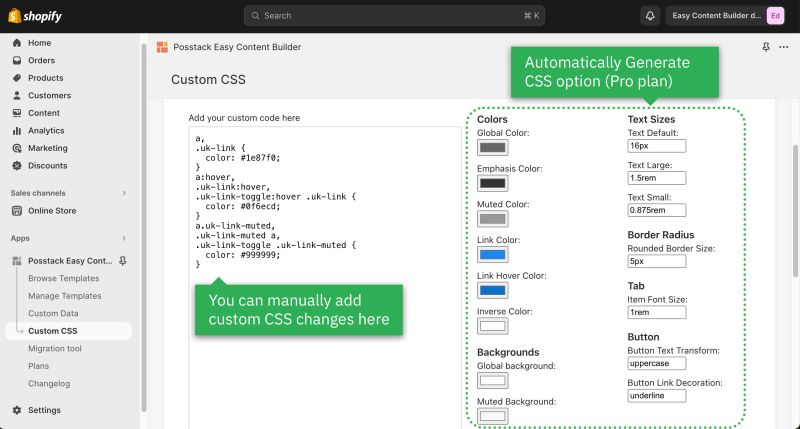
Custom CSS
- Learn how to customize your Shopify themes (change your font size, button, background, border radius, etc.) with Custom CSS using Easy Content Builder: 5-min video tutorial.
- For Pro plan: In addition to the standard Custom CSS feature, you have an Automatically Generate CSS option - a handy way to customize your theme without coding. Learn more.

How to enable parallax scrolling
Parallax effects involve a page's background moving at a different speed than the foreground content.

NOTE: Supposed that you already created a Section Settings (where you upload your background image) and content blocks used as the foreground content, like this screenshot:

Enable a parallax movement on scroll:

Enter the Background Y position (the vertical position for the background image). In this demo, we applied the parallax scrolling to 2 sections (one with a value of -800; one with a value of 400).
Please note you can use px, %, vw, or vh units.
How to enable animations on scrolling
Easy Content Builder lets you apply different types of animation to elements at the section level as you scroll down the page.

Steps to enable on-scroll animation:
- Add Section Settings section (where you control the global configuration of the section, such as column layout, width, background color, etc.)
- Add a section you want to display (for example, Accordion, Before & After slider, etc). Under this section configuration, navigate to Animate on scroll field and set your desired animation effect (Slide up, Fade, Slide up, Slide left, Slide right, or Scale up)
How to create a full-width section
Steps to set a section full-width:
- Add Section Settings section (where you control the global configuration of the section, such as column layout, width, background color, etc.)
- Under the Section Settings configuration, enable the Full Width Container.
Overlapping Image with text
Easy Content Builder lets you overlap a rich content column over an image. For example, you create an overlap effect with a text block in one column on the right, overlapping an image on the left so that the text is on top of the image.
You can easily specify the width (percent) and position (left/right) of the image and rich content column.
Common use cases:
- A rich text section overlaps an image
- An image overlaps an image
- A scrolling image carousel overlaps an image
- A Before & After slider overlaps an image
- A video overlaps an image
- A featured product slider overlaps an image

Here are steps to create the sample section above with overlapping text and image:
Step 1: Add Section Settings block and configure as follows:
- Container Max Width: leave it blank.
- Desktop layout: Two Col: First Block Left, Remains Right
- Main Column Width: 40 (this refers to the width of the main text block that will overlap the background image)
- Background image: upload your desired image
- Background image for mobile: upload your desired image
- Background Image Position: Right
- Note: The Background Image Position must match the Desktop Layout field.
- To show the image on the right, the text column on the left: set Background Image Position: right and set Desktop Layout: Two Col: First Block Left, Remains Right.
- To show the image on the left, the text column on the right: set Background Image Position: left and set Desktop Layout: Two Col: First Block Right, Remains Left.
- Background Image Width: 60 (this refers to the width of the image displayed below the text section)
- Padding top: leave it blank.
- Padding bottom: leave it blank.
- Container Padding top: 50px
- Container Padding top: 50px
You can adjust the configurations as you wish.
Step 2: Add Section Title section with the following configurations:
- Insert the Title, Tagline, Description, Icons as you wish.
- Background color: specify your desired color (we used #f5ead9 for the demo purposes)
- Margin: No margin
- Padding: Medium
Step 3 (Optional): Add space above and below the current section you've created.
You can add extra space above/below your overlapping image and rich content section by using one of the following options:
- Option 1: Add a new Section Settings and specify Container Padding Top and Container Padding Bottom to define your desired space (while keeping all other default configurations unchanged).
- Option 2: Add a new Custom HTML section and configure its margin.
