Block Before and After Slider: Difference between revisions
From Posstack.com Documentation
mNo edit summary |
mNo edit summary |
||
| Line 5: | Line 5: | ||
{{Note|See Before & After Slider examples [https://easy-content-builder-demo.myshopify.com/products/the-women-greenhouse-tee here], [https://easy-content-builder-demo.myshopify.com/products/sneaker here], or [https://easy-content-builder-demo.myshopify.com/products/stylish-woolen-fashion-hat here].|reminder}} | {{Note|See Before & After Slider examples [https://easy-content-builder-demo.myshopify.com/products/the-women-greenhouse-tee here], [https://easy-content-builder-demo.myshopify.com/products/sneaker here], or [https://easy-content-builder-demo.myshopify.com/products/stylish-woolen-fashion-hat here].|reminder}} | ||
=== How to add Before & After section === | |||
'''Before & After''' (previously '''''Features''''' block) helps you create separate content blocks (Each block comes with its heading, description, and icon). You can easily position the icon (left, right, center, or bottom) to pair with the wrapped text. | |||
*'''Step 1''': Add a '''Section Settings''' section that allows you to control the global settings of the '''Before & After''' section. | |||
:In this special section, you can specify multi-column layouts, activate full width, determine the section's maximum width, choose a background color, and set global margins and padding, among other options. | |||
:{{Note|Note: If you include the '''Before & After''' in the core product information, skip the step for adding '''Section Settings'''. Just add the '''Before & After'''. [[File:Ecb add section core product info.jpg|800px|frameless]]|reminder}} | |||
*'''Step 2''': Add an '''Before & After''' section and customize the settings according to your preferences. | |||
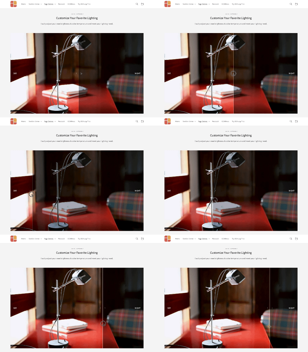
:[[File:Ecb before-after-slider.gif|frameless|518x518px]] | |||
{{Note|''If you are new to our Easy Content Builder, please take a look at the [[Add_section_settings|Add Sections]] section for detailed instructions on how to add a section to your theme.|reminder}} | {{Note|''If you are new to our Easy Content Builder, please take a look at the [[Add_section_settings|Add Sections]] section for detailed instructions on how to add a section to your theme.|reminder}} | ||
=== Before & After section settings=== | |||
{| class="wikitable" | {| class="wikitable" | ||
|+ | |+ | ||
Revision as of 03:54, 7 November 2024
Before & After slider block lets you compare two versions of an image together. Before and after images will appear with a divider which can be moved so that users can see the difference.
NOTE: This block is only available for the Pro plan. You can still add and edit this block normally in the Theme Editor; however, you need to upgrade your plan to apply them to the front end.
How to add Before & After section
Before & After (previously Features block) helps you create separate content blocks (Each block comes with its heading, description, and icon). You can easily position the icon (left, right, center, or bottom) to pair with the wrapped text.
- Step 1: Add a Section Settings section that allows you to control the global settings of the Before & After section.
- In this special section, you can specify multi-column layouts, activate full width, determine the section's maximum width, choose a background color, and set global margins and padding, among other options.
- Step 2: Add an Before & After section and customize the settings according to your preferences.
If you are new to our Easy Content Builder, please take a look at the Add Sections section for detailed instructions on how to add a section to your theme.
Before & After section settings
| Block Settings | Description |
|---|---|
| Image 1 | Upload the Before image |
| Image 1 Label | Enter the label of the Before image |
| Image 2 | Upload the After image |
| Image 2 Label | Enter the label of the After image |
| Image Width (px) | Set the width of Before & After images |
| Image Height (px) | Set the height of Before & After images |
| Image Crop | Cut out a part of the image: Top, Left, Bottom, Right, Center |
| Direction | Set the sliding direction, either horizontal or vertical |
| Slide on | Set the divider to move on mouse hover or dragging |
| Position | Adjust the start position of the divider in percentages |
| Divider Width | Set the divider bar's width (in px) |
| Divider Color | Set the color of the divider bar |
| Arrow Color | Set the color of the navigation arrow |
| Arrow Opacity | Set the opacity of the navigation arrow |
| Animate On Scroll | Apply different types of animation to elements within each section as you scroll down the page. Learn more about scrolling animations here. |
| Margin | Set the vertical spacing between elements. |
Add other content blocks
You can add many content blocks to a section you've created. These content blocks will be displayed in different positions within the section, depending on the Desktop/Mobile Layouts you configure.
See all content blocks available that you can add to a section.


