Block Featured Collections: Difference between revisions
From Posstack.com Documentation
mNo edit summary |
mNo edit summary |
||
| Line 1: | Line 1: | ||
'''Note''': Featured Collections | '''Note''': Featured Collections has been merged into Featured Products block. Please refer to the new [[Block Featured Products|Featured Products]] for more information. | ||
Featured Collections block enables you to display any specific product collections on a page. Your customers can then click the featured collection image to visit the collection page which shows a gallery of the products that are in the collection. | Featured Collections block enables you to display any specific product collections on a page. Your customers can then click the featured collection image to visit the collection page which shows a gallery of the products that are in the collection. | ||
Revision as of 14:45, 8 April 2023
Note: Featured Collections has been merged into Featured Products block. Please refer to the new Featured Products for more information.
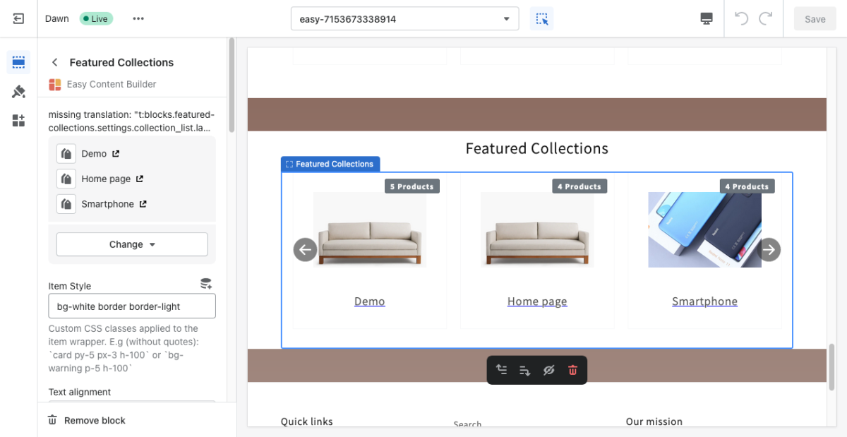
Featured Collections block enables you to display any specific product collections on a page. Your customers can then click the featured collection image to visit the collection page which shows a gallery of the products that are in the collection.
From the Shopify theme editor, click on Featured Collections on the sidebar to view the details of settings.
(If you’re new to our Easy Content Builder, please refer to section Add App Sections and Add ECB Blocks for more details on how to create and edit a section or a block.)
| Section settings | Description |
|---|---|
| Collection | Select the product collections you want to feature on the page. |
| Item Style | Custom CSS classes applied to the item wrapper. E.g (without quotation mark): `card py-5 px-3 h-100` or `bg-warning p-5 h-100` |
| Text Alignment | Align the Collection’s title to the left or center. |
| Image Width | Set the width (in pixel) of the collection’s featured image. |
| Image Height | Set the width (in pixel) of the collection’s featured image. |
| Image Crop | Cut out a part of the image: Top, Left, Bottom, Right, Center. |
| Image Border | Set the style of the image border: square, rounded, or thumbnail. |
| Items per row (Mobile) | Set the number of collections displayed per row on Mobile devices (Less than 576px). |
| Items per row (Tablet) | Set the number of collections displayed per row on Tablet devices (576px - 991px). |
| Items per row (Desktop) | Set the number of collections displayed per row on Desktop devices (992px and up). |
| Slider settings - Show Slider Arrows | Show or hide the slider arrows. |
| Slider settings - Auto Play | Change slides of products after a specified interval (in milliseconds). Enter 0 to disable. |
| Slider settings - Animation duration | Duration of the sliding animation (in milliseconds). |
| Padding Top | Set the padding top (in px) of the block. |
| Padding Bottom | Set the padding bottom (in px) of the block. |
| Margin Top | Set the margin top (in px) of the block. |
| Margin Bottom | Set the margin bottom (in px) of the block. |

