Block Circle Menu: Difference between revisions
mNo edit summary |
|||
| (19 intermediate revisions by the same user not shown) | |||
| Line 1: | Line 1: | ||
{{DISPLAYTITLE:Block: Circle Menu}} | {{DISPLAYTITLE:Block: Circle Menu}} | ||
==Overview== | |||
The Circle Menu section lets you add a circle menu, square menu, or pill menu that showcases your featured product collections anywhere in your Shopify store. It turns the collection list into a ‘bubble navigation’ that fits well on any device. | The Circle Menu section lets you add a circle menu, square menu, or pill menu that showcases your featured product collections anywhere in your Shopify store. It turns the collection list into a ‘bubble navigation’ that fits well on any device. | ||
You can create three distinct styles of Circle Menus: | |||
# Showcasing menus in a slider format | |||
# Arranging menus in a grid layout | |||
# Showcasing text-only menus, which can be either in a slider style or a horizontally scrolling format. | |||
{{Note|NOTE: This block is only available for the PRO plan. You can configure this block normally in the Theme Editor; however, you need to upgrade your plan to apply them to the front end.|inline}} | {{Note|NOTE: This block is only available for the PRO plan. You can configure this block normally in the Theme Editor; however, you need to upgrade your plan to apply them to the front end.|inline}} | ||
{{Note|By default, Easy Content Builder offers support for structured data (schema.org) to generate rich snippets for the Circle Menu section, ultimately enhancing the SEO performance of your Shopify store.|reminder}} | |||
=== What is the Circle Menu section perfect for? === | === What is the Circle Menu section perfect for? === | ||
You have various options to use the '''Circle Menu''' section for your Shopify themes: | You have various options to use the '''Circle Menu''' section for your Shopify themes: | ||
* A visual navigation that highlights your key collections - see an example [https://easy-content-builder-demo.myshopify.com/pages/section-circle-menu here]. | * A text-only circle menu (Slider option) - see an example [https://easy-content-builder-demo.myshopify.com/pages/section-circle-menu here]. [[File:Ecb-circle-menu-slider.png|frameless|800x800px]] | ||
* A text-only circle menu (Scrollable menu option) - see an example [https://easy-content-builder-demo.myshopify.com/pages/section-circle-menu here][[File:Ecb-circle-menu-linear.png|frameless|800x800px]] | |||
* A visual navigation that highlights your key collections - see an example [https://easy-content-builder-demo.myshopify.com/pages/section-circle-menu here]. | |||
[[File:Ecb-bubble-nav1.png|frameless|800x800px]] | [[File:Ecb-bubble-nav1.png|frameless|800x800px]] | ||
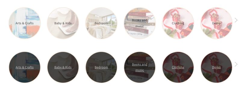
* The circle menu displays the collection names inside the image (with an overlay-opacity) | |||
[[File:Ecb circle overlay.jpg|frameless|800x800px]] | |||
* A horizontal category filter - see an example [https://easy-content-builder-demo.myshopify.com/pages/section-circle-menu here]. | * A horizontal category filter - see an example [https://easy-content-builder-demo.myshopify.com/pages/section-circle-menu here]. | ||
[[File:Ecb-bubble-nav2.png|frameless|800x800px]] | [[File:Ecb-bubble-nav2.png|frameless|800x800px]] | ||
| Line 15: | Line 27: | ||
[[File:Ecb-bubble-nav3.png|frameless|800x800px]] | [[File:Ecb-bubble-nav3.png|frameless|800x800px]] | ||
=== | ==How to add Circle Menu section== | ||
Add a ''' | === Watch video tutorial=== | ||
Be sure to watch the step-by-step video tutorials demonstrating how to utilize the sections provided in Posstack Easy Content Builder, [https://www.youtube.com/watch?v=4U084tqoNqE&list=PLZdliUBbfeeGpJ6_zH4FDyF9QvYv1Pz-2&index=3 click here to watch the video]. | |||
=== How to add Circle Menu section === | |||
*'''Step 1''': Add a '''Section Settings''' section that allows you to control the global settings of the Circle Menu section. | |||
:In this special section, you can specify multi-column layouts, activate full width, determine the section's maximum width, choose a background color, and set global margins and padding, among other options. | |||
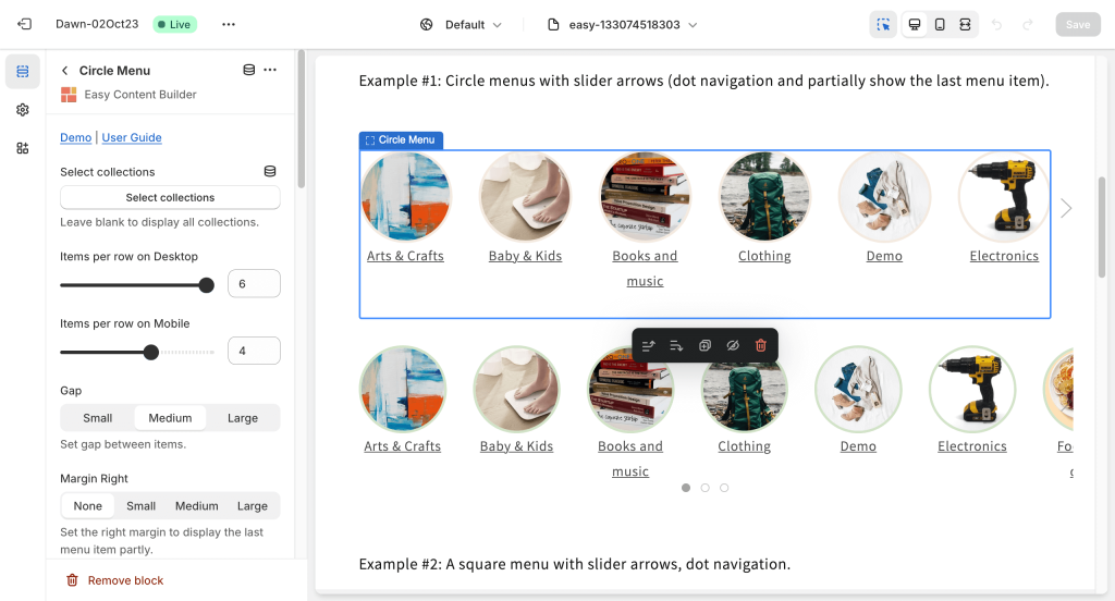
*'''Step 2''': Add a '''Circle Menu''' section and customize the settings according to your preferences. | |||
[[File:Ecb-circle-menu-config.png|frameless|1024x1024px]] | [[File:Ecb-circle-menu-config.png|frameless|1024x1024px]] | ||
{{Note|''If you are new to our Easy Content Builder, please take a look at the [[Add_section_settings|Add Sections]] section for detailed instructions on how to add a section to your theme.|reminder}} | {{Note|''If you are new to our Easy Content Builder, please take a look at the [[Add_section_settings|Add Sections]] section for detailed instructions on how to add a section to your theme.|reminder}} | ||
==Customize Circle Menu== | |||
=== Circle Menu global settings === | |||
{| class="wikitable" | {| class="wikitable" | ||
|+ | |+ | ||
| Line 29: | Line 54: | ||
|- | |- | ||
|Style | |Style | ||
|Select the grid layout or | |Select the grid layout, slider, or scrollable menu options: | ||
* '''Slider''': presents a horizontal menu displayed in a sliding format. Click the arrow to move to the next menu item. | |||
* '''Grid''': organizes the menu items in a grid layout. | |||
* '''Scroll''': offers a horizontally scrollable menu. You can swipe on mobile or scroll on desktop to navigate through the different menu items. | |||
|- | |||
|Item Style | |||
| | |||
* '''Image + Title''': Displays both the featured images of the Collection along with the Collection title as the menu item. | |||
* '''Title Only''': Only the Collection title is shown, making it ideal for a text-only menu. | |||
'''Note''': For additional information on customizing the menu item when the '''Title Only''' option is enabled, please refer to the '''Link Style''' field below. | |||
|- | |- | ||
|Items per row on Desktop | |Items per row on Desktop | ||
| Line 43: | Line 79: | ||
|Sets the right margin to partly display the last menu item. | |Sets the right margin to partly display the last menu item. | ||
|- | |- | ||
| | |Image Overlay | ||
|Adds CSS classes to change the menu text style. | |Place text on top of the image. | ||
|- | |||
|Link style | |||
|Adds CSS classes to change the menu link style. | |||
* If you enable '''Image Overlay''' and set the '''Overlay Background Color''' as '''Dark''', use this class: '''uk-light''' | |||
* If you enable '''Image Overlay''' and set the '''Overlay Background Color''' as '''Light''', use these classes: '''uk-link-text uk-text-decoration-none''' | |||
// '''Link Style''' (when the Item Style > Title Only is enabled): | |||
* '''uk-link-text''': Use this class if you want to apply the default menu style. | |||
* '''uk-button-secondary uk-text-light''': Apply these classes to create a button with a colored background and light text. | |||
* '''uk-button-secondary uk-button''': Apply these classes to create a button with a colored background and light text. | |||
* Note: If you wish to switch these classes to the primary style, use: '''uk-button-primary uk-text-light''' | |||
|- | |||
|Overlay Background Color | |||
|Set it as '''Light''' for a light opacity overlay, '''Dark''' for a darker opacity overlay, or '''None''' to disable the overlay. | |||
|- | |- | ||
|Image width (px) | |Image width (px) | ||
| Line 91: | Line 142: | ||
|} | |} | ||
===Add other content blocks | ===Circle Menu tips=== | ||
If you decide to position the Circle Menu section beneath the main header, here are a few suggestions to improve the menu: | |||
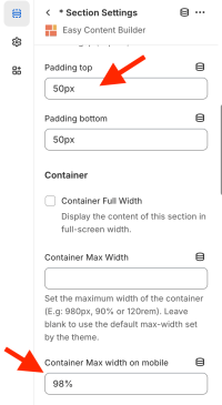
1. Consider adding more top padding above the circle menu. You can easily adjust the '''Padding top''' value in your '''Section Settings''' to achieve this. | |||
2. For mobile devices, applying a bit of left padding to the circle menu could be beneficial. Try adjusting the '''Container Max Width on Mobile''' to 98% or a value that suits your preference. | |||
[[File:Ecb-circlemenu-optimize.png|200px|frameless]] | |||
==Add other content blocks== | |||
You can add many content blocks to a section you've created. These content blocks will be displayed in different positions within the section, depending on the Desktop/Mobile Layouts you configure. | You can add many content blocks to a section you've created. These content blocks will be displayed in different positions within the section, depending on the Desktop/Mobile Layouts you configure. | ||
Latest revision as of 12:18, 22 May 2025
Overview
The Circle Menu section lets you add a circle menu, square menu, or pill menu that showcases your featured product collections anywhere in your Shopify store. It turns the collection list into a ‘bubble navigation’ that fits well on any device.
You can create three distinct styles of Circle Menus:
- Showcasing menus in a slider format
- Arranging menus in a grid layout
- Showcasing text-only menus, which can be either in a slider style or a horizontally scrolling format.
What is the Circle Menu section perfect for?
You have various options to use the Circle Menu section for your Shopify themes:
- A text-only circle menu (Slider option) - see an example here.

- A text-only circle menu (Scrollable menu option) - see an example here

- A visual navigation that highlights your key collections - see an example here.
- The circle menu displays the collection names inside the image (with an overlay-opacity)
- A horizontal category filter - see an example here.
- Showcase featured collections on your homepage or any store page - see an example here.
How to add Circle Menu section
Watch video tutorial
Be sure to watch the step-by-step video tutorials demonstrating how to utilize the sections provided in Posstack Easy Content Builder, click here to watch the video.
How to add Circle Menu section
- Step 1: Add a Section Settings section that allows you to control the global settings of the Circle Menu section.
- In this special section, you can specify multi-column layouts, activate full width, determine the section's maximum width, choose a background color, and set global margins and padding, among other options.
- Step 2: Add a Circle Menu section and customize the settings according to your preferences.
Customize Circle Menu
Circle Menu global settings
| Section settings | Description |
|---|---|
| Select Collections | Selects the product collections available in the list. Leave blank to display all categories. |
| Style | Select the grid layout, slider, or scrollable menu options:
|
| Item Style |
Note: For additional information on customizing the menu item when the Title Only option is enabled, please refer to the Link Style field below. |
| Items per row on Desktop | Sets the number of menu items displayed per row on Desktop devices (Less than 992px and up). |
| Items per row on Mobile: | Set the number of menu items displayed per row on Mobile devices (Less than 576px). |
| Gap | Sets the gap between menu items. |
| Margin Right | Sets the right margin to partly display the last menu item. |
| Image Overlay | Place text on top of the image. |
| Link style | Adds CSS classes to change the menu link style.
// Link Style (when the Item Style > Title Only is enabled):
|
| Overlay Background Color | Set it as Light for a light opacity overlay, Dark for a darker opacity overlay, or None to disable the overlay. |
| Image width (px) | Sets the menu icon's width (in pixels). |
| Image height (px) | Sets the menu icon's height (in pixels). |
| Image crop | Cuts out a part of the menu icon: Top, Left, Bottom, Right, Center. |
| Border radius | Adds rounded corners to the menu icons. You can set your menu icons with Circle, Rounded, or Pill values.
You can combine three fields - Image Width, Image Height, and Border radius - to create a wide variety of menu shapes: circle, square, rectangular, and oval. |
| Border width | Sets a width for the borders around the menu icons. |
| Border color | Sets a color for the borders around the menu icons. |
| Hover color | Adds a hoverable border color for the borders around the menu icons. |
| Active | Adds a border color for the borders around an active menu icon. |
| Show slider arrows | Shows/hides the slider arrows on the Desktop. The slider arrows are hidden on mobile by default. |
| Show navigation | Shows/hides the dot navigation. Set Mobile Only if you want to display just the dot navigation on mobile.
NOTE: If you enable the Margin Right, consider disabling the Show Navigation. |
| Slider set | Enables this option to loop through a set of slides instead of single items. |
| Container max width | Adjusts the container width (in pixels)
Animate on scroll: |
| Margin | Sets the vertical spacing between elements. |
Circle Menu tips
If you decide to position the Circle Menu section beneath the main header, here are a few suggestions to improve the menu:
1. Consider adding more top padding above the circle menu. You can easily adjust the Padding top value in your Section Settings to achieve this.
2. For mobile devices, applying a bit of left padding to the circle menu could be beneficial. Try adjusting the Container Max Width on Mobile to 98% or a value that suits your preference.
Add other content blocks
You can add many content blocks to a section you've created. These content blocks will be displayed in different positions within the section, depending on the Desktop/Mobile Layouts you configure.


