Block Icons With Text: Difference between revisions
| (164 intermediate revisions by 2 users not shown) | |||
| Line 1: | Line 1: | ||
{{DISPLAYTITLE:Block: Icons With Text}} | |||
[[File: | {{Note|Easy Content Builder offers 4 sections for managing images: | ||
*[[Block_Image|Image Section]]: Ideal for showcasing a single image. | |||
*[[Block_Image_With_Text|Images With Text]]: Great for presenting images alongside headings, descriptions, and CTA buttons, with the option to customize the ratio of image to text. | |||
*[[Block_Gallery|Gallery]]: Perfect for creating a grid of photos and videos. Clicking on an image or video opens a lightbox popup to display related content. | |||
*Icons With Text (the current page you are viewing): Designed for displaying a slider or grid of images, icons, and text. This section can be used for showcasing Trust Badges, a scrolling announcement bar, logo lists, testimonials, or any text columns with icons.|reminder}} | |||
== Overview == | |||
'''Icons With Text''' helps you create separate content blocks (Each block comes with its heading, description, and icon). You can easily position the icon (left, right, center, or bottom) to pair with the wrapped text. | |||
=== What is the Icons With Text section perfect for? === | |||
You have various options to use the '''Icons With Text''' section for your Shopify themes: | |||
* Trust badges: See an example [https://easy-content-builder-demo.myshopify.com/products/razor here]. | |||
:[[File:Ecb-icon-text-demo8.png|border|frameless|400x400px]] | |||
* Payment icons: See an example [https://easy-content-builder-demo.myshopify.com/products/shopify-bundles here]. | |||
:[[File:Ecb-icon-text-demo1.png|border|frameless|400x400px]] | |||
* Shipping info: See an example [https://easy-content-builder-demo.myshopify.com/products/reading-desk-lamp here]. | |||
:[[File:Ecb-icon-text-demo7.png|border|frameless|400x400px]] | |||
* Feature highlights: See an example [https://easy-content-builder-demo.myshopify.com/products/vitamin-d-boost here]. | |||
:[[File:Ecb-icon-text-demo2.png|border|frameless|800x800px]] | |||
* Testimonial slider: See an example [https://easy-content-builder-demo.myshopify.com/products/razor here]. | |||
:[[File:Ecb-icon-text-demo4.png|border|frameless|800x800px]] | |||
* Logo Listing: See an example [https://easy-content-builder-demo.myshopify.com/pages/gym-supplements here] or scrolling logo list: | |||
:[[File:Ecb-icon-text-demo6.png|border|frameless|800x800px]] | |||
== How to add Icons With Text section == | |||
=== Watch video tutorial=== | |||
Be sure to watch the step-by-step video tutorials demonstrating how to utilize the sections provided in Posstack Easy Content Builder, [https://www.youtube.com/watch?v=23m3fbMu0Ic&list=UULF7ZIZyAESKFQKzo42MU4LQg&index=1 click here to watch the video]. | |||
=== Add Icons With Text section === | |||
*'''Step 1''': Add a '''Section Settings''' section that allows you to control the global settings of the '''Icons With Text''' section. | |||
:In this special section, you can specify multi-column layouts, activate full width, determine the section's maximum width, choose a background color, and set global margins and padding, among other options. | |||
:{{Note|Note: If you include the '''Icons With Text''' in the core product information, skip the step for adding '''Section Settings'''. Just add the '''Icons With Text'''. [[File:Ecb add section core product info.jpg|800px|frameless]]|reminder}} | |||
*'''Step 2''': Add an '''Icons With Text''' section and customize the settings according to your preferences. | |||
{{Note|''If you are new to our Easy Content Builder, please take a look at the [[Add_section_settings|Add Sections]] section for detailed instructions on how to add a section to your theme.|inline}} | |||
== Customize Icons With Text == | |||
=== Global settings === | |||
From the Shopify theme editor, click on '''Icons With Text''' on the sidebar to view the details of settings. | |||
[[File:Iwt-config-new.jpg|800px|frameless]] | |||
{| class="wikitable" | {| class="wikitable" | ||
!Section settings | !Section settings | ||
| Line 16: | Line 55: | ||
|Text Alignment | |Text Alignment | ||
|Align all content elements to the left, right, or center. | |Align all content elements to the left, right, or center. | ||
If "Inherit" is enabled, the text alignment will follow the page's configuration. This is helpful for RTL (right-to-left) pages, as it automatically adjusts the direction of text and icons in Icons With Text from left-to-right (LTR) to right-to-left when languages such as Arabic, Persian, or Hebrew are changed. | |||
|- | |- | ||
|Item | |Item Margin | ||
| | |Adjust the bottom spacing between items. You can choose from No Margin, Small, Medium, or Large options. | ||
|- | |- | ||
| | |CSS classes | ||
|Set the | |'''NOTE''': You can enter multiple classes in the CSS Class field, separating them with spaces. | ||
{{Note|See more examples of how to add multiple classes to create an Icon With Text section [[Block_Icons_With_Text#Set_the_Heading_and_body_text_font_size/weight|here]]|reminder}} | |||
'''<u>// Define Icon Width & Height</u>''' | |||
*Set the icon width: '''image-width-100''' (replace 100 with the desired value). | |||
*Set the icon height: '''image-height-100''' (replace 100 with the desired value). | |||
: | |||
:'''EXAMPLE''' '''- Icons With Text''' (See [https://easy-content-builder-demo.myshopify.com/products/bundle-4 live demo]):[[File:Iwt-class-eg-dimension.jpg|frameless|800x800px]] | |||
'''<u>// Add a style to cards:</u>''' | |||
* '''uk-card-primary''': creates a styled box with a primary color | |||
* '''uk-background-muted''': Applies a muted background color. | |||
* '''uk-border-rounded''': applies rounded corners. | |||
* '''uk-box-shadow-small''' applies a small box shadow. | |||
* '''uk-padding-small''' Adds small padding to the element. | |||
* '''uk-padding-remove-vertical''' Removes top and bottom padding from an element (This class is handy to keep items compact in the Product Information section of Shopify Product page) | |||
* '''uk-height-1-1''' applies a height of 100%. | |||
* '''uk-grid-small''' Add this class to apply a small gap. | |||
* '''uk-grid-medium''' This refers to default value which applies a medium gap | |||
* '''uk-grid-large''' Add this class to apply a large gap | |||
* '''uk-grid-collapse''' Add this class to remove the grid-gap entirely. | |||
: | |||
:'''EXAMPLE''' '''- Card Style''' (See [https://easy-content-builder-demo.myshopify.com/products/pizza-ovens live demo]):[[File:Iwt-class-eg-card-style.jpg|frameless|800x800px]] | |||
'''<u>// Adjust Vertical Alignment</u>''' | |||
* Use the '''image-middle''' class for middle alignment when positioning the icon on the left. This ensures proper vertical alignment between the icon and text blocks. | |||
'''<u>// Enable Icons With Text Slider</u>''' | |||
*Convert items into sliders: '''slider'''. Show the slider with navigation arrows: '''slider-nav'''. | |||
'''<u>// Adjust Title and Body text size and color</u>''' | |||
* Set the Heading and body text font-weight: learn more [[Block Icons With Text#Set the Heading font-weight|here]]. | |||
* Apply a different color to the text element: learn more [[Block Icons With Text#Apply a different color to text element|here]]. | |||
'''<u>// Use Metaobjects</u>''' | |||
* Use metaobjects as a dynamic source: '''dynamic-source''' (Learn step-by-step guide [[Block Icons With Text#How to create an Icons With Text metaobject|here]]) | |||
'''<u>// Collapsible Text Columns with Icons</u>''' | |||
* '''toggle''': use this class to create Collapsible Text Columns with Icons that function similarly to an Accordion section. | |||
: | |||
:'''EXAMPLE - Collapsible Icons With Text''' (See [https://easy-content-builder-demo.myshopify.com/products/bundle-4 live demo]):[[File:Iwt-class-eg-toggle.jpg|frameless|800x800px]] | |||
'''<u>// Enable Auto-scrolling:</u>''' | |||
To enable auto-scrolling (Perfect for Logo slider, scrolling announcement text, Testimonial slider, etc.), add the CSS classes below: | |||
*'''scrolling''': scrolling from right to left. | |||
*'''scrolling-r''': scrolling from left to right. | |||
*'''duration-10''': Specify the animation's duration (in seconds), which should complete one cycle. Replace '10' with your desired value. | |||
*'''nowrap''': to show text in one row (helpful for the Scrolling Announcement bar) | |||
*'''overflow-hidden''': the scrolling items will be shown within the block's container. | |||
*'''max-width-200''': Set item max width (replace 200 with your desired width). | |||
:'''<u>NOTE</u>''': If you do not set '''max-width-value''', each image's maximum width is 280px. To set the image bigger than 280px, you must specify both '''image-width-value''' and '''max-width-value''' (input the '''value''' as you wish. Make sure the value of '''image-width-value''' is always smaller than that of '''max-width-value'''. | |||
:'''EXAMPLE''' '''- Autoscrolling Text Bar''' (See [https://easy-content-builder-demo.myshopify.com/pages/homepage-flowers live demo]) | |||
:{{Note|To display a long text in one line, use '''nowrap max-width-500''' (replace 500 with a value greater than your text length).|inline}} | |||
:[[File:Iwt-class-eg-scrolling-textbar.jpg|frameless|800x800px]]'''EXAMPLE''' '''- Autoscrolling Image Carousel''' (See [https://easy-content-builder-demo.myshopify.com/products/travel-tumbler Live Demo]): | |||
:[[File:Iwt-class-eg-scrolling-img.jpg|frameless|800x800px]] | |||
'''<u>// Enable Instagram Feed, Tiktok/Youtube Slider:</u>''' | |||
* '''dynamic-source modal image-width-400 slider slider-nav''': show a regular Instagram/Tiktok/Youtube video slider (like [https://easy-content-builder-demo.myshopify.com/pages/section-instagram-feed-tiktok-youtube-slider this example]). | |||
* '''dynamic-source modal image-width-400 scrolling duration-100''': show an auto-scrolling instagram feed or Tiktok/Youtube video slider. | |||
'''<u>INFO</u>''': Currently, the metaobjects used as a dynamic source can be used on 3 page types: product page, store page, and blog post page. | |||
'''<u>NOTE</u>''': The Slider, Auto-scrolling, and Metaobject features are only available for the PRO plan. To add multiple classes, <u>enter the classes with space between them</u>. | |||
|- | |- | ||
| | |Items per row on Mobile | ||
|Set the number of featured content blocks displayed per row on | |Set the number of featured content blocks displayed per row on Mobile devices. | ||
|- | |- | ||
|Desktop | |Items per row on Desktop | ||
|Set the number of featured content blocks displayed per row on Desktop devices | |Set the number of featured content blocks displayed per row on Desktop devices. [[File:Icons-w-text-1col.jpg|frameless|600x600px]][[File:Icons-w-text-width.jpg|frameless|600x600px]] | ||
|- | |- | ||
|Animate On Scroll | |Animate On Scroll | ||
| Line 36: | Line 149: | ||
|- | |- | ||
|Icon | |Icon | ||
| | |Upload the SVG Icon, Icon Font, or Image | ||
|- | |- | ||
|Body | |Body | ||
|Add and style (bold, italic, add link) the text content that appears on each block. | | Add and style (bold, italic, add link) the text content that appears on each block. | ||
|} | |} | ||
=== | ===Set the Heading and body text font size/weight=== | ||
To adjust the title font size, use one of these classes: | |||
*heading-h1 | |||
*heading-h2 | |||
*heading-h3 | |||
*heading-h4 | |||
*heading-h5 | |||
*heading-h6 | |||
*heading-small | |||
*heading-medium | |||
*heading-large | |||
*heading-xlarge | |||
*heading-2xlarge | |||
*heading-3xlarge | |||
* '''uk-title-bold''': set the Heading's weight to bold (See the [https://easy-content-builder-demo.myshopify.com/products/monstera-deliciosa Icons with text demo] with bold title) | {{note| NOTE: '''Heading-small''' and '''heading-3xlarge''' refers to larger heading sizes in comparison to standard headings (H1 to H6). These additional sizes are useful for highlighting essential branding messages on your page while maintaining standard headings for SEO purposes.|inline}} | ||
To adjust the body text font size, use one of these classes: | |||
*body-fs1 | |||
*body-fs2 | |||
*body-fs3 | |||
*body-fs4 | |||
*body-fs5 | |||
*body-fs6 | |||
To adjust the weight of the title or body text to bold when needed, add one of the classes below: | |||
*'''uk-title-bold''': set the Heading's weight to bold (See the [https://easy-content-builder-demo.myshopify.com/products/monstera-deliciosa Icons with text demo] with bold title) | |||
* '''uk-text-bold''': set the weight of both the Heading and body text to bold | * '''uk-text-bold''': set the weight of both the Heading and body text to bold | ||
[[File: | {{Note|'''EXAMPLE 1''': | ||
Here’s an example of how to add multiple classes to create an Icon With Text section. Here, `image-width-40` and `image-height-40` specify the icon dimensions, `uk-title-bold` makes the heading bold, `heading-h2` sets the heading size to H2, and `body-fs4` adjusts the paragraph text size. | |||
[[File:Iwt-class-example-1.jpg|800px|frameless]] | |||
'''EXAMPLE 2''': | |||
How to use an Icon With Text section next to Add to Cart button. Here, `image-width-26` and `image-height-26` specify the icon dimensions, `heading-h3` sets the heading size to H3, `uk-title-bold` makes the heading bold, `uk-text-muted` gives the paragraph text a muted appearance. | |||
[[File:Iwt-class-example-2.jpg|800px|frameless]] | |||
|reminder}} | |||
=== Apply a different color to text element === | ===Apply a different color to text element=== | ||
You can also use one of these classes to apply a different color to text elements. | You can also use one of these classes to apply a different color to text elements. | ||
* '''uk-text-muted''': <span style="color:#999">Add this class to mute text.</span> | *'''uk-text-muted''': <span style="color:#999">Add this class to mute text.</span> | ||
* '''uk-text-emphasis''': <span style="color:#222">Add this class to emphasize text.</span> | *'''uk-text-emphasis''': <span style="color:#222">Add this class to emphasize text.</span> | ||
* '''uk-text-primary''': <span style="color:#1e87f0">Add this class to emphasize text with the primary color.</span> | *'''uk-text-primary''': <span style="color:#1e87f0">Add this class to emphasize text with the primary color.</span> | ||
* '''uk-text-secondary''': <span style="color:#222">Add this class to emphasize text with the secondary color.</span> | *'''uk-text-secondary''': <span style="color:#222">Add this class to emphasize text with the secondary color.</span> | ||
* '''uk-text-success''': <span style="color:#32d296">Add this class to indicate success.</span> | *'''uk-text-success''': <span style="color:#32d296">Add this class to indicate success.</span> | ||
* '''uk-text-warning''': <span style="color:#faa05a">Add this class to indicate a warning.</span> | *'''uk-text-warning''': <span style="color:#faa05a">Add this class to indicate a warning.</span> | ||
* '''uk-text-danger''': <span style="color:#f0506e">Add this class to indicate danger.</span> | *'''uk-text-danger''': <span style="color:#f0506e">Add this class to indicate danger.</span> | ||
{{Note|'''Note''': You can add multiple classes, just type the classes with space between them. [[File:Ecb guide icons text classes.jpg|border|frameless|1024x1024px]]|inline}} | |||
{{Note|'''Note''' | {{Note|'''Extra Note''' Besides the default classes, you can directly change the '''Primary''', '''Secondary''', '''Success''', and other colors for your entire site via '''Easy Content Builder''' > '''Customizations''' > '''Generate Custom CSS'''. Find the step-by-step guide [[Custom_CSS#Adjust_the_button_style,_font_size,_border_radius,_background_color|here]].|reminder}} | ||
===Create layout boxes with different card styles=== | |||
You can add a specific card style to the Icons with text block by using these additional classes: | |||
=== | '''uk-card-primary uk-height-1-1 uk-padding''' | ||
{{Note|See the card style demo: [https://easy-content-builder-demo.myshopify.com/pages/page-1 here]|reminder}} | |||
By default, you can apply three styles to cards: | |||
*'''uk-card-default''': create a visually styled box. | |||
*'''uk-card-primary''': emphasize the card with a primary color. | |||
*'''uk-card-secondary''': give the card a secondary background color. | |||
[[File:Ecb guide icons text cardstyle.jpg|border|frameless|1024x1024px]] | |||
== Use cases == | |||
===Collapsible Text Columns with Icons.=== | |||
[[File:Iwt collapsible.jpg|frameless|800x800px]]{{Note|NOTE: This feature is only available for the PRO plan.|inline}} | |||
How to create a collapsible Text Columns with Icons: | |||
* '''Step 1''': Create a '''Section Settings''' to control the global settings of the slider (where you specify this section’s column layout, width, background color, etc.) | |||
*'''Step 2''': Create an '''Icons With Text''' section. | |||
*'''Step 3''': Enter 'toggle' class to enable collapsible Text Columns with Icons. Then add 'image-width-24' class (change the width value '24' as you wish) to set the width of your icons. | |||
*'''Step 4''': Set your desired Items per row on Desktop/Mobile. | |||
*'''Step 5''': Open the Icons With Text configuration and insert the title/body text/icon (SVG, Icon font, or Image) depending on which content type you want to display. | |||
===Scrolling announcement bar and infinite logo/image carousel.=== | |||
[[File:Ecb scrolling vid.gif|frameless|750x750px]]{{Note|NOTE: This feature is only available for the PRO plan.|inline}} | |||
How to create a scrolling logo list/text bar/image carousel: | |||
* '''Step 1''': Create a '''Section Settings''' to control the global settings of the slider (where you specify this section’s column layout, width, background color, etc.) | |||
*'''Step 2''': Create an '''Icons With Text''' section. | |||
* '''Step 3''': Open the Icons With Text configuration and insert the title/body text/icon (SVG, Icon font, or Image) depending on which content type you want to display. | |||
*'''Step 4''': enter these additional classes into the '''CSS Classes''' field depending on the scrolling style you want: | |||
:{{Note|Note: You can add multiple classes, type the classes with space between them.|inline}} | |||
:*'''scrolling''': scrolling from right to left. | |||
:*'''scrolling-r''': scrolling from left to right. | |||
:*'''duration-10''': Specify duration (in second) that the animation should complete one cycle. Replace '10' with your desired value. | |||
:* '''nowrap''': showing text messages in one row (helpful for Scrolling important messages) | |||
:*'''overflow-hidden''': scrolling items will be shown within the block's container. | |||
:*'''max-width-200''': Set the items’ maximum width (replace 200 with your desired width). | |||
:{{Note|NOTE: If you do not set max-width-value, each image's maximum width is '''280px''' by default. To show images bigger than 280px, you must specify both the '''image-width-value''' and '''max-width-value''' (input the value as you wish. Make sure '''image-width-value''' ≤ '''max-width-value'''.)|reminder}} | |||
Below are a few examples of logo/text/image carousels we created for demo purposes: | |||
:'''Scrolling announcement bar (full-width):''' | |||
:[[File:Ecb-guide-scrolling-text.jpg|border|frameless|1024x1024px]]'''Scrolling announcement bar (shown within a column container):''' | |||
:[[File:Ecb-guide-scrolling-text-overflow-hidden.jpg|frameless|1024x1024px]] | |||
: '''Scrolling logo list:''' | |||
:[[File:Ecb-guide-scrolling-logos.jpg|border|frameless|1024x1024px]] | |||
:'''Infinite image carousel:''' | |||
:[[File:Ecb-guide-scrolling-images.jpg|border|frameless|1024x1024px]] | |||
{{Note| | ===Testimonial Carousel=== | ||
{{Note|''NOTE: This feature is only available for PRO plan.''|inline}} | |||
You can use Icons With Text block to create a Testimonial carousel by entering these additional classes into the '''Item Style''' field: | |||
*'''slider''': to enable the carousel | |||
*'''slider-nav''': to enable the arrow navigation | |||
{{Note|Note: You can add multiple classes, just type the classes with space between them.|inline}} | |||
{{Note|See the Testimonial carousel demo [https://easy-content-builder-demo.myshopify.com/products/razor here].|reminder}} | |||
* Step 1: Create a Section Settings to control the global settings of the carousel (The whole block width, background color, etc.) | <u>'''How to create a Testimonial:'''</u> | ||
* Step 2: | |||
* Step 3: | *'''Step 1''': Create a '''Section Settings''' to control the global settings of the carousel (The whole block width, background color, etc.) | ||
*'''Step 2''': Create an '''Icons With Text''' section. | |||
*'''Step 3''': Open the Icons With Text configuration and insert the title, Icon (SVG, Icon font, or Image), and body text as you wish. | |||
'''Note''': You can define the number of Testimonial items per row from 1 up to 6 items (using the Mobile & Desktop configuration). | '''Note''': You can define the number of Testimonial items per row from 1 up to 6 items (using the Mobile & Desktop configuration). | ||
| Line 97: | Line 288: | ||
[[File:Add testimonial slider.jpg|border|frameless|1024x1024px]] | [[File:Add testimonial slider.jpg|border|frameless|1024x1024px]] | ||
=== | ===How to add SVG icons to Icons With Text === | ||
=====Upload SVG icons===== | |||
{{Note|AUG 2023 - IMPORTANT NOTE: | |||
Shopify now allows uploading SVG files. For those who used SVG inline (under the Icons With Text block), which is now deprecated, you are required to re-upload those SVG icons to be compatible with the new change in Shopify. Then update your icons' width by following [[Block_Icons_With_Text#Set_the_icon_width|this guide]].|inline}} | |||
=====Set the icon width ===== | |||
To adjust the icon's width, simply enter the extra class into the ''CSS classes'' field: '''image-width-100''' (replace '''100''' with the desired value). | |||
=====Change the SVG icon color===== | |||
Here are steps to adjust the SVG icon's color: | |||
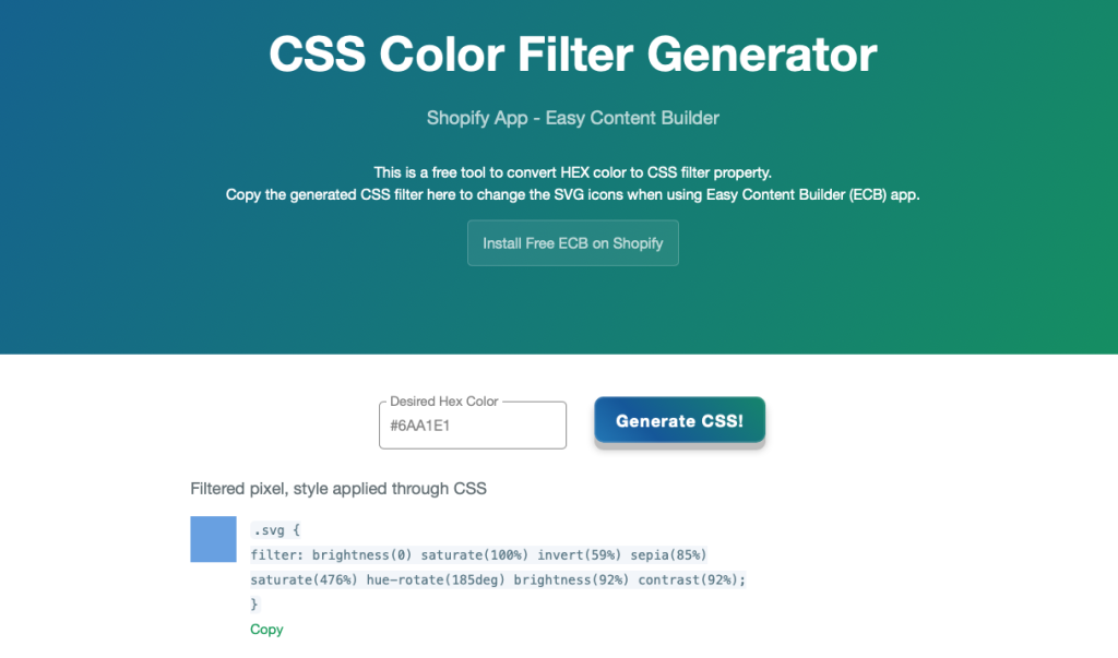
*'''Step 1''': Convert your '''HEX color''' to CSS filter property. | |||
:Simply use [https://posstack.com/css-color-filter-generator/ this free tool], enter your HEX color format (e.g. #121212) to convert to CSS filter property. Then, copy the generated CSS filter result. | |||
:[[File:CSS-color-filter-convert.png|border|frameless|1024x1024px]] | |||
*'''Step 2''': Navigate back to your Theme Editor > click on the '''App''' section containing the '''Icons With Text''' block where you want to change the SVG icons' color. | |||
* '''Step 3''': Paste the generated CSS filter property into the '''Custom CSS''' field. And hit Save. | |||
:[[File:CSS-color-filter-generator.jpg|border|frameless|1024x1024px]] | |||
===How to create an Icons With Text metaobject === | |||
{{Note|Note: Connecting metaobjects to your Online Store through dynamic sources is available for the Pro version only. [https://apps.shopify.com/easy-content-builder Go Pro]. |inline}} | |||
{{Note|'''When to use the Icons with Text metaobject''': | |||
* Showcasing a slider or grid of text columns with icons (more than 6 items) | |||
* Featuring an auto-scrolling [https://easy-content-builder-demo.myshopify.com/pages/section-video Instagram Feed/TikTok & YouTube slider] (links open in a modal)|reminder}} | |||
'''Step-by-step guide''': | |||
The following guidelines explain how to create an Icons with Text grid, which can also be applied to set up an Instagram/TikTok or YouTube slider. | |||
'''Video Tutorial''': | |||
Watch this [https://www.youtube.com/watch?v=9B08nQeX11g video tutorial] to discover how to add video sliders from YouTube, TikTok, Instagram, or Vimeo to your Shopify product page using Icons With Text metaobjects. | |||
[[File:Ecb youtube video slider iwt.jpg|800px|frameless]] | |||
======Step 1: Update Staff permissions====== | |||
If your store has multiple staff members, make sure you assign the right permission for staff to work on the metaobjects. | |||
:[[File:Staff-permission.jpg|frameless|1024x1024px]] | |||
:Otherwise, your staff can not add entries when working with the metaobjects. | |||
: [[File:Permission notice.png|frameless|785x785px]] | |||
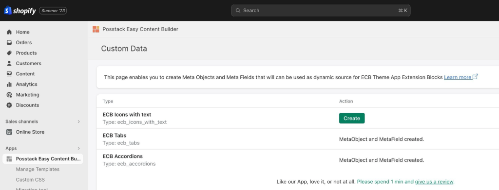
======Step 2: Create Metaobjects====== | |||
*From your Shopify admin, navigate to Apps > Posstack Easy Content Builder > '''Custom Data'''. | |||
*Click on '''Create''' next to the desired content type (Icons With Text, Tabs, Accordions). Once created, you should see the message ''Metaobject and Metafield created'': | |||
: [[File:Metaobject created.png|frameless|1024x1024px]] | |||
:{{Note|To create an Instagram Feed/ Tiktok & Youtube Slider like [https://easy-content-builder-demo.myshopify.com/pages/section-instagram-feed-tiktok-youtube-slider this example], you simply create '''Icons With Text''' metaobject in this step. |reminder}} | |||
* And all metafields associated with the above-mentioned metaobjects are automatically created too. You can check those metafields by following these steps: | |||
**In your Shopify admin, click Settings > '''Custom data''' | |||
**You should see 3 metafields Products, Pages, Blog Posts: | |||
:[[File:Metafields created.jpg|frameless|1024x1024px]] | |||
**Click on each metafield Products, Pages, or Blog Posts to see the metafield definitions: | |||
:[[File:Metafield definitions.png|frameless|871x871px]] | |||
''' | ======Step 3: Create entries for the Metaobjects====== | ||
* From your Shopify admin, select the part of your store that you want to add a metaobject to. For example, '''Products''' (Easy Content Builder now supports metaobjects for Products, Pages, Blog Posts). | |||
*Click the name of a product you want to edit. | |||
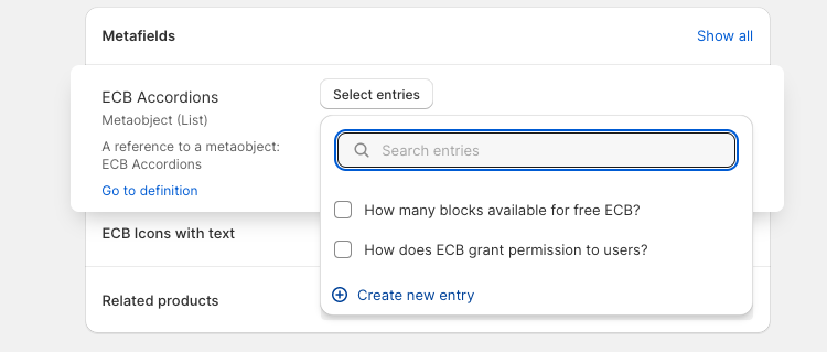
*In the '''Metafields''' section, click on the form field to add an entry (ECB Accordions, ECB Tabs, or ECB Icons With Text depending on which metaobjects you created in '''Step 2''') | |||
:[[File:Add-entries.jpg|frameless|645x645px]] | |||
*Next, click '''Select Entry''' > '''Create New Entry''' and complete the fields for your entry. Once done, click '''Save'''. | |||
:[[File:Add-entries-detail.png|frameless|750x750px]] | |||
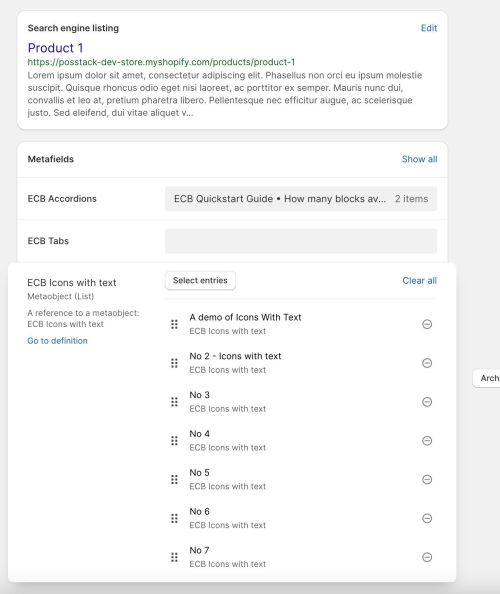
:To create other entries, you repeat the exact steps by clicking '''Select Entry''' > '''Create New Entry'''. If you have already created entries, simply click the checkboxes to determine which entries will be displayed on your storefront. Here is an example of metaobject entries we created for demo purposes: | |||
:[[File:Icon entry examples.jpg|frameless|594x594px]] | |||
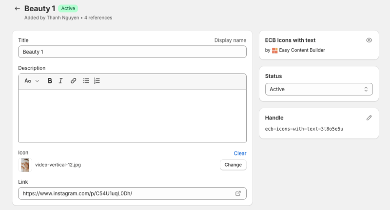
:{{Note|Here's a sample Metaobject entry that stores the Instagram video information, which will be displayed on the storefront in a format similar to the [https://easy-content-builder-demo.myshopify.com/pages/section-instagram-feed-tiktok-youtube-slider Instagram Feed/Tiktok & Youtube Slider] example.[[File:Ecb instagram entry.png|800px|frameless]] | |||
|reminder}} | |||
*Once done, click '''Save'''. | |||
====== Step 4: Connecting metaobjects to your Online Store through dynamic sources====== | |||
*From your Shopify admin, click Apps > '''Easy Content Builder''' | |||
*From the Easy Content Builder dashboard, click '''Manage Templates'''. | |||
*Then select the template that you want to edit and click '''Customize'''. | |||
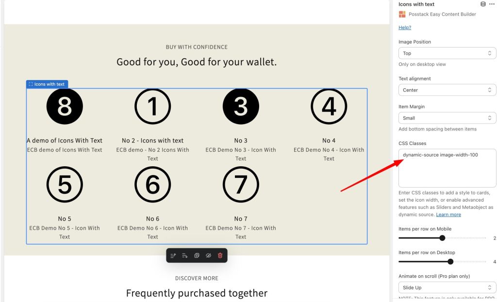
*From the Theme Editor, open the ''Icons With Text'' block where you want to edit. Then insert two classes into the CSS classes field: '''dynamic-source image-width-100''' (replace '''100''' with the desired value for your icons' width). | |||
:{{Note|When you add the class '''dynamic-source''' to Icons With Text, it will automatically link to your metaobjects (list entries type). This means you won't have to manually map each individual entry in Icons With Text. Importantly, this approach allows you to add more than 6 items, compared to manually mapping each field.|reminder}} | |||
:[[File:Dynamic source.jpg|frameless|1024x1024px]] | |||
:{{Note|To display the Instagram Feed or Tiktok video slider as shown in [https://easy-content-builder-demo.myshopify.com/pages/section-instagram-feed-tiktok-youtube-slider this example], you should input the following classes into the CSS classes field: '''dynamic-source modal image-width-400 slider slider-nav'''|reminder}} | |||
:{{Note|Or input the following classes into the CSS classes field to show an auto-scrolling instagram feed: '''dynamic-source modal image-width-400 scrolling duration-100'''|inline}} | |||
==Add other content blocks== | |||
You can add many content blocks to a section you've created. These content blocks will be displayed in different positions within the section, depending on the Desktop/Mobile Layouts you configure. | |||
[[File:Ecb-block-v2.jpg|border|frameless|800x800px]] | |||
[ | {{Note|See [https://easy-content-builder-demo.myshopify.com/pages/section-variations all content blocks] available that you can add to a section.|reminder}} | ||
Latest revision as of 04:51, 4 November 2025
- Image Section: Ideal for showcasing a single image.
- Images With Text: Great for presenting images alongside headings, descriptions, and CTA buttons, with the option to customize the ratio of image to text.
- Gallery: Perfect for creating a grid of photos and videos. Clicking on an image or video opens a lightbox popup to display related content.
- Icons With Text (the current page you are viewing): Designed for displaying a slider or grid of images, icons, and text. This section can be used for showcasing Trust Badges, a scrolling announcement bar, logo lists, testimonials, or any text columns with icons.
Overview
Icons With Text helps you create separate content blocks (Each block comes with its heading, description, and icon). You can easily position the icon (left, right, center, or bottom) to pair with the wrapped text.
What is the Icons With Text section perfect for?
You have various options to use the Icons With Text section for your Shopify themes:
- Trust badges: See an example here.
- Payment icons: See an example here.
- Shipping info: See an example here.
- Feature highlights: See an example here.
- Testimonial slider: See an example here.
- Logo Listing: See an example here or scrolling logo list:
How to add Icons With Text section
Watch video tutorial
Be sure to watch the step-by-step video tutorials demonstrating how to utilize the sections provided in Posstack Easy Content Builder, click here to watch the video.
Add Icons With Text section
- Step 1: Add a Section Settings section that allows you to control the global settings of the Icons With Text section.
- In this special section, you can specify multi-column layouts, activate full width, determine the section's maximum width, choose a background color, and set global margins and padding, among other options.
- Note: If you include the Icons With Text in the core product information, skip the step for adding Section Settings. Just add the Icons With Text.


- Step 2: Add an Icons With Text section and customize the settings according to your preferences.
Customize Icons With Text
Global settings
From the Shopify theme editor, click on Icons With Text on the sidebar to view the details of settings.

| Section settings | Description |
|---|---|
| Image Position | Set the position of the icon (left, right, center, bottom) to pair with the wrapped text. Applied to desktop view only. |
| Text Alignment | Align all content elements to the left, right, or center.
If "Inherit" is enabled, the text alignment will follow the page's configuration. This is helpful for RTL (right-to-left) pages, as it automatically adjusts the direction of text and icons in Icons With Text from left-to-right (LTR) to right-to-left when languages such as Arabic, Persian, or Hebrew are changed. |
| Item Margin | Adjust the bottom spacing between items. You can choose from No Margin, Small, Medium, or Large options. |
| CSS classes | NOTE: You can enter multiple classes in the CSS Class field, separating them with spaces.
See more examples of how to add multiple classes to create an Icon With Text section here
// Define Icon Width & Height
// Add a style to cards:
// Adjust Vertical Alignment
// Enable Icons With Text Slider
// Adjust Title and Body text size and color
// Use Metaobjects
// Collapsible Text Columns with Icons
// Enable Auto-scrolling: To enable auto-scrolling (Perfect for Logo slider, scrolling announcement text, Testimonial slider, etc.), add the CSS classes below:
// Enable Instagram Feed, Tiktok/Youtube Slider:
INFO: Currently, the metaobjects used as a dynamic source can be used on 3 page types: product page, store page, and blog post page. NOTE: The Slider, Auto-scrolling, and Metaobject features are only available for the PRO plan. To add multiple classes, enter the classes with space between them. |
| Items per row on Mobile | Set the number of featured content blocks displayed per row on Mobile devices. |
| Items per row on Desktop | Set the number of featured content blocks displayed per row on Desktop devices.  
|
| Animate On Scroll | This feature is only available for the Pro plan. It lets you apply different types of animation to elements within each section as you scroll down the page. Learn more about scrolling animations here. |
| Item Title | Enter the title of each featured content block. |
| Icon | Upload the SVG Icon, Icon Font, or Image |
| Body | Add and style (bold, italic, add link) the text content that appears on each block. |


Set the Heading and body text font size/weight
To adjust the title font size, use one of these classes:
- heading-h1
- heading-h2
- heading-h3
- heading-h4
- heading-h5
- heading-h6
- heading-small
- heading-medium
- heading-large
- heading-xlarge
- heading-2xlarge
- heading-3xlarge
To adjust the body text font size, use one of these classes:
- body-fs1
- body-fs2
- body-fs3
- body-fs4
- body-fs5
- body-fs6
To adjust the weight of the title or body text to bold when needed, add one of the classes below:
- uk-title-bold: set the Heading's weight to bold (See the Icons with text demo with bold title)
- uk-text-bold: set the weight of both the Heading and body text to bold
Here’s an example of how to add multiple classes to create an Icon With Text section. Here, `image-width-40` and `image-height-40` specify the icon dimensions, `uk-title-bold` makes the heading bold, `heading-h2` sets the heading size to H2, and `body-fs4` adjusts the paragraph text size.
 EXAMPLE 2:
How to use an Icon With Text section next to Add to Cart button. Here, `image-width-26` and `image-height-26` specify the icon dimensions, `heading-h3` sets the heading size to H3, `uk-title-bold` makes the heading bold, `uk-text-muted` gives the paragraph text a muted appearance.
EXAMPLE 2:
How to use an Icon With Text section next to Add to Cart button. Here, `image-width-26` and `image-height-26` specify the icon dimensions, `heading-h3` sets the heading size to H3, `uk-title-bold` makes the heading bold, `uk-text-muted` gives the paragraph text a muted appearance.

Apply a different color to text element
You can also use one of these classes to apply a different color to text elements.
- uk-text-muted: Add this class to mute text.
- uk-text-emphasis: Add this class to emphasize text.
- uk-text-primary: Add this class to emphasize text with the primary color.
- uk-text-secondary: Add this class to emphasize text with the secondary color.
- uk-text-success: Add this class to indicate success.
- uk-text-warning: Add this class to indicate a warning.
- uk-text-danger: Add this class to indicate danger.
Create layout boxes with different card styles
You can add a specific card style to the Icons with text block by using these additional classes:
uk-card-primary uk-height-1-1 uk-padding
By default, you can apply three styles to cards:
- uk-card-default: create a visually styled box.
- uk-card-primary: emphasize the card with a primary color.
- uk-card-secondary: give the card a secondary background color.
Use cases
Collapsible Text Columns with Icons.

How to create a collapsible Text Columns with Icons:
- Step 1: Create a Section Settings to control the global settings of the slider (where you specify this section’s column layout, width, background color, etc.)
- Step 2: Create an Icons With Text section.
- Step 3: Enter 'toggle' class to enable collapsible Text Columns with Icons. Then add 'image-width-24' class (change the width value '24' as you wish) to set the width of your icons.
- Step 4: Set your desired Items per row on Desktop/Mobile.
- Step 5: Open the Icons With Text configuration and insert the title/body text/icon (SVG, Icon font, or Image) depending on which content type you want to display.
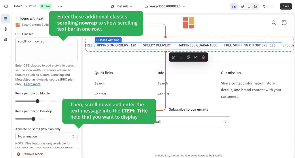
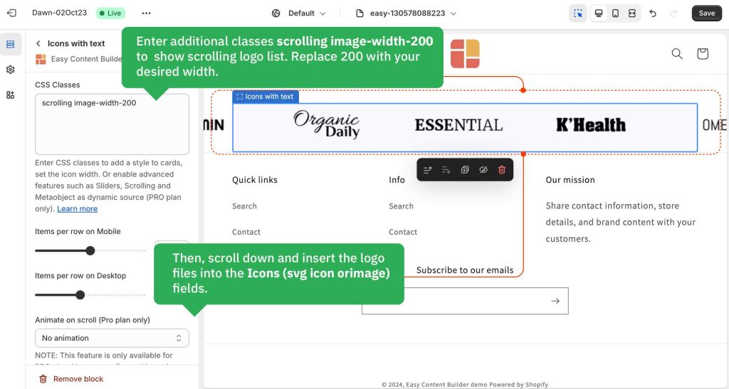
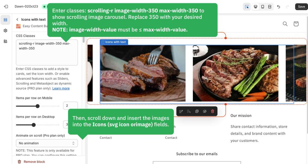
Scrolling announcement bar and infinite logo/image carousel.

How to create a scrolling logo list/text bar/image carousel:
- Step 1: Create a Section Settings to control the global settings of the slider (where you specify this section’s column layout, width, background color, etc.)
- Step 2: Create an Icons With Text section.
- Step 3: Open the Icons With Text configuration and insert the title/body text/icon (SVG, Icon font, or Image) depending on which content type you want to display.
- Step 4: enter these additional classes into the CSS Classes field depending on the scrolling style you want:
- Note: You can add multiple classes, type the classes with space between them.
- scrolling: scrolling from right to left.
- scrolling-r: scrolling from left to right.
- duration-10: Specify duration (in second) that the animation should complete one cycle. Replace '10' with your desired value.
- nowrap: showing text messages in one row (helpful for Scrolling important messages)
- overflow-hidden: scrolling items will be shown within the block's container.
- max-width-200: Set the items’ maximum width (replace 200 with your desired width).
- NOTE: If you do not set max-width-value, each image's maximum width is 280px by default. To show images bigger than 280px, you must specify both the image-width-value and max-width-value (input the value as you wish. Make sure image-width-value ≤ max-width-value.)
Below are a few examples of logo/text/image carousels we created for demo purposes:
- Scrolling announcement bar (full-width):
 Scrolling announcement bar (shown within a column container):
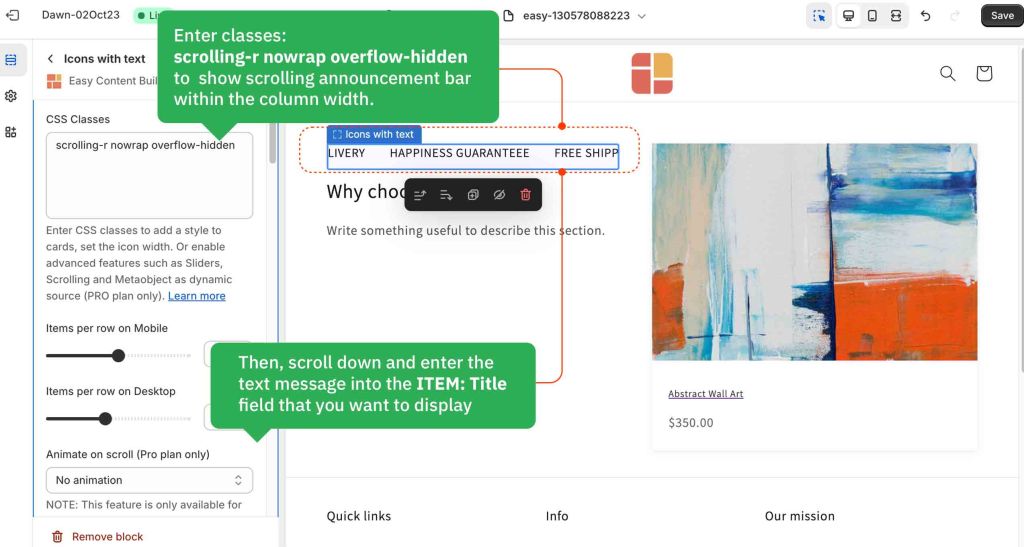
- Scrolling logo list:
- Infinite image carousel:


Testimonial Carousel
You can use Icons With Text block to create a Testimonial carousel by entering these additional classes into the Item Style field:
- slider: to enable the carousel
- slider-nav: to enable the arrow navigation
How to create a Testimonial:
- Step 1: Create a Section Settings to control the global settings of the carousel (The whole block width, background color, etc.)
- Step 2: Create an Icons With Text section.
- Step 3: Open the Icons With Text configuration and insert the title, Icon (SVG, Icon font, or Image), and body text as you wish.
Note: You can define the number of Testimonial items per row from 1 up to 6 items (using the Mobile & Desktop configuration).
Below is an example of a Testimonial carousel that displays 3 items:

How to add SVG icons to Icons With Text
Upload SVG icons
Set the icon width
To adjust the icon's width, simply enter the extra class into the CSS classes field: image-width-100 (replace 100 with the desired value).
Change the SVG icon color
Here are steps to adjust the SVG icon's color:
- Step 1: Convert your HEX color to CSS filter property.
- Simply use this free tool, enter your HEX color format (e.g. #121212) to convert to CSS filter property. Then, copy the generated CSS filter result.

- Step 2: Navigate back to your Theme Editor > click on the App section containing the Icons With Text block where you want to change the SVG icons' color.
- Step 3: Paste the generated CSS filter property into the Custom CSS field. And hit Save.

How to create an Icons With Text metaobject
- Showcasing a slider or grid of text columns with icons (more than 6 items)
- Featuring an auto-scrolling Instagram Feed/TikTok & YouTube slider (links open in a modal)
Step-by-step guide:
The following guidelines explain how to create an Icons with Text grid, which can also be applied to set up an Instagram/TikTok or YouTube slider.
Video Tutorial:
Watch this video tutorial to discover how to add video sliders from YouTube, TikTok, Instagram, or Vimeo to your Shopify product page using Icons With Text metaobjects.

Step 1: Update Staff permissions
If your store has multiple staff members, make sure you assign the right permission for staff to work on the metaobjects.

- Otherwise, your staff can not add entries when working with the metaobjects.

Step 2: Create Metaobjects
- From your Shopify admin, navigate to Apps > Posstack Easy Content Builder > Custom Data.
- Click on Create next to the desired content type (Icons With Text, Tabs, Accordions). Once created, you should see the message Metaobject and Metafield created:
- To create an Instagram Feed/ Tiktok & Youtube Slider like this example, you simply create Icons With Text metaobject in this step.

- And all metafields associated with the above-mentioned metaobjects are automatically created too. You can check those metafields by following these steps:
- In your Shopify admin, click Settings > Custom data
- You should see 3 metafields Products, Pages, Blog Posts:

- Click on each metafield Products, Pages, or Blog Posts to see the metafield definitions:

Step 3: Create entries for the Metaobjects
- From your Shopify admin, select the part of your store that you want to add a metaobject to. For example, Products (Easy Content Builder now supports metaobjects for Products, Pages, Blog Posts).
- Click the name of a product you want to edit.
- In the Metafields section, click on the form field to add an entry (ECB Accordions, ECB Tabs, or ECB Icons With Text depending on which metaobjects you created in Step 2)

- Next, click Select Entry > Create New Entry and complete the fields for your entry. Once done, click Save.
- To create other entries, you repeat the exact steps by clicking Select Entry > Create New Entry. If you have already created entries, simply click the checkboxes to determine which entries will be displayed on your storefront. Here is an example of metaobject entries we created for demo purposes:
- Here's a sample Metaobject entry that stores the Instagram video information, which will be displayed on the storefront in a format similar to the Instagram Feed/Tiktok & Youtube Slider example.


- Once done, click Save.
Step 4: Connecting metaobjects to your Online Store through dynamic sources
- From your Shopify admin, click Apps > Easy Content Builder
- From the Easy Content Builder dashboard, click Manage Templates.
- Then select the template that you want to edit and click Customize.
- From the Theme Editor, open the Icons With Text block where you want to edit. Then insert two classes into the CSS classes field: dynamic-source image-width-100 (replace 100 with the desired value for your icons' width).
- When you add the class dynamic-source to Icons With Text, it will automatically link to your metaobjects (list entries type). This means you won't have to manually map each individual entry in Icons With Text. Importantly, this approach allows you to add more than 6 items, compared to manually mapping each field.
- To display the Instagram Feed or Tiktok video slider as shown in this example, you should input the following classes into the CSS classes field: dynamic-source modal image-width-400 slider slider-nav
- Or input the following classes into the CSS classes field to show an auto-scrolling instagram feed: dynamic-source modal image-width-400 scrolling duration-100

Add other content blocks
You can add many content blocks to a section you've created. These content blocks will be displayed in different positions within the section, depending on the Desktop/Mobile Layouts you configure.
