Block Custom HTML: Difference between revisions
mNo edit summary |
|||
| (8 intermediate revisions by the same user not shown) | |||
| Line 1: | Line 1: | ||
{{DISPLAYTITLE:Block: Custom HTML}} | |||
The Custom HTML block lets you add snippets of HTML to your page. This block is helpful to embed custom content such as Google Map, Google Forms, specialized newsletter signups, or third-party widgets. | The Custom HTML block lets you add snippets of HTML to your page. This block is helpful to embed custom content such as Google Map, Google Forms, specialized newsletter signups, or third-party widgets. | ||
{{Note|See Custom HTML block example [https://easy-content-builder-demo.myshopify.com/pages/section-variations here].|inline}} | |||
=== How to add Custom HTML section === | |||
*'''Step 1''': Add a '''Section Settings''' section that allows you to control the global settings of the '''Custom HTML''' section. | |||
:In this special section, you can specify multi-column layouts, activate full width, determine the section's maximum width, choose a background color, and set global margins and padding, among other options. | |||
:{{Note|Note: If you include the '''Custom HTML''' in the core product information, skip the step for adding '''Section Settings'''. Just add the '''Custom HTML'''. [[File:Ecb add section core product info.jpg|800px|frameless]]|reminder}} | |||
*'''Step 2''': Add a '''Custom HTML''' section and customize the settings according to your preferences. | |||
:[[File:Block custom HTML.png|1200x1200px]] | |||
[[ | {{Note|''If you are new to our Easy Content Builder, please take a look at the [[Add_section_settings|Add Sections]] section for detailed instructions on how to add a section to your theme.|reminder}} | ||
=== Custom HTML global settings === | |||
From the Shopify theme editor, click on '''Custom HTML''' on the sidebar to view the details of settings. | |||
{| class="wikitable" | {| class="wikitable" | ||
!Section settings | !Section settings | ||
| Line 38: | Line 49: | ||
You can apply the same tweak to create blank space in 3-column or 4-column layouts. | You can apply the same tweak to create blank space in 3-column or 4-column layouts. | ||
==== '''Use case 2''': Use the Custom HTML block to add vertical spacing between the rows. ==== | ==== '''Use case 2''': Use the Custom HTML block to add vertical spacing between the rows/columns. ==== | ||
Besides the | Besides the primary purpose - inserting custom HTML code - you can use this block to add extra space between the existing content rows/columns within a section - you leave all configuration fields blank (no need to add any custom code) and just set the margin to adjust the spacing as you wish. | ||
Here are examples of how to use the Custom HTML block to add blank spaces: | |||
* A hero banner with two columns (left columns with text and CTA buttons, right column with a blank Custom HTML block): [[Block Image With Text#Use case 3: Hero banner with 3 CTAs buttons|view details]]. | |||
* A hero banner using a blank Custom HTML block to add extra space between the Heading vs. CTA buttons: [[Block Image With Text#Use case 6: Hero banner with extra space between Headline/subheadline vs. CTAs buttons|view details]]. | |||
===Add other content blocks=== | |||
You can add many content blocks to a section you've created. These content blocks will be displayed in different positions within the section, depending on the Desktop/Mobile Layouts you configure. | |||
[[File:Ecb-block-v2.jpg|border|frameless|800x800px]] | |||
{{Note|See [https://easy-content-builder-demo.myshopify.com/pages/section-variations all content blocks] available that you can add to a section.|reminder}} | |||
Latest revision as of 01:55, 27 March 2025
The Custom HTML block lets you add snippets of HTML to your page. This block is helpful to embed custom content such as Google Map, Google Forms, specialized newsletter signups, or third-party widgets.
How to add Custom HTML section
- Step 1: Add a Section Settings section that allows you to control the global settings of the Custom HTML section.
- In this special section, you can specify multi-column layouts, activate full width, determine the section's maximum width, choose a background color, and set global margins and padding, among other options.
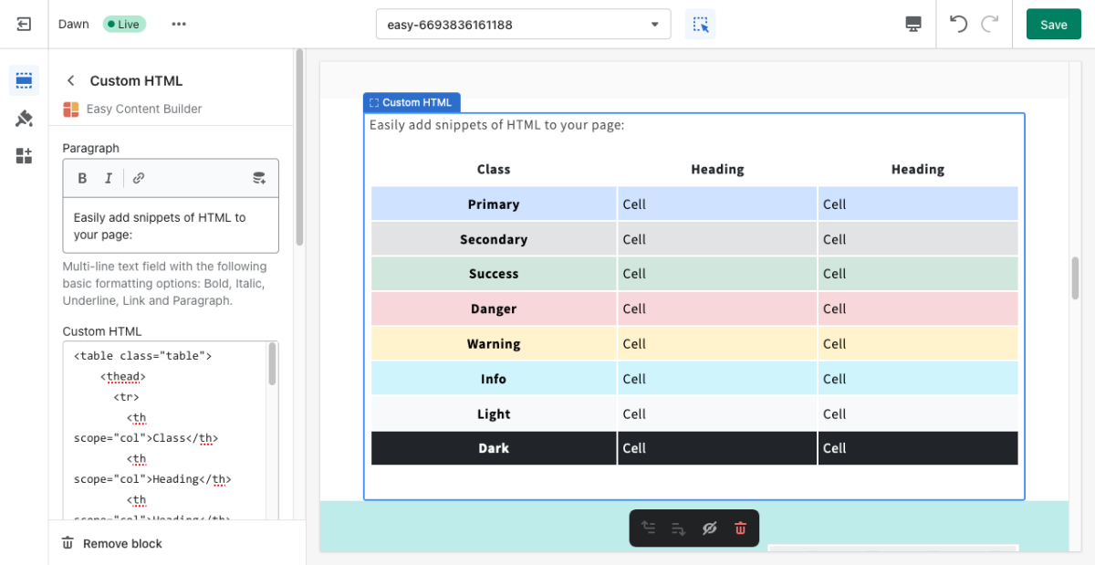
- Step 2: Add a Custom HTML section and customize the settings according to your preferences.
Custom HTML global settings
From the Shopify theme editor, click on Custom HTML on the sidebar to view the details of settings.
| Section settings | Description |
|---|---|
| Paragraph | Multi-line text field with the following basic formatting options: Bold, Italic, Underline, Link and Paragraph. |
| Custom HTML | Add your HTML-formatted code to this field. |
| Custom Liquid | Add app snippets or other Liquid code to create advanced customizations. |
| Margin | Set the vertical spacing between elements. |
Other special use cases of Custom HTML block
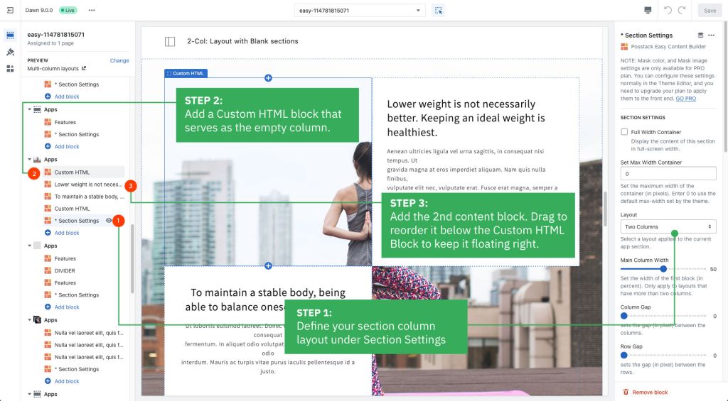
Use case 1: Create multiple-column layouts with blank sections.
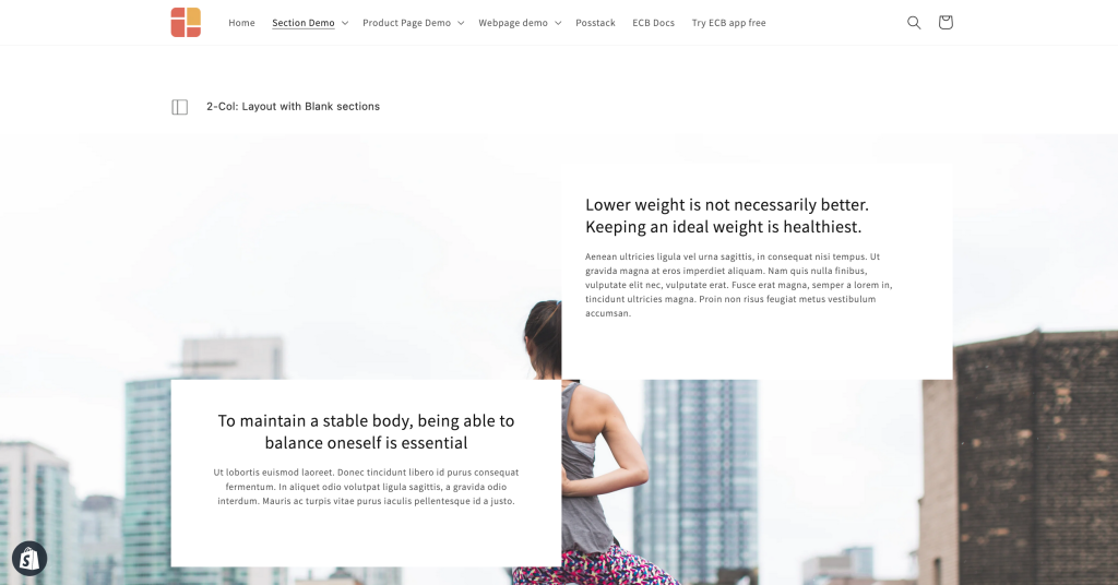
Below is a sample 2-column layout with the 1st column floating left/right and the 2nd blank column:
Simply add a Custom HTML block that serves as the empty column to achieve this layout.
You can apply the same tweak to create blank space in 3-column or 4-column layouts.
Use case 2: Use the Custom HTML block to add vertical spacing between the rows/columns.
Besides the primary purpose - inserting custom HTML code - you can use this block to add extra space between the existing content rows/columns within a section - you leave all configuration fields blank (no need to add any custom code) and just set the margin to adjust the spacing as you wish.
Here are examples of how to use the Custom HTML block to add blank spaces:
- A hero banner with two columns (left columns with text and CTA buttons, right column with a blank Custom HTML block): view details.
- A hero banner using a blank Custom HTML block to add extra space between the Heading vs. CTA buttons: view details.
Add other content blocks
You can add many content blocks to a section you've created. These content blocks will be displayed in different positions within the section, depending on the Desktop/Mobile Layouts you configure.


