Block Icons With Text: Difference between revisions
mNo edit summary |
|||
| Line 17: | Line 17: | ||
|Align all content elements to the left, right, or center. | |Align all content elements to the left, right, or center. | ||
|- | |- | ||
| | |CSS classes | ||
|Custom CSS classes | |Enter Custom CSS classes: | ||
* Add a style to cards: '''uk-card-primary uk-height-1-1 uk-padding''' | |||
* Set the image width: '''image-width-100''' (replace 100 with the desired value). | |||
* Convert items into sliders: '''slider'''. Show the slider with navigation arrows: '''slider-nav'''. | |||
* Use metaobjects (learn how to create and use metaobjects [[Create metaobjects|here]]) as a dynamic source: '''dynamic-source''' | |||
'''<u>INFO</u>''': Currently, the metaobjects used as a dynamic source can be used on 3 page types: product page, store page, and blog post page. | |||
'''<u>NOTE</u>''': The Slider and Metaobject features are only available for the PRO plan. To add multiple classes, <u>enter the classes with space between them</u>. | |||
|- | |- | ||
|Mobile | |Mobile | ||
Revision as of 04:21, 22 August 2023
General Configuration
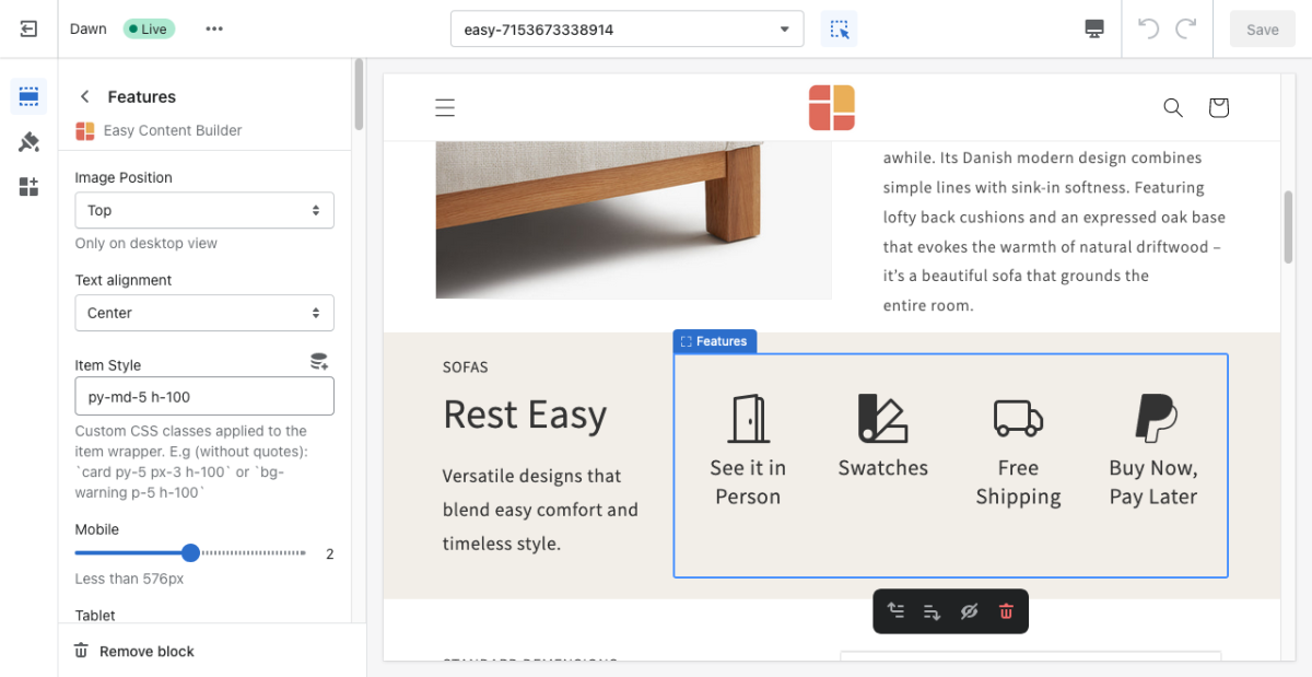
Icons With Text (previously Features block) helps you create separate content blocks (Each block comes with its heading, description, and icon). You can easily position the icon (left, right, center, or bottom) to pair with the wrapped text.
See Features block examples here, here, or here.
From the Shopify theme editor, click on Icons With Text (previously Features block) on the sidebar to view the details of settings.
| Section settings | Description |
|---|---|
| Image Position | Set the position of the icon (left, right, center, bottom) to pair with the wrapped text. Applied to desktop view only. |
| Text Alignment | Align all content elements to the left, right, or center. |
| CSS classes | Enter Custom CSS classes:
INFO: Currently, the metaobjects used as a dynamic source can be used on 3 page types: product page, store page, and blog post page. NOTE: The Slider and Metaobject features are only available for the PRO plan. To add multiple classes, enter the classes with space between them. |
| Mobile | Set the number of featured content blocks displayed per row on Mobile devices (Less than 576px). |
| Tablet | Set the number of featured content blocks displayed per row on Tablet devices (576px - 991px). |
| Desktop | Set the number of featured content blocks displayed per row on Desktop devices (992px and up). |
| Animate On Scroll | This feature is only available for the Pro plan. It lets you apply different types of animation to elements within each section as you scroll down the page. Learn more about scrolling animations here. |
| Item Title | Enter the title of each featured content block. |
| Icon | Insert HTML code of SVG, Icon Font or Image.
If you use an image, you can insert the file path as follows: <img src="//cdn.shopify.com/s/files/1/0683/5339/2927/files/ecb_v2_settings.png?v=1680505491"> (NOTE: Please replace the path ''//cdn.shopify.com..." with your image's path). |
| Body | Add and style (bold, italic, add link) the text content that appears on each block. |
How to add SVG icons to Icons With Text
NOTE: Shopify does not allow to upload SVG files at this time. It only supports JPG, PNG, GIF, and WebP on supported browsers.
With Easy Content Builder, you can add SVGs inline into Icons With Text blocks.
Set the Heading font-weight
You may want to use additional classes to set the weight of the title to bold when needed. Add one of the classes below to the field 'Item Style':
- uk-title-bold: set the Heading's weight to bold (See the Icons with text demo with bold title)
- uk-text-bold: set the weight of both the Heading and body text to bold
Apply a different color to text element
You can also use one of these classes to apply a different color to text elements.
- uk-text-muted: Add this class to mute text.
- uk-text-emphasis: Add this class to emphasize text.
- uk-text-primary: Add this class to emphasize text with the primary color.
- uk-text-secondary: Add this class to emphasize text with the secondary color.
- uk-text-success: Add this class to indicate success.
- uk-text-warning: Add this class to indicate a warning.
- uk-text-danger: Add this class to indicate danger.
Add a Testimonial Carousel
NOTE: This feature is only available for PRO plan.
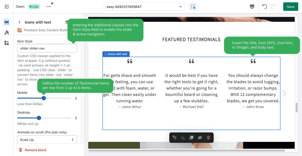
You can use Icons With Text block to create a Testimonial carousel by entering these additional classes into the Item Style field:
- slider: to enable the carousel
- slider-nav: to enable the arrow navigation
Note: You can add multiple classes, just type the classes with space between them.
How to create a Testimonial:
- Step 1: Create a Section Settings to control the global settings of the carousel (The whole block width, background color, etc.)
- Step 2: Insert the title
- Step 3: Insert the Icon (SVG, Icon font, or Image)
- Step 4: Insert the body text
Note: You can define the number of Testimonial items per row from 1 up to 6 items (using the Mobile & Desktop configuration).
Below is an example of a Testimonial carousel that displays 3 items:
Create layout boxes with different card styles
You can add a specific card style to the Icons with text block by using these additional classes:
uk-card-primary uk-height-1-1 uk-padding
By default, you can apply three styles to cards:
- uk-card-default: create a visually styled box.
- uk-card-primary: emphasize the card with a primary color.
- uk-card-secondary: give the card a secondary background color.


