Block Circle Menu: Difference between revisions
From Posstack.com Documentation
mNo edit summary |
|||
| Line 1: | Line 1: | ||
The Circle Menu section lets you add a circle menu, square menu, or pill menu that showcases your featured product collections anywhere in your Shopify store. It turns the collection list into a ‘bubble navigation’ that fits well on any device. | The Circle Menu section lets you add a circle menu, square menu, or pill menu that showcases your featured product collections anywhere in your Shopify store. It turns the collection list into a ‘bubble navigation’ that fits well on any device. | ||
{{Note|NOTE: This block is only available for the PRO plan. You can configure this block normally in the Theme Editor; however, you need to upgrade your plan to apply them to the front end.|inline}} | |||
=== What is the Circle Menu section perfect for? === | === What is the Circle Menu section perfect for? === | ||
Revision as of 08:34, 21 February 2024
The Circle Menu section lets you add a circle menu, square menu, or pill menu that showcases your featured product collections anywhere in your Shopify store. It turns the collection list into a ‘bubble navigation’ that fits well on any device.
NOTE: This block is only available for the PRO plan. You can configure this block normally in the Theme Editor; however, you need to upgrade your plan to apply them to the front end.
What is the Circle Menu section perfect for?
You have various options to use the Circle Menu section for your Shopify themes:
- A visual navigation that highlights your key collections - see an example here.
- A horizontal category filter - see an example here.
- Showcase featured collections on your homepage or any store page - see an example here.
General Configuration
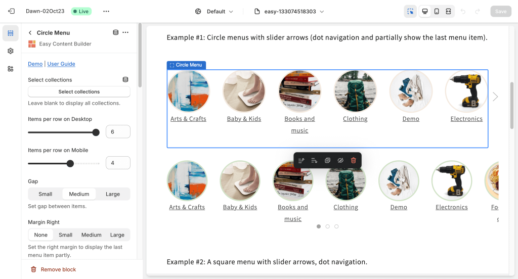
Add a Circle Menu section on the sidebar from the Shopify theme editor. Then click on the Circle Menu title to view the details of settings.
| Section settings | Description |
|---|---|
| Select Collections | Selects the product collections available in the list. Leave blank to display all categories. |
| Items per row on Desktop | Sets the number of menu items displayed per row on Desktop devices (Less than 992px and up). |
| Items per row on Mobile: | Set the number of menu items displayed per row on Mobile devices (Less than 576px). |
| Gap | Sets the gap between menu items. |
| Margin Right | Sets the right margin to partly display the last menu item. |
| Text style | Adds CSS classes to change the menu text style. |
| Image width (px) | Sets the menu icon's width (in pixels). |
| Image height (px) | Sets the menu icon's height (in pixels). |
| Image crop | Cuts out a part of the menu icon: Top, Left, Bottom, Right, Center. |
| Border radius | Adds rounded corners to the menu icons. You can set your menu icons with Circle, Rounded, or Pill values.
You can combine three fields - Image Width, Image Height, and Border radius - to create a wide variety of menu shapes: circle, square, rectangular, and oval. |
| Border width | Sets a width for the borders around the menu icons. |
| Border color | Sets a color for the borders around the menu icons. |
| Hover color | Adds a hoverable border color for the borders around the menu icons. |
| Active | Adds a border color for the borders around an active menu icon. |
| Show slider arrows | Shows/hides the slider arrows on the Desktop. The slider arrows are hidden on mobile by default. |
| Show navigation | Shows/hides the dot navigation. Set Mobile Only if you want to display just the dot navigation on mobile.
NOTE: If you enable the Margin Right, consider disabling the Show Navigation. |
| Slider set | Enables this option to loop through a set of slides instead of single items. |
| Container max width | Adjusts the container width (in pixels)
Animate on scroll: |
| Margin | Sets the vertical spacing between elements. |


