Block Before and After Slider: Difference between revisions
From Posstack.com Documentation
| Line 6: | Line 6: | ||
=== How to add Before & After section === | === How to add Before & After section === | ||
*'''Step 1''': Add a '''Section Settings''' section that allows you to control the global settings of the '''Before & After''' section. | *'''Step 1''': Add a '''Section Settings''' section that allows you to control the global settings of the '''Before & After''' section. | ||
Revision as of 04:02, 7 November 2024
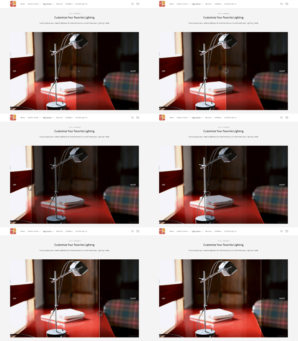
Before & After slider block lets you compare two versions of an image together. Before and after images will appear with a divider which can be moved so that users can see the difference.
NOTE: This block is only available for the Pro plan. You can still add and edit this block normally in the Theme Editor; however, you need to upgrade your plan to apply them to the front end.
How to add Before & After section
- Step 1: Add a Section Settings section that allows you to control the global settings of the Before & After section.
- In this special section, you can specify multi-column layouts, activate full width, determine the section's maximum width, choose a background color, and set global margins and padding, among other options.
- Step 2: Add an Before & After section and customize the settings according to your preferences.
If you are new to our Easy Content Builder, please take a look at the Add Sections section for detailed instructions on how to add a section to your theme.
Before & After section settings
| Block Settings | Description |
|---|---|
| Image 1 | Upload the Before image |
| Image 1 Label | Enter the label of the Before image |
| Image 2 | Upload the After image |
| Image 2 Label | Enter the label of the After image |
| Image Width (px) | Set the width of Before & After images |
| Image Height (px) | Set the height of Before & After images |
| Image Crop | Cut out a part of the image: Top, Left, Bottom, Right, Center |
| Direction | Set the sliding direction, either horizontal or vertical |
| Slide on | Set the divider to move on mouse hover or dragging |
| Position | Adjust the start position of the divider in percentages |
| Divider Width | Set the divider bar's width (in px) |
| Divider Color | Set the color of the divider bar |
| Arrow Color | Set the color of the navigation arrow |
| Arrow Opacity | Set the opacity of the navigation arrow |
| Animate On Scroll | Apply different types of animation to elements within each section as you scroll down the page. Learn more about scrolling animations here. |
| Margin | Set the vertical spacing between elements. |
Add other content blocks
You can add many content blocks to a section you've created. These content blocks will be displayed in different positions within the section, depending on the Desktop/Mobile Layouts you configure.
See all content blocks available that you can add to a section.


