Block Buttons: Difference between revisions
From Posstack.com Documentation
No edit summary |
No edit summary |
||
| Line 1: | Line 1: | ||
{{note | {{note|1= | ||
This content block helps you add predefined buttons for actions on a page. | This content block helps you add predefined buttons for actions on a page. | ||
}} | }} | ||
Revision as of 07:56, 27 July 2023
This content block helps you add predefined buttons for actions on a page.
See Button examples here, here, or here.
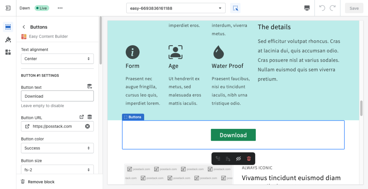
From the Shopify theme editor, click on Button on the sidebar to view the details of settings.
(If you’re new to our Easy Content Builder, please refer to section Add App Sections and Add ECB Blocks for more details on how to create and edit a section or a block.)
| Section settings | Description |
|---|---|
| Text Alignment | Align text to the left, right, or center. |
| Full-width | Enable responsive full-width button. |
| Button Text | Enter the button’s text. Leave this field empty to disable the button. |
| Button URL | Set the internal or external URL for the button’s link. |
| Button Style | Apply a different look for the button. You can choose a Primary Button/Danger Button for the primary action button, a Default Button (outlined button)/Secondary Button for a medium emphasis, or a Text/Link Button for a low emphasis action button. |
| Button Size | Set the button size - Small, Default, or Large. |
| Animate On Scroll | This feature is only available for the Pro plan. It lets you apply different types of animation to elements within each section as you scroll down the page. Learn more about scrolling animations here. |
| Margin | Set the vertical spacing between elements. |

