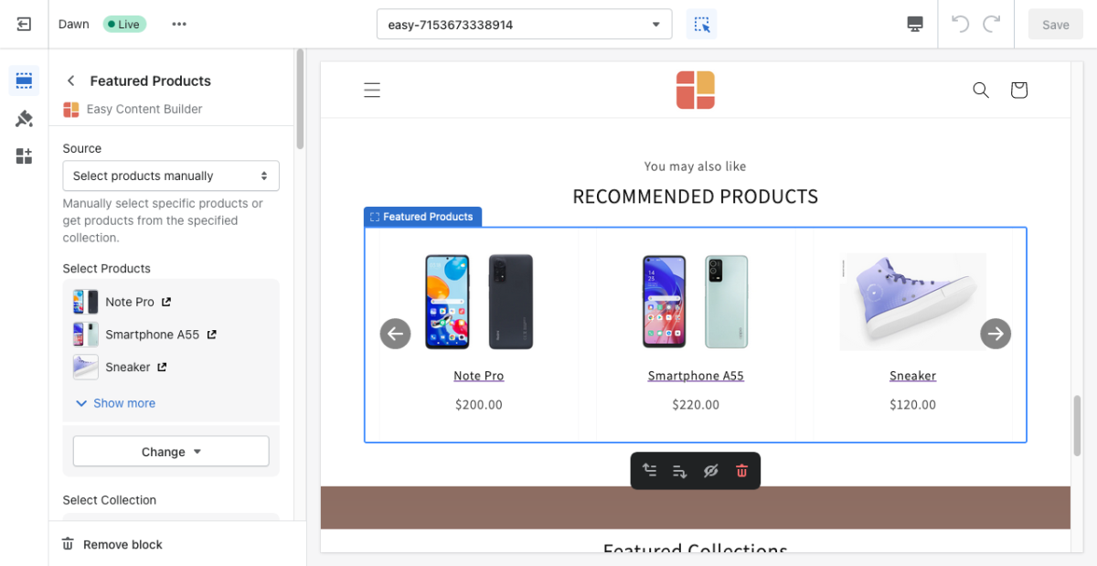
Block Featured Products
From Posstack.com Documentation
This content block allows you to easily create an attractive product slider for custom chosen products or an entire collection.
See Featured Products examples here, here, and here.
From the Shopify theme editor, click on Featured Products on the sidebar to view the details of settings.
If you’re new to our Easy Content Builder, please refer to section Add App Sections and Add ECB Blocks for more details on how to create and edit a section or a block.
Section settings
| Section settings | Description |
|---|---|
| Source | Select the source of products that you want to feature:
|
| Select Products | Use this setting when you set Source to Select products manually. Use the Search bar to search for a specific product term or select the products available in the list. |
| Select Collection | Use this setting when you set Source to Products in collection. Use the Search bar to search for a specific collection term or select the product collection available in the list. |
| Limit Products | The maximum number of products that you can feature in the Featured Product section. |
| Card Style | Create layout boxes for each product item. Emphasize an item with a primary card style. |
| Card Size | Decrease or increase the padding of the card body. |
| Box Shadow | Decrease or increase the box shadows of the card. |
| Text Alignment | Align the Products’ title and price to the left, right, or center. |
| Show Add to Cart | Show or hide the Add to Cart button. |
| Show Description | Show or hide descriptions of products/collections. |
| Description Length | Keep your descriptions long enough that they're sufficiently descriptive. The "optimal" length will vary depending on your specific situation. |
| Image Width | Set the width (in pixel) of the collection’s featured image. |
| Image Height | Set the width (in pixel) of the collection’s featured image. |
| Image Crop | Cut out a part of the image: Top, Left, Bottom, Right, Center. |
| (Items per row) Item Width on Mobile | Define the width of the product card.
|
| (Items per row) Item Width on Desktop | Item width on desktop:
|
| Gap | Set the gap between items. |
| Slider settings - Show Slider Arrows | Show or hide the slider arrows on the Desktop. The slider arrows are hidden on mobile by default. |
| Arrows Outside | Place arrows outside of a slider. |
| Slider settings - Auto Play | Change slides of products after a specified interval (in milliseconds). Enter 0 to disable. |
| Slider Set | To loop through a set of slides instead of single items. |
| Animate On Scroll | This feature is only available for the Pro plan. It lets you apply different types of animation to elements within each section as you scroll down the page. Learn more about scrolling animations here. |
| Margin | Set the vertical spacing between elements. |
Part 2: Add Related Product section using Dynamic sources:
Besides the default option - Select products manually mentioned in Part 1 above, you can also display the Related Products using Dynamic sources.
NOTE: Adding Related Products using the Dynamic sources best fits when you want to apply the same template to many products, and each product comes with its specific (dynamic) list of Related Products.
Info: Dynamic sources link the product data as a metafield to section input settings, which lets you add metafields to pages right from the theme editor. Shopify offers different types of metafields to add custom data to a specific part of your Shopify store. Learn more here.
Step 1: Create a metafield definition for the Related Products
- From your Shopify admin, click Settings > Custom Data
- Click Products > click Add definition
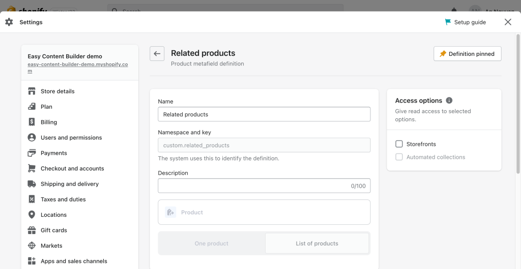
- In the Product Metafield definition form, assign a namespace (the group that your metafield will belong to) and a key (the specific metafield name) as follows:
- Name: Related products
- Namespace and key: custom.related_products
- Description: (optional)
- Select type > Product, make sure you enable List of Product.
Step 2: Add value to the metafield
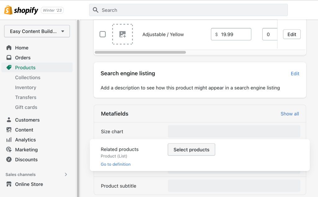
- From your Shopify admin > click Products > click the Product you want to add Related Product section.
- Scroll down to the Metafield section > click Related Products field to select the products you want to display as Related Product:
Step 3: Link the product metafields to your template
- From your Shopify admin, click Apps > Easy Content Builder
- Click Manage Templates > find the template of the product you want to edit, then click Customize
- Navigate to the section you want to add the Related Products.
- For example: you add Related Products to the core Product section, simply click Add block > click Featured Products:
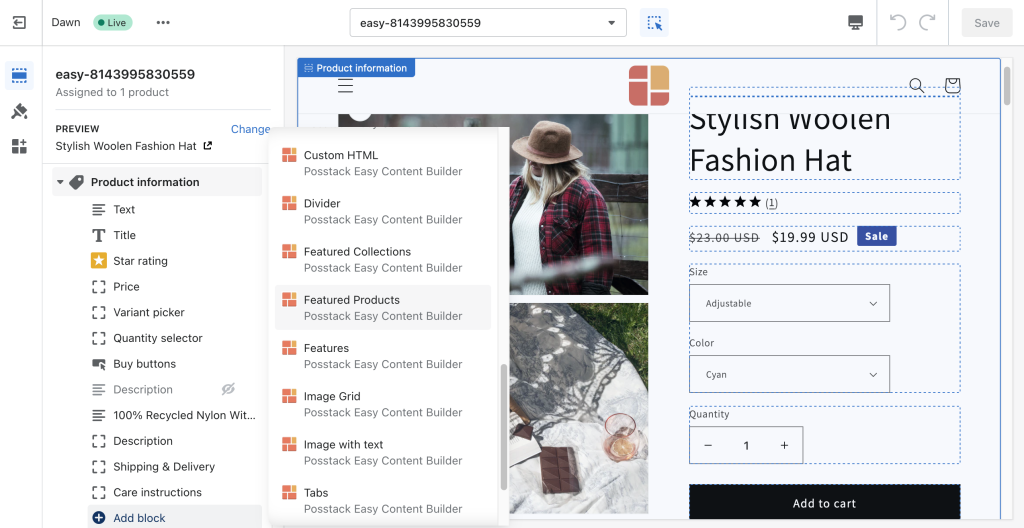
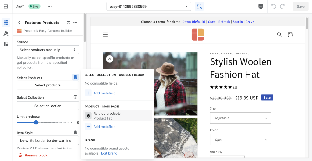
- Open the Featured Products section you’ve just created > click the connect dynamic source icon next to the Select Products field > click Related Products > then click Save to apply the changes to the storefront.
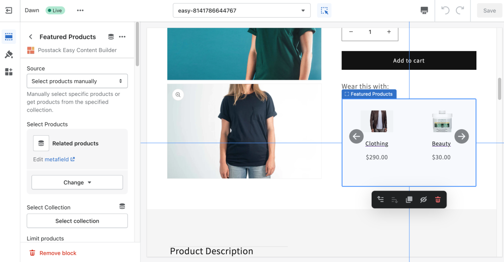
- Once you assign the related products using dynamic sources, you can edit and change the products your way through the Theme Editor.
- For example: you add Related Products to the core Product section, simply click Add block > click Featured Products:

