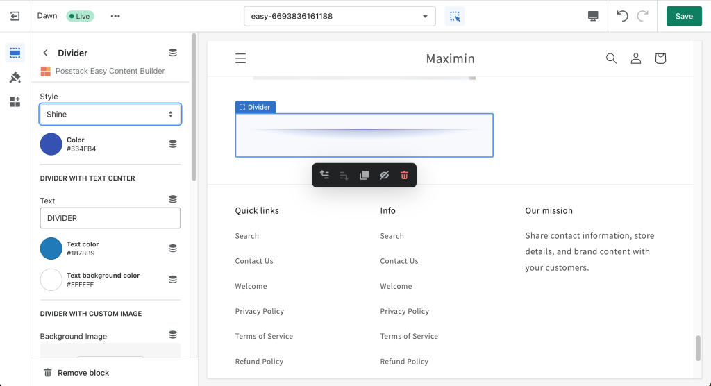
Block: Divider
From Posstack.com Documentation
The Divider block lets you add horizontal lines that separate the content sections of a page.
It supports a variety of 15 horizontal divider styles. In addition, you can also use a custom image as a divider and configure the image height to fit your needs.
See Divider examples here.
Watch tutorial video
Be sure to watch the step-by-step video tutorials demonstrating how to utilize the sections provided in Posstack Easy Content Builder, available here.
If you are new to our Easy Content Builder, please take a look at the Add Sections section for detailed instructions on how to add a section to your theme.
| Block Settings | Description |
|---|---|
| Style |
|
| Color | Select the color of the divider |
| Text | Enter the title text displayed inside the horizontal divider (only applied when Style is set to Text center) |
| Text Color | Select the text color |
| Text Background Color | Set the background color of the text |
| Image | Upload a background image to use as a divider. |
| Image Height | Set the height (px) of the background image |
| Background Image Repeat | Set if the background image will be repeated horizontally |
| Max Width | Set the maximum width of the container (in pixels). Enter 0 to use the default max width set by your theme |
| Margin | Set the vertical spacing between elements. |
Add other content blocks
You can add many content blocks to a section you've created. These content blocks will be displayed in different positions within the section, depending on the Desktop/Mobile Layouts you configure.
See all content blocks available that you can add to a section.


