Block: Gallery
From Posstack.com Documentation
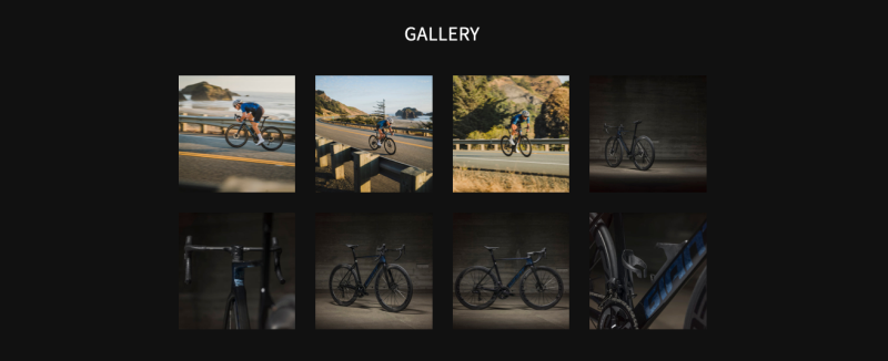
The Gallery section allows you to easily add and style beautiful image galleries on your page.
In the Free plan, you can include a static image grid (like in the demo for the Pro plan), but the Lightbox 'popup' slideshow in the Gallery section is disabled by default. The Lightbox 'popup' feature, which opens to display connected images or videos when clicked, is available in the Pro plan.
Easy Content Builder offers 4 sections for managing images:
- Image Section: Ideal for showcasing a single image.
- Images With Text: Great for presenting images alongside headings, descriptions, and CTA buttons, with the option to customize the ratio of image to text.
- Gallery: Perfect for creating a grid of photos and videos. Clicking on an image or video opens a lightbox popup to display related content.
- Icons With Text: Designed for displaying a slider or grid of images, icons, and text. This section can be used for showcasing Trust Badges, a scrolling announcement bar, logo lists, testimonials, or any text columns with icons.
Gallery use cases
Gallery settings
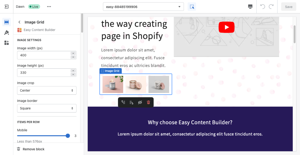
From the Shopify theme editor, click on Gallery on the sidebar to view the details of settings.
If you are new to our Easy Content Builder, please take a look at the Add Sections section for detailed instructions on how to add a section to your theme.
| Section settings | Description |
|---|---|
| Image Width | Set the width (in pixel) of each image in the grid. |
| Image Height | Set the width (in pixel) of the collection’s featured image. |
| Image Crop | Cut out a part of the image: Top, Left, Bottom, Right, Center. |
| Image Border | Set the image border - normal, rounded, circle, or pill. |
| Lightbox gallery - Animation (Pro plan only) | Set the animation for the Lightbox popup - Slide, Fade, or Scale. The lightbox opens to display the images or videos connected to it by default when site visitors click inside the image/videos. |
| Items Per Row - Mobile | Set the number of featured content blocks displayed per row on Mobile devices (Less than 576px). |
| Items Per Row - Tablet | Set the number of featured content blocks displayed per row on Tablet devices (576px - 991px). |
| Items Per Row - Desktop | Set the number of featured content blocks displayed per row on Desktop devices (992px and up). |
| Gap | Set the gap between items. |
| Video Thumbnail | This setting is only available for the Pro version. Display a poster image for the video. |
| Video Link | This setting is only available for the Pro version. Embed the Youtube or Vimeo video link. |
| Image | Add images you’d like to show in the image grid. |
| Animate On Scroll | This feature is only available for the Pro plan. It lets you apply different types of animation to elements within each section as you scroll down the page. Learn more about scrolling animations here. |
| Margin | Set spacing between elements and their content. |
Add other content blocks
You can add many content blocks to a section you've created. These content blocks will be displayed in different positions within the section, depending on the Desktop/Mobile Layouts you configure.
See all content blocks available that you can add to a section.


