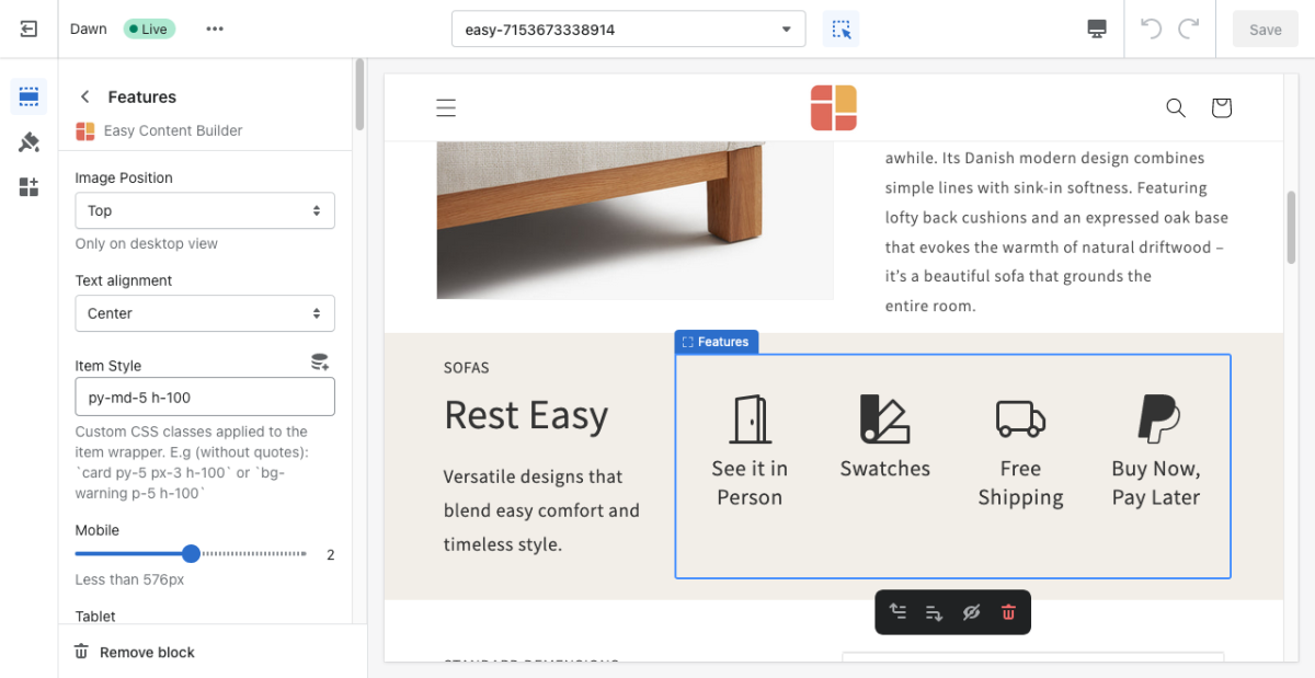
Block Features
From Posstack.com Documentation
This block helps you create separate content blocks (Each block comes with its heading, description, and icon). You can easily position the icon (left, right, center, or bottom) to pair with the wrapped text.
See Features block examples here, here, or here.
From the Shopify theme editor, click on Features on the sidebar to view the details of settings.
(If you’re new to our Easy Content Builder, please refer to section Add App Sections and Add ECB Blocks for more details on how to create and edit a section or a block.)
| Section settings | Description |
|---|---|
| Image Position | Set the position of the icon (left, right, center, bottom) to pair with the wrapped text. Applied to desktop view only. |
| Text Alignment | Align all content elements to the left, right, or center. |
| Item Style | Custom CSS classes applied to item wrapper. E.g. (without quotation marks): `card py-5 px-3 h-100` or `bg-warning p-5 h-100` |
| Mobile | Set the number of featured content blocks displayed per row on Mobile devices (Less than 576px). |
| Tablet | Set the number of featured content blocks displayed per row on Tablet devices (576px - 991px). |
| Desktop | Set the number of featured content blocks displayed per row on Desktop devices (992px and up). |
| Animate On Scroll | This feature is only available for the Pro plan. It lets you apply different types of animation to elements within each section as you scroll down the page. Learn more about scrolling animations here. |
| Item Title | Enter the title of each featured content block. |
| Icon | Insert HTML code of SVG, Icon Font or Image. |
| Body | Add and style (bold, italic, add link) the text content that appears on each block. |

