Block Accordion: Difference between revisions
mNo edit summary |
|||
| Line 2: | Line 2: | ||
This content block helps you build vertically collapsing accordions. | This content block helps you build vertically collapsing accordions. | ||
{{Note|NOTE: Accordion is only available for the PRO plan. You can configure this block normally in the Theme Editor; however, you need to upgrade your plan to apply them to the front end.|inline}} | {{Note|NOTE: Accordion is only available for the PRO plan. You can configure this block normally in the Theme Editor; however, you need to upgrade your plan to apply them to the front end.|inline}} | ||
{{Note|By default, Easy Content Builder offers support for structured data (schema.org) to generate rich snippets for the Accordion section, ultimately enhancing the SEO performance of your Shopify store.|reminder}} | |||
===What is the Accordion section perfect for?=== | ===What is the Accordion section perfect for?=== | ||
Revision as of 09:12, 10 June 2024
This content block helps you build vertically collapsing accordions.
What is the Accordion section perfect for?
You have various options to use the Accordion section for your Shopify themes:
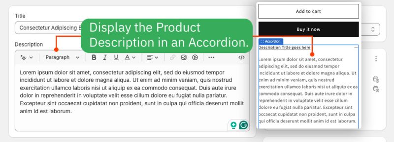
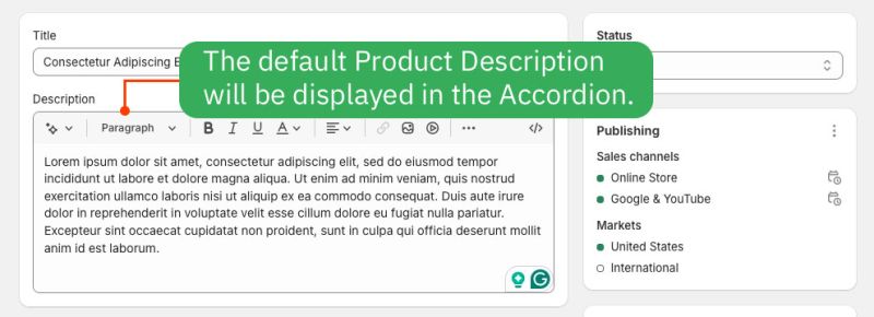
- Display the Product Description in the Accordion:
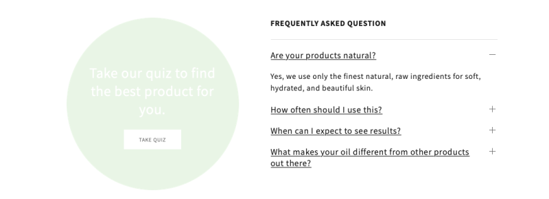
- FAQ: See an example here.
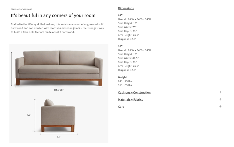
- Specifications: See an example here.
- FAQ 2: See an example here.
General Configuration
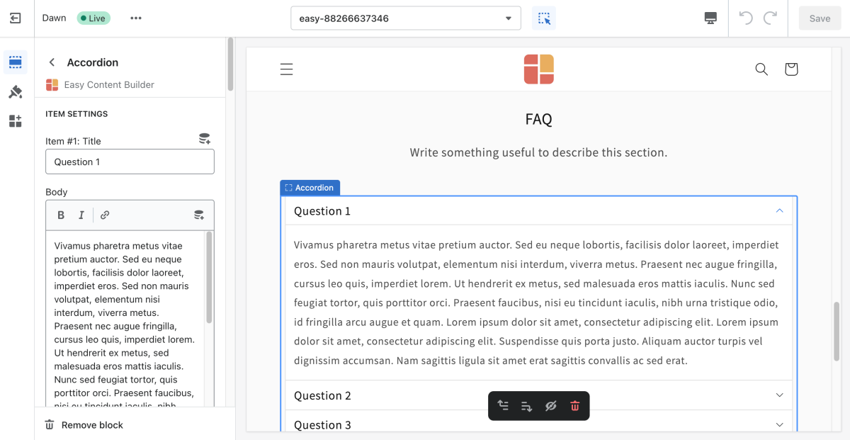
From the Shopify theme editor, click on Accordion on the sidebar to view the details of settings.
| Section settings | Description |
|---|---|
| No Collapsing | By default, all accordion items can be collapsed. Enable this setting to prevent this behavior and always maintain one open item. |
| Multiple Open Items | To display multiple content sections simultaneously without collapsing when the other is opened. |
| Title Size | Change the heading size to H1, H2, H3, H4, H5, or H6. |
| Text Size | Set the body text size - Small, Default, Large |
| Item Title | The title of the accordion content |
| Body | The details of the accordion content.
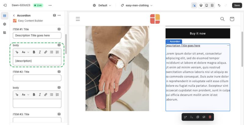
To display the product descriptions as a collapsible accordion, enter the shortcode: [description] |
| Max Width | Set the width of the Accordion container in pixel. |
| Animate On Scroll | This feature is only available for the Pro plan. It lets you apply different types of animation to elements within each section as you scroll down the page. Learn more about scrolling animations here. |
| Margin | Set the vertical spacing between elements. |
| Padding | Set spacing between elements and their content. |
Display the Product Description as an Accordion
Here are steps:
Step 1: Create or update a product description
- From your Shopify admin, click Products to go to the Products page.
- From the Products page, click Add Product.
- Enter a product title and product description, along with additional details.
- Click Save product.
Step 2: Load the product description in an Accordion
Suppose that you already created a template using Easy Content Builder. Then, follow the steps below to edit that template and add the Description to the Accordion section:
- From your Shopify admin, click Apps > Easy Content Builder.
- From the Easy Content Builder dashboard, click Manage Templates. Find the template that you want to edit, and then click Customize.
- From the theme editor, click + Add Section in the sidebar.
- Scroll down the list of available blocks prebuilt by the Easy Content Builder and click Accordion.
- Open the Accordion configuration panel and enter the item title. To display the product descriptions in a collapsible accordion, enter the shortcode into the body field: [description]
- Click Save.
Create Accordion metaobjects
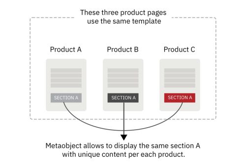
When to use Accordion metaobjects
Metaobjects are handy when you want to add fully custom Accordion section per product/page using a single template. That means some (or all) products/pages have unique Accordion sections specific to each product/page, even though they use the same Template.
How to use Accordion metaobjects
Check out the setup guide.
Add other content blocks
You can add many content blocks to a section you've created. These content blocks will be displayed in different positions within the section, depending on the Desktop/Mobile Layouts you configure.
