Block Section Title: Difference between revisions
From Posstack.com Documentation
No edit summary |
No edit summary |
||
| Line 5: | Line 5: | ||
[[File:Block section title.png|1200x1200px]] | [[File:Block section title.png|1200x1200px]] | ||
''(If you’re new to our Easy Content Builder, please refer to section [[Add App Sections]] and [[Add ECB Blocks]] for more details on how to create and edit a section or a block.)'' | ''(If you’re new to our Easy Content Builder, please refer to section [[Add Sections|Add App Sections]] and [[Add Blocks|Add ECB Blocks]] for more details on how to create and edit a section or a block.)'' | ||
{| class="wikitable" | {| class="wikitable" | ||
!Section settings | !Section settings | ||
Revision as of 16:58, 22 November 2022
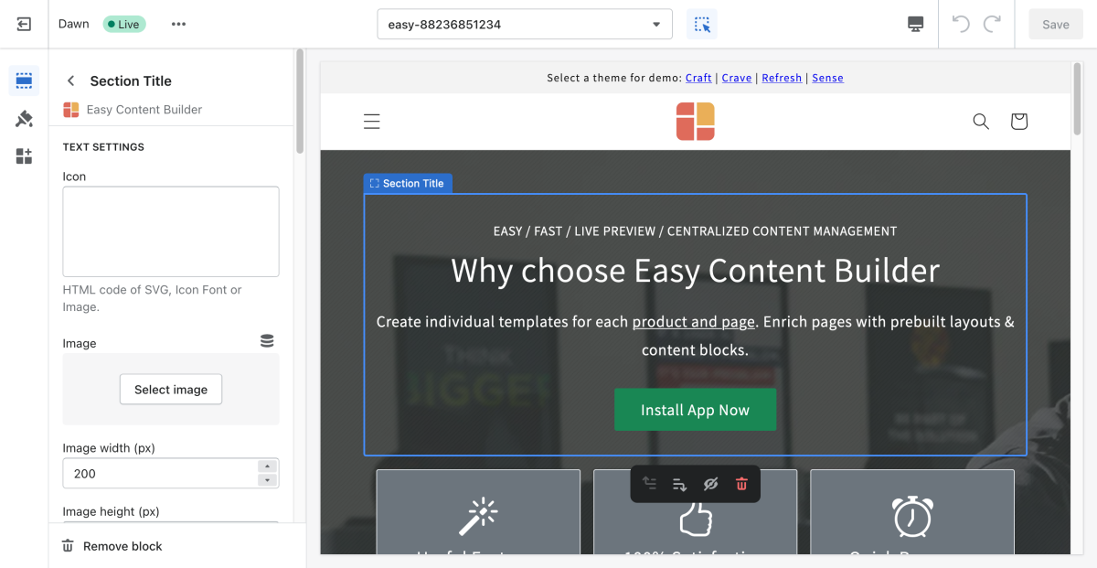
The Section Title lets you create catchy titles/headings for each content block. Since the Section Title is an independent content block, you get total control to decide where and how to use it. You can enrich the Title/Heading block with an icon, featured image, tagline, and a CTA button.
From the Shopify theme editor, click on the Section title on the sidebar to view the details of settings.
(If you’re new to our Easy Content Builder, please refer to section Add App Sections and Add ECB Blocks for more details on how to create and edit a section or a block.)
| Section settings | Description |
|---|---|
| Icon | Insert HTML code of SVG, Icon Font or Image. |
| Image | Add the image you want to feature above the Title/Heading. |
| Image Width | Set the width (in pixel) of the featured image above the Title/ |
| Image Height | Set the width (in pixel) of the featured image above the Title/Heading. |
| Image Crop | Cut out a part of the featured image: Top, Left, Bottom, Right, Center. |
| Image Border | Set the style of the featured image border: square, rounded, or thumbnail. |
| Text Alignment | Align all elements of the Section title to the left, right, or center. |
| Title | Type a title for the content block. |
| Title | Change the heading to H1, H2, H3, H4, H5, or H6. |
| Tagline | Type a short tagline that will be shown above the Title/Heading. |
| Tagline Size | Change the tagline to fs_1, fs_2, fs_3, fs_4, fs_5, or fs_6. Set to ‘fs_1’ for the largest size. |
| Description | Type the content of the title/heading block. |
| Description Size | Change the text size to fs_1, fs_2, fs_3, fs_4, fs_5, or fs_6. Set to ‘fs_1’ for the largest size. |
| Button Text | Enter the button’s text. Leave this field empty to disable the button. |
| Button URL | Set the internal or external URL for the button’s link. |
| Button Color | Choose the color of the button (based on the predefined button styles) |
| Button Size | Set the button size that ranges from 'fs_1' to 'fs_6'. Use ‘fs_1’ for the largest button size. |
| Max Width | Define the maximum width (in pixel) of the block’s container. |
| Padding Top | Set the padding top (in px) of the block |
| Padding Bottom | Set the padding bottom (in px) of the block |
| Margin Top | Set the margin top (in px) of the block |
| Margin Bottom | Set the margin bottom (in px) of the block |

