Block Accordion: Difference between revisions
From Posstack.com Documentation
No edit summary |
No edit summary |
||
| Line 5: | Line 5: | ||
[[File:Block accordion.png|1200x1200px]] | [[File:Block accordion.png|1200x1200px]] | ||
''(If you’re new to our Easy Content Builder, please refer to section [[Add App Sections]] and [[Add ECB Blocks]] for more details on how to create and edit a section or a block.)'' | ''(If you’re new to our Easy Content Builder, please refer to section [[Add Sections|Add App Sections]] and [[Add Blocks|Add ECB Blocks]] for more details on how to create and edit a section or a block.)'' | ||
{| class="wikitable" | {| class="wikitable" | ||
!Section settings | !Section settings | ||
Revision as of 17:05, 22 November 2022
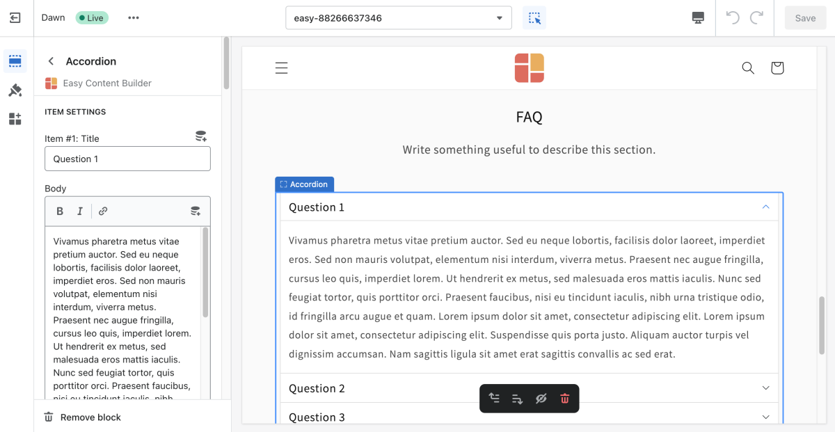
This content block helps you build vertically collapsing accordions.
From the Shopify theme editor, click on Accordion on the sidebar to view the details of settings.
(If you’re new to our Easy Content Builder, please refer to section Add App Sections and Add ECB Blocks for more details on how to create and edit a section or a block.)
| Section settings | Description |
|---|---|
| Item Title | The title of the accordion content |
| Body | The details of the accordion content |
| Max Width | Set the width of the Accordion container in pixel. |
| Padding Top | Set the padding top (in px) of the block |
| Padding Bottom | Set the padding bottom (in px) of the block |
| Margin Top | Set the margin top (in px) of the block |
| Margin Bottom | Set the margin bottom (in px) of the block |

