Block Divider
From Posstack.com Documentation
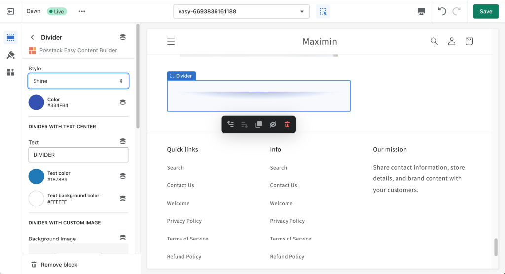
The Divider block lets you add horizontal lines that separate the content sections of a page.
It supports a variety of 15 horizontal divider styles. In addition, you can also use a custom image as a divider and configure the image height to fit your needs.
See Divider examples here.
If you’re new to our Easy Content Builder, please refer to section Add App Sections and Add ECB Blocks for more details on how to create and edit a section or a block.
| Block Settings | Description |
|---|---|
| Style |
|
| Color | Select the color of the divider |
| Text | Enter the title text displayed inside the horizontal divider (only applied when Style is set to Text center) |
| Text Color | Select the text color |
| Text Background Color | Set the background color of the text |
| Image | Upload a background image to use as a divider. |
| Image Height | Set the height (px) of the background image |
| Background Image Repeat | Set if the background image will be repeated horizontally |
| Max Width | Set the maximum width of the container (in pixels). Enter 0 to use the default max width set by your theme |
| Margin | Set the vertical spacing between elements. |
Add other content blocks
You can add many content blocks to a section you've created. These content blocks will be displayed in different positions within the section, depending on the Desktop/Mobile Layouts you configure.
See all content blocks available that you can add to a section.


