Block Icons With Text
What is the Icons With Text section perfect for?
You have various options to use the Icons With Text section for your Shopify themes:
- Trust badges: See an example here.
- Payment icons: See an example here.
- Shipping info: See an example here.
- Feature highlights: See an example here.
- Testimonial slider: See an example here.
- Logo Listing: See an example here or scrolling logo list:
General Configuration
Icons With Text (previously Features block) helps you create separate content blocks (Each block comes with its heading, description, and icon). You can easily position the icon (left, right, center, or bottom) to pair with the wrapped text.
From the Shopify theme editor, click on Icons With Text (previously Features block) on the sidebar to view the details of settings.

| Section settings | Description |
|---|---|
| Image Position | Set the position of the icon (left, right, center, bottom) to pair with the wrapped text. Applied to desktop view only. |
| Text Alignment | Align all content elements to the left, right, or center. |
| Set the icon/image width | Enter image-width-100 (replace 100 with the desired value) to the CSS classes field.
NOTE: Once you define the width of the icon/image, make sure you configure the number of items per row on Mobile/Desktop, like the examples below:
|
| CSS classes | // Enter Custom CSS classes:
// Enable Auto-scrolling: To enable auto-scrolling (Perfect for Logo slider, scrolling announcement text, Testimonial slider, etc.), add the CSS classes below:
INFO: Currently, the metaobjects used as a dynamic source can be used on 3 page types: product page, store page, and blog post page. NOTE: The Slider, Auto-scrolling, and Metaobject features are only available for the PRO plan. To add multiple classes, enter the classes with space between them. |
| Items per row on Mobile | Set the number of featured content blocks displayed per row on Mobile devices. |
| Items per row on Desktop | Set the number of featured content blocks displayed per row on Desktop devices. |
| Animate On Scroll | This feature is only available for the Pro plan. It lets you apply different types of animation to elements within each section as you scroll down the page. Learn more about scrolling animations here. |
| Item Title | Enter the title of each featured content block. |
| Icon | Upload the SVG Icon, Icon Font, or Image |
| Body | Add and style (bold, italic, add link) the text content that appears on each block. |


Scrolling announcement bar and infinite logo/image carousel.

How to create a scrolling logo list/text bar/image carousel:
- Step 1: Create a Section Settings to control the global settings of the slider (where you specify this section’s column layout, width, background color, etc.)
- Step 2: Create an Icons With Text section.
- Step 3: Open the Icons With Text configuration and insert the title/body text/icon (SVG, Icon font, or Image) depending on which content type you want to display.
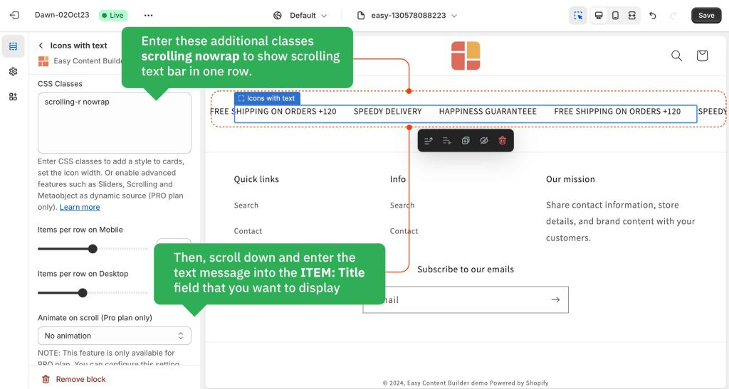
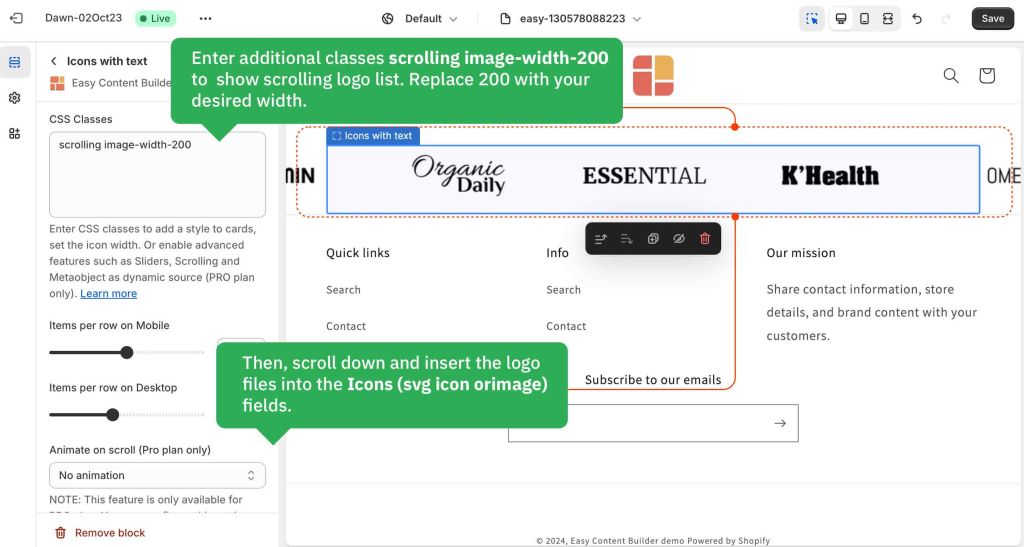
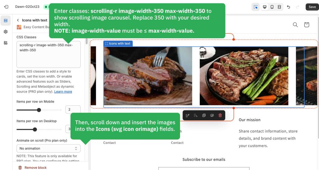
- Step 4: enter these additional classes into the CSS Classes field depending on the scrolling style you want:
- Note: You can add multiple classes, type the classes with space between them.
- scrolling: scrolling from right to left.
- scrolling-r: scrolling from left to right.
- duration-10: Specify duration (in second) that the animation should complete one cycle. Replace '10' with your desired value.
- nowrap: showing text messages in one row (helpful for Scrolling important messages)
- overflow-hidden: scrolling items will be shown within the block's container.
- max-width-200: Set the items’ maximum width (replace 200 with your desired width).
- NOTE: If you do not set max-width-value, each image's maximum width is 280px by default. To show images bigger than 280px, you must specify both the image-width-value and max-width-value (input the value as you wish. Make sure image-width-value ≤ max-width-value.)
Below are a few examples of logo/text/image carousels we created for demo purposes:
- Scrolling announcement bar (full-width):
 Scrolling announcement bar (shown within a column container):
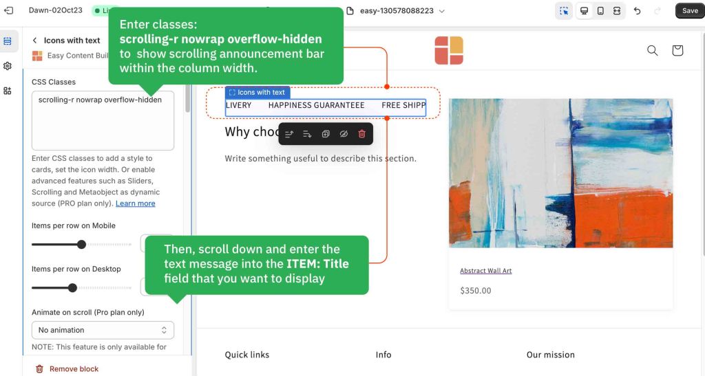
- Scrolling logo list:
- Infinite image carousel:


Testimonial Carousel
You can use Icons With Text block to create a Testimonial carousel by entering these additional classes into the Item Style field:
- slider: to enable the carousel
- slider-nav: to enable the arrow navigation
How to create a Testimonial:
- Step 1: Create a Section Settings to control the global settings of the carousel (The whole block width, background color, etc.)
- Step 2: Create an Icons With Text section.
- Step 3: Open the Icons With Text configuration and insert the title, Icon (SVG, Icon font, or Image), and body text as you wish.
Note: You can define the number of Testimonial items per row from 1 up to 6 items (using the Mobile & Desktop configuration).
Below is an example of a Testimonial carousel that displays 3 items:

How to add SVG icons to Icons With Text
Upload SVG icons
Using metaobjects to load SVG icons as a dynamic source
NOTE: The Metaobject feature is only available for the PRO plan.
Step 1: Enter this CSS class into the CSS Classes field: dynamic-source
This field allows you to add multiple CSS classes, make sure you enter all the CSS classes with space between them.
Step 2: Create and use metaobjects by following this guide.
Set the icon width
To adjust the icon's width, simply enter the extra class into the CSS classes field: image-width-100 (replace 100 with the desired value).
Change the SVG icon color
Here are steps to adjust the SVG icon's color:
- Step 1: Convert your HEX color to CSS filter property.
- Simply use this free tool, enter your HEX color format (e.g. #121212) to convert to CSS filter property. Then, copy the generated CSS filter result.
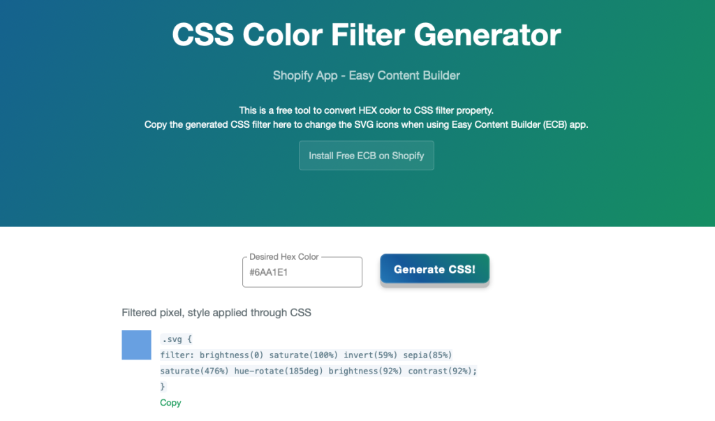

- Step 2: Navigate back to your Theme Editor > click on the App section containing the Icons With Text block where you want to change the SVG icons' color.
- Step 3: Paste the generated CSS filter property into the Custom CSS field. And hit Save.

Set the Heading font-weight
You may want to use additional classes to set the weight of the title to bold when needed. Add one of the classes below to the field 'Item Style':
- uk-title-bold: set the Heading's weight to bold (See the Icons with text demo with bold title)
- uk-text-bold: set the weight of both the Heading and body text to bold
Apply a different color to text element
You can also use one of these classes to apply a different color to text elements.
- uk-text-muted: Add this class to mute text.
- uk-text-emphasis: Add this class to emphasize text.
- uk-text-primary: Add this class to emphasize text with the primary color.
- uk-text-secondary: Add this class to emphasize text with the secondary color.
- uk-text-success: Add this class to indicate success.
- uk-text-warning: Add this class to indicate a warning.
- uk-text-danger: Add this class to indicate danger.
Create layout boxes with different card styles
You can add a specific card style to the Icons with text block by using these additional classes:
uk-card-primary uk-height-1-1 uk-padding
By default, you can apply three styles to cards:
- uk-card-default: create a visually styled box.
- uk-card-primary: emphasize the card with a primary color.
- uk-card-secondary: give the card a secondary background color.
Add other content blocks
You can add many content blocks to a section you've created. These content blocks will be displayed in different positions within the section, depending on the Desktop/Mobile Layouts you configure.
