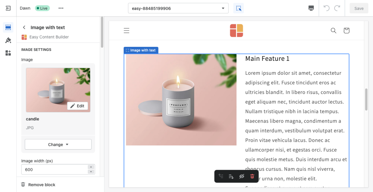
Block Image With Text
From Posstack.com Documentations
This block helps you create separate content blocks (Each block comes with its heading, tagline, description, featured image, and CTA button). You can easily position the image (left, right, center, or bottom) to pair with the description text.
See Image With Text examples here.
From the Shopify theme editor, click on Image with text on the sidebar to view the details of settings.
(If you’re new to our Easy Content Builder, please refer to section Add App Sections and Add ECB Blocks for more details on how to create and edit a section or a block.)
| Section settings | Description |
|---|---|
| Card Style | Create layout boxes for each product item. Emphasize an item with a primary card style. |
| Card Size | Decrease or increase the padding of the card body. |
| Box Shadow | Decrease or increase the box shadows of the card. |
| Image | Add the image you want to feature in the block. |
| Image Width | Set the width (in pixel) of the collection’s featured image. |
| Image Height | Set the width (in pixel) of the collection’s featured image. |
| Image Crop | Cut out a part of the image: Top, Left, Bottom, Right, Center. |
| Image position | Position the image (left, right, center, bottom) to pair with the block’s main text content. This setting is only applied to Desktop devices. |
| Vertical Alignment | Align the content to the vertical position: top, middle, or bottom. |
| Text Alignment | Align text to the left, right, or center. |
| Title | Type a title for the content block. |
| Title Size | Change the heading to H1, H2, H3, H4, H5, or H6. |
| Badge | Create nice looking text badges. |
| Tagline | Type a short tagline for the content block. |
| Tagline Size | Set the tagline size - Small, Default, or Large |
| Description | Type the content of the block. |
| Description Size | Set the description size - Small, Default, or Large |
| Button Text | Enter the button’s text. Leave this field empty to disable the button. |
| Button URL | Set the internal or external URL for the button’s link. |
| Button Style | Apply a different look for the button. You can choose a Primary Button/Danger Button for the primary action button, a Default Button (outlined button)/Secondary Button for a medium emphasis, or a Text/Link Button for a low emphasis action button. |
| Button Size | Set the button size - Small, Default, or Large |
| Animate On Scroll | This feature is only available for the Pro plan. It lets you apply different types of animation to elements within each section as you scroll down the page. Learn more about scrolling animations here. |
| Margin | Set the vertical spacing between elements. |

