Block Section Settings: Difference between revisions
mNo edit summary |
|||
| Line 27: | Line 27: | ||
* Two Columns | * Two Columns | ||
* Two Columns: First Block Right, others Left | * Two Columns: First Block Right, others Left | ||
:'''First Block Right''' refers to the main content block you want to show on the right column. Drag any block you want to reorder on top of other blocks to keep it in the First Block position. | |||
:'''Others Left''' means all other blocks will be displayed on the left column. | |||
* Two Columns: First Block Left, others Right | * Two Columns: First Block Left, others Right | ||
:'''First Block Left''' refers to the main content block you want to show on the left column. Drag any block you want to reorder on top of other blocks to keep it in the First Block position. | |||
:'''Others Right''' means all other blocks will be displayed on the right column. | |||
* Three Columns (''Three columns will each automatically be 33.33% wide.'') | * Three Columns (''Three columns will each automatically be 33.33% wide.'') | ||
* Three Equal Columns (''The first column's width is specified based on the main block width, the remaining columns will be the same width.'' ) | * Three Equal Columns (''The first column's width is specified based on the main block width, the remaining columns will be the same width.'' ) | ||
* Three Columns: First Block Right, others Left | * Three Columns: First Block Right, others Left | ||
:'''First Block Right''' refers to the main content block you want to show on the right column. Drag any block you want to reorder on top of other blocks to keep it in the First Block position. | |||
:'''Others Left''' means all other blocks will be displayed on the 1st and middle columns. | |||
* Three Columns: First Block Left, others Right | * Three Columns: First Block Left, others Right | ||
:'''First Block Left''' refers to the main content block you want to show on the 1st left column. Drag any block you want to reorder on top of other blocks to keep it in the First Block position. | |||
:'''Others Right''' means all other blocks will be displayed on the middle and 3rd columns. | |||
* Four Equal Columns | * Four Equal Columns | ||
|- | |- | ||
Revision as of 03:27, 29 August 2023
Easy Content Builder uses Section Settings as a special block to determine your ideal layouts within a section:
NOTE: Mask image feature is only available for the PRO plan. You can configure this setting normally in the Theme Editor; however, you need to upgrade your plan to apply them to the front end.
- You can define 1-column, 2-columns, 3-columns, or 4-columns layouts that are fully responsive (See multiple-column layout examples).
- You can add as many sections on a page as you want. In each section, you create a Section Settings block to control the layout for that specific section.
Details of settings
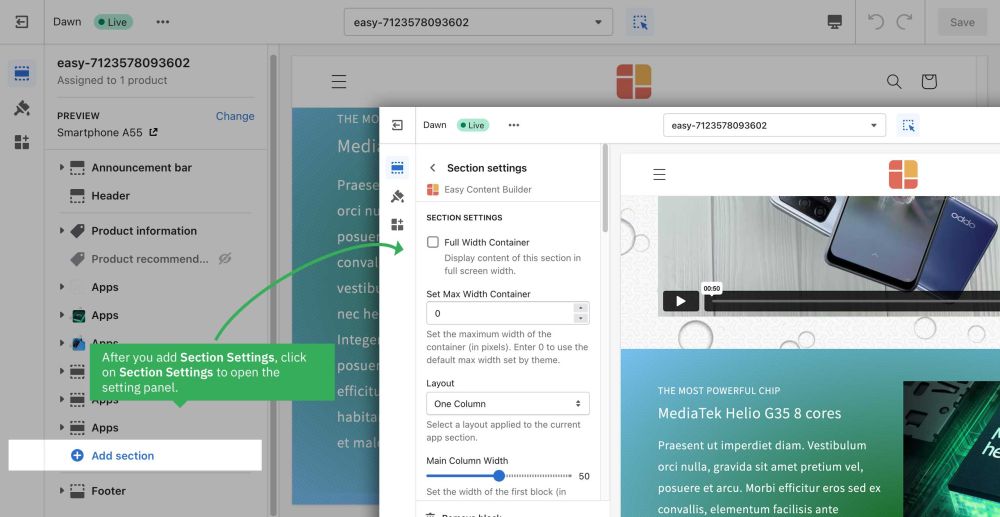
From the Shopify theme editor, click on Section settings on the sidebar to view the details of settings.
| Section settings | Description |
|---|---|
| Full Width Container | Display content of this section in full screen width. |
| Set Max Width Container | Set the maximum width of the container (in pixels). Enter 0 to use the default max width set by your theme. |
| Layout | Select a layout applied to the current app section:
|
| Main Column Width | Set the width of the first block in percentages. This setting is only applied to the layouts that have more than two columns. |
| Column Gap | Set the gap (in pixels) between the columns |
| Row Gap | Set the gap (in pixels) between the rows |
| Background Color | Specifies the background color of the section by CSS or Gradient options. Click the color and use the Gradient color picker or enter the value of the new color in the CSS Code field. You can also create a gradient background using CSS code - for example linear-gradient(red, green), radial-gradient(red, green), or conic-gradient(red, green). |
| Background image | Set the background image of the section. Once added, you can tab the Change button below the image to delete or change the image. |
| Background Image Position | Set the starting position of a background image. |
| Mask Color | Specifies the color overlay over the background color or the background image. Click the color and use the color picker or enter the value of the new color in the text field. |
| Mask Image | Using the image as a mask layer. Must be a PNG image. You can download mask images here. |
| Mask Opacity | Set the opacity/transparency of the mask. |
| Container Background color | Set the color of Containers - a fundamental building block - that are used to contain, pad, and align your content within a given device or viewport. |
| Text Color | Set the color of the text inside the section. |
| Padding Top | Set the padding top (in px) of the section |
| Padding Bottom | Set the padding bottom (in px) of the section |
| Container Padding top | Set the padding top (in px) of the container |
| Container Padding bottom | Set the padding top (in px) of the container |
Reorder the Section Settings block
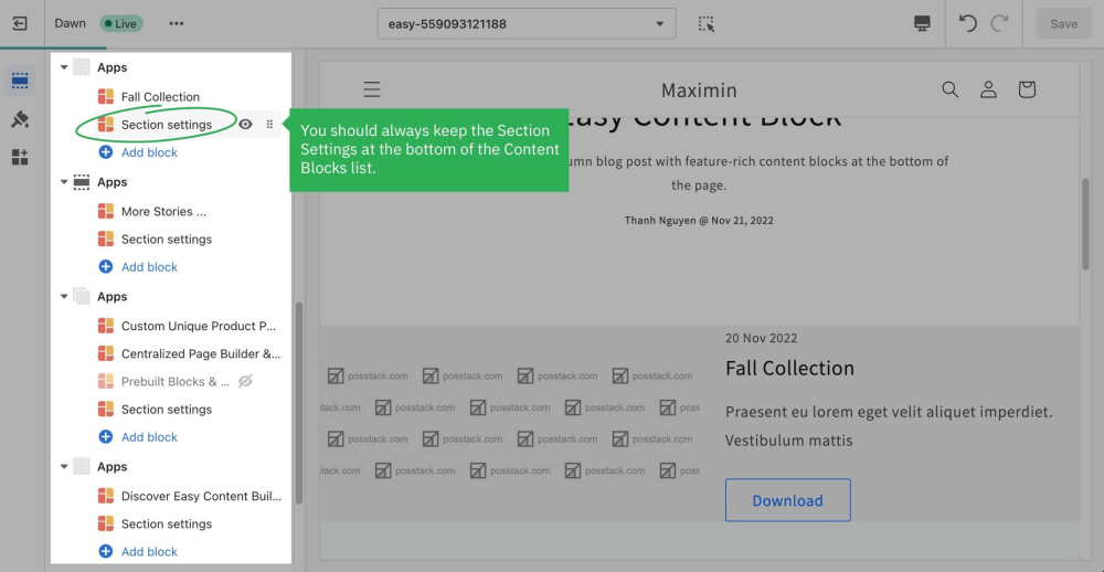
Even though you can click and drag the ⋮⋮ icon next to the Section Settings to rearrange the block on your page, you should always keep the Section Settings at the bottom of the Content Blocks list that you might add to a section.

Multi-column Layout Setup
Learn how to create multiple-column layouts here.
How to create a parallax movement on scroll?
Parallax effects involve a page's background moving at a different speed than the foreground content.
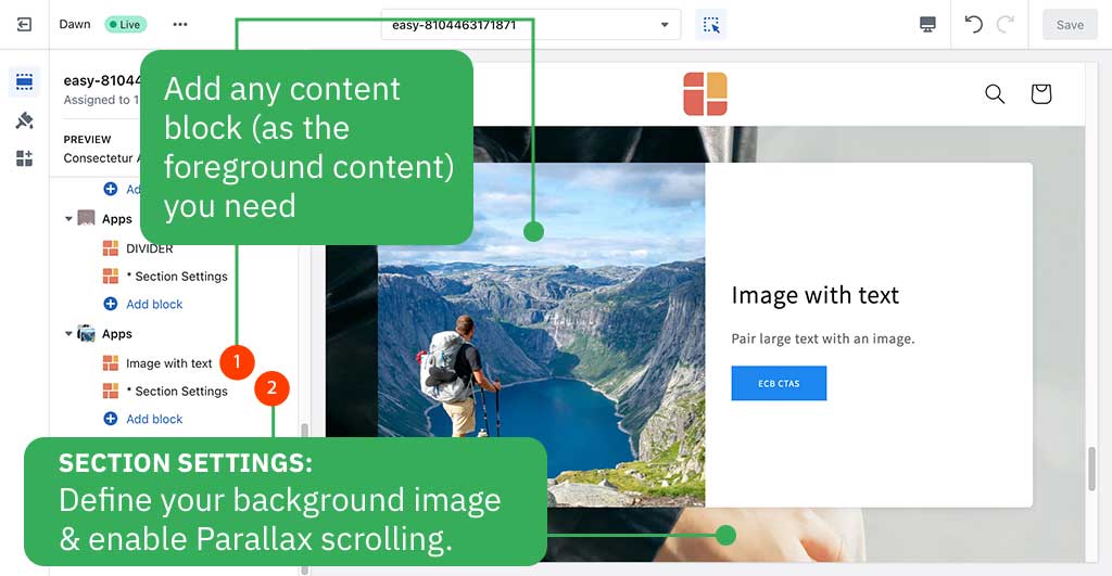
NOTE: Supposed that you already created a Section Settings (where you upload your background image) and content blocks used as the foreground content, like this screenshot:
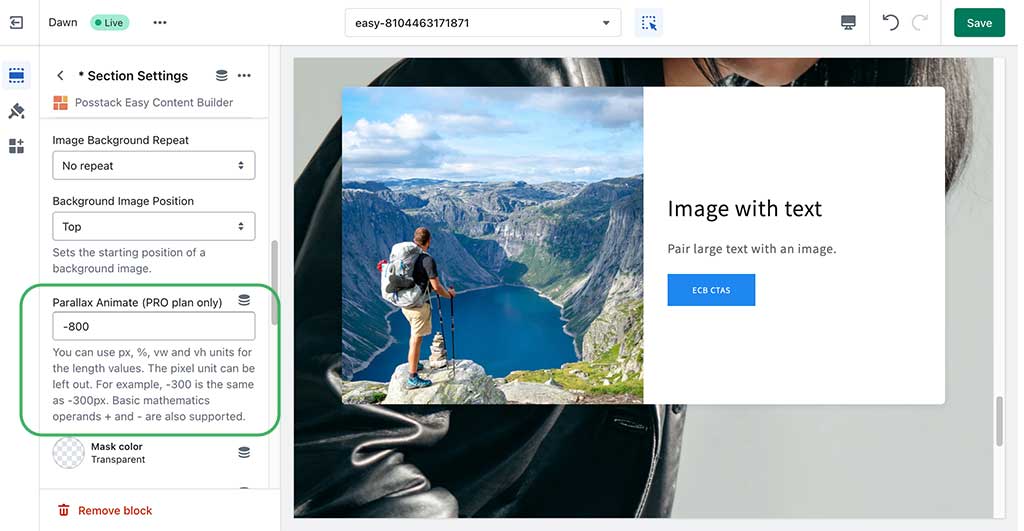
Enable a parallax movement on scroll:
Enter the Background Y position (the vertical position for the background image). In this demo, we applied the parallax scrolling to 2 sections (one with a value of -800; one with a value of 400).
Please note you can use px, %, vw, or vh units.


