Section Settings: Difference between revisions
mNo edit summary |
|||
| (33 intermediate revisions by the same user not shown) | |||
| Line 1: | Line 1: | ||
==Create a Section Settings== | |||
===What is Section Settings === | |||
[[Section Settings]] is a special block that Easy Content Builder provides to determine your ideal layouts (1-column, 2-column, 3-column, 4-column, or hierarchical layouts) and global configurations (full-width layout, mask color, mask image, background video, parallax animation, etc.) within the section itself. | |||
[[File:Ecb-layout-basics-2.jpg|frameless|800x800px]] | |||
=== Create a new Section Settings === | |||
==== Step 1: Create a template ==== | |||
You can follow one of the guides below to create the first template, depending on which type of page you want to customize: | |||
* Create a template for <u>Multiple pages</u> (''Perfect for a group of products, pages, or articles that use the same template layout'') | |||
*Create a template for <u>a single page</u> (''Perfect for a unique landing page, lookbook, or long-form product page.'') | |||
*Create a template for standard pages (homepage, collection pages, etc.) | |||
* Or create a <u>metaobject template</u> (''Handy for building pages with fully custom data like '''Cooking Recipes''', '''FAQs''', '''Specs''', '''Artist profile''' pages, etc.''). If you're new to Shopify metaobject, check out what metaobject is and when to use it [https://posstack.com/resources/shopify-metaobject-templates here] | |||
After creating a template, you should be redirected to the Theme Editor. Here, you can add a Section Settings block to the template you created. | |||
Each template can have many sections. In each section, you can create a [[Section Settings]] block to control the layout for that specific section. {{Note|Note: You can also open the Theme Editor of the specific template directly from the Easy Content Builder dashboard. Simply go to Shopify admin > Apps > Easy Content Builder > Manage Templates > select the template you want to edit and click '''Customize'''.|inline}} | |||
==== Step 2: Create a Section Settings ==== | |||
* From your Shopify admin, click Apps > '''Easy Content Builder'''. | * From your Shopify admin, click Apps > '''Easy Content Builder'''. | ||
* From the Easy Content Builder dashboard, click '''Manage Templates'''. Find the template that you want to edit, and then click '''Customize'''. | *From the Easy Content Builder dashboard, click '''Manage Templates'''. Find the template that you want to edit, and then click '''Customize'''. | ||
* From the theme editor, click '''+ Add Section''' in the sidebar. | *From the theme editor, click '''+ Add Section''' in the sidebar. | ||
:{{Note|Tips: While using the preview inspector, you can also add sections to the template directly from the preview window.|inline}} | |||
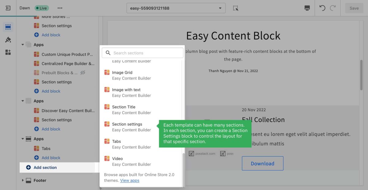
* Scroll down the list of available blocks prebuilt by the Easy Content Builder and click '''Section settings.''' [[File:Add section settings.jpg|1200x1200px]] | *Scroll down the list of available blocks prebuilt by the Easy Content Builder and click '''Section settings.''' [[File:Add section settings.jpg|1200x1200px]] | ||
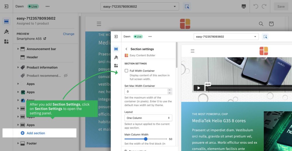
* Next, click on '''Section settings''' to open the section setting panel and configure the layout to your needs. The section settings will appear on the sidebar. Click '''Save''' to apply any changes you might make. [[File:Add section config.jpg|1000x1000px]] | *Next, click on '''Section settings''' to open the section setting panel and configure the layout to your needs. The section settings will appear on the sidebar. Click '''Save''' to apply any changes you might make. [[File:Add section config.jpg|1000x1000px]] | ||
:{{Note|After adding a Section Settings, a blank section is added in the theme preview mode; however, no specific content is visible. Once you add the first content block (Add block > Apps > Select a section from the list), the new content block will appear in the preview. |inline}} | |||
:{{Note| Note: To learn more about the configurations in the Section Settings, please refer to section [[Block Section Settings|ECB Block Settings > Block: Section Settings]].|reminder}} | |||
==== | ==== Step 3: Add content blocks ==== | ||
Now you can add many content blocks to the section you've created. These content blocks will be displayed in different positions within the section, depending on the Desktop/Mobile Layouts you configure. | |||
[[File:Ecb-block-v2.jpg|border|frameless|800x800px]] | |||
{{Note|See [https://easy-content-builder-demo.myshopify.com/pages/section-variations all content blocks] available that you can add to the section you've just created.|reminder}} | |||
==Multi-column Layout Setup== | |||
===The layout basics=== | |||
Easy Content Builder lets you specify the column layout at the section level. You can combine one-column, two-column, three-column, four-column, or [[Section Settings#Hierarchical grid|hierarchical grid]] layouts on the same page. | |||
[[Block Section Settings|Section Settings]] is used to determine the column layout of each section. Then, you add [https://easy-content-builder-demo.myshopify.com/pages/section-variations multiple content blocks] to each column and configure the margin/padding and the gap between columns/rows to create your desired layout. | |||
The screenshot below illustrates how you can create a layout with three sections - each section comes with its own column layout: | |||
=== 1-col boxed layout === | #A full-width Heading section | ||
#Three-column content section | |||
#Two-column content section | |||
[[File:Ecb-layout-basics-2.jpg|frameless|1024x1024px]] | |||
===1-col boxed layout=== | |||
How it looks on the storefront: | How it looks on the storefront: | ||
| Line 37: | Line 61: | ||
[[File:Ecb-1col-guide.jpg|border|frameless|1024x1024px]] | [[File:Ecb-1col-guide.jpg|border|frameless|1024x1024px]] | ||
*'''Step 1''': Add '''[[Block_Section_Settings|Section Settings]]''' block and configure '''Desktop Layout''' as ''One Column'' (you can play around with other configurations of the '''Section Settings''' block as you wish). | *'''Step 1''': Add '''[[Block_Section_Settings|Section Settings]]''' block and configure '''Desktop Layout''' as ''One Column'' (you can play around with other configurations of the '''Section Settings''' block as you wish). | ||
:{{Note|If you're new to the Easy Content Builder app, learn how to [[Add_Sections|add a section]] and [[Add_Blocks|add a block]]. |info}} | :{{Note|If you're new to the Easy Content Builder app, learn how to [[Add_Sections|add a section]] and [[Add_Blocks|add a block]]. |info}} | ||
| Line 43: | Line 67: | ||
*'''Step 2''': Add any pre-built content block you want. In the example above, we added two '''[[Block_Image_With_Text|Image With Text]]''' blocks. | *'''Step 2''': Add any pre-built content block you want. In the example above, we added two '''[[Block_Image_With_Text|Image With Text]]''' blocks. | ||
=== 1-col with Background Image === | ===1-col with Background Image=== | ||
How it looks on the storefront: | How it looks on the storefront: | ||
| Line 56: | Line 80: | ||
[[File:1col-section-setting.png|border|frameless|1024x1024px]] | [[File:1col-section-setting.png|border|frameless|1024x1024px]] | ||
* Desktop Layout: Two Columns | *Desktop Layout: Two Columns | ||
: Selecting the ''Two Columns'' value lets you display the main content block (Text, CTA button) on the left side of this section. This way, you can easily control the width of your main content block using the ''Main Column Width'' setting. | :Selecting the ''Two Columns'' value lets you display the main content block (Text, CTA button) on the left side of this section. This way, you can easily control the width of your main content block using the ''Main Column Width'' setting. | ||
:{{note|If you need to (1) display the main content block (Text, CTA button) on the right side, or (2) add multiple elements in the main content block (Text, extra spacing, multiple CTA buttons), follow this [[Block_Image_With_Text#Use_case_3:_Hero_banner_with_3_CTAs_buttons|step-by-step guide]].|info}} | :{{note|If you need to (1) display the main content block (Text, CTA button) on the right side, or (2) add multiple elements in the main content block (Text, extra spacing, multiple CTA buttons), follow this [[Block_Image_With_Text#Use_case_3:_Hero_banner_with_3_CTAs_buttons|step-by-step guide]].|info}} | ||
* Main Column Width: By default, you can start with a 50/50 layout for image and text elements or change this ratio by changing the '''Main Column Width''' value. | *Main Column Width: By default, you can start with a 50/50 layout for image and text elements or change this ratio by changing the '''Main Column Width''' value. | ||
* Background image: Upload your background image (Max background image width x height: 2500 x 1406 px. Learn more about [https://posstack.com/blog/shopify-images-best-practice recommended image dimensions].) | *Background image: Upload your background image (Max background image width x height: 2500 x 1406 px. Learn more about [https://posstack.com/blog/shopify-images-best-practice recommended image dimensions].) | ||
* Parallax Animate: -300 (this setting is optional and available for the [http://apps.shopify.com/easy-content-builder Pro plan] only) | *Parallax Animate: -300 (this setting is optional and available for the [http://apps.shopify.com/easy-content-builder Pro plan] only) | ||
* Mask Image: Add a mask layer over the background image (this setting is optional and available for the [http://apps.shopify.com/easy-content-builder Pro plan] only). You can download mask images [https://www.toptal.com/designers/subtlepatterns here]. | * Mask Image: Add a mask layer over the background image (this setting is optional and available for the [http://apps.shopify.com/easy-content-builder Pro plan] only). You can download mask images [https://www.toptal.com/designers/subtlepatterns here]. | ||
* Text Color: #FFFFFF | *Text Color: #FFFFFF | ||
* Padding top: 50px | *Padding top: 50px | ||
* Padding bottom: 300px | *Padding bottom: 300px | ||
'''Step 2''': Add a '''[[Block Section Title|Section Title]]''' block | '''Step 2''': Add a '''[[Block Section Title|Section Title]]''' block | ||
| Line 72: | Line 96: | ||
[[File:1col-section-title.png|border|frameless|1024x1024px]] | [[File:1col-section-title.png|border|frameless|1024x1024px]] | ||
* Fill in the Title, Tagline, Description, and button style as you wish. | *Fill in the Title, Tagline, Description, and button style as you wish. | ||
Note: The Image With Text block comes with one default CTA button. Use the Image With Text and Button blocks if you need multiple CTA buttons. Check out '''''[[Block Image With Text|Use case 3: Hero banner with 3 CTAs buttons]]''''' for more details. | Note: The Image With Text block comes with one default CTA button. Use the Image With Text and Button blocks if you need multiple CTA buttons. Check out '''''[[Block Image With Text|Use case 3: Hero banner with 3 CTAs buttons]]''''' for more details. | ||
* Background color: #5d3f3d (change to your desired color) | *Background color: #5d3f3d (change to your desired color) | ||
* Animate on scroll: Fade (this setting is optional and available for the Pro plan only) | *Animate on scroll: Fade (this setting is optional and available for the Pro plan only) | ||
* Margin: Medium | * Margin: Medium | ||
* Padding: Medium | *Padding: Medium | ||
{{Note|Tips: Check out this step-by-step guide - [[Block_Image_With_Text#Use_case_4:_Hero_banner_with_a_background_color_overlay|Create a Hero banner with a background color overlay]] - that helps you achieve a similar 1-col layout.}} | {{Note|Tips: Check out this step-by-step guide - [[Block_Image_With_Text#Use_case_4:_Hero_banner_with_a_background_color_overlay|Create a Hero banner with a background color overlay]] - that helps you achieve a similar 1-col layout.}} | ||
=== 2-col with Flexible Col Width === | ===2-col with Flexible Col Width=== | ||
Below is a 2-column section we built on our [https://easy-content-builder-demo.myshopify.com/products/vitamin-d-boost Nutrition template demo]: | Below is a 2-column section we built on our [https://easy-content-builder-demo.myshopify.com/products/vitamin-d-boost Nutrition template demo]: | ||
| Line 95: | Line 119: | ||
[[File:2-col-section-settings.png|border|frameless|1024x1024px]] | [[File:2-col-section-settings.png|border|frameless|1024x1024px]] | ||
* Desktop Layout: ''Two Col: First Block Left, Others Right''. | *Desktop Layout: ''Two Col: First Block Left, Others Right''. | ||
:* ''''First Block Left'''<nowiki/>' refers to the main content block you want to show on the left column. Drag any block you want to reorder on top of other blocks to keep it in the First Block position. | :*''''First Block Left'''<nowiki/>' refers to the main content block you want to show on the left column. Drag any block you want to reorder on top of other blocks to keep it in the First Block position. | ||
:* ''''Others Right'''<nowiki/>' means all other blocks will be displayed on the right column. | :* ''''Others Right'''<nowiki/>' means all other blocks will be displayed on the right column. | ||
* Mobile Layout: One Column | *Mobile Layout: One Column | ||
* Main Column Width: By default, you can start with a 50/50 layout for image and text elements or change this ratio by changing the '''Main Column Width''' value. | *Main Column Width: By default, you can start with a 50/50 layout for image and text elements or change this ratio by changing the '''Main Column Width''' value. | ||
* Background color: Use the Gradient color picker or enter the value of the new color in the CSS Code field. | *Background color: Use the Gradient color picker or enter the value of the new color in the CSS Code field. | ||
* Padding top: 50px | *Padding top: 50px | ||
* Padding bottom: 50px | *Padding bottom: 50px | ||
'''Step 2''': Add '''[[Block Image With Text|Image With Text]]''' block with the configurations below: | '''Step 2''': Add '''[[Block Image With Text|Image With Text]]''' block with the configurations below: | ||
| Line 108: | Line 132: | ||
[[File:2-col-img-w-text.png|border|frameless|1024x1024px]] | [[File:2-col-img-w-text.png|border|frameless|1024x1024px]] | ||
* Card Style: Overlay - No Mask | *Card Style: Overlay - No Mask | ||
* Card Size: Default | *Card Size: Default | ||
* Box Shadow: No Shadow | * Box Shadow: No Shadow | ||
* Image: upload your own image | *Image: upload your own image | ||
* Image width: enter your actual image width here (our demo width is 1024) | *Image width: enter your actual image width here (our demo width is 1024) | ||
* Image height: enter your actual image height here (our demo height is 768) | *Image height: enter your actual image height here (our demo height is 768) | ||
* Margin: Default | *Margin: Default | ||
'''Step 3''': Add the first '''[[Block Section Title|Section Title]]''' block and fill in the Title, Tagline, and Description as you wish. | '''Step 3''': Add the first '''[[Block Section Title|Section Title]]''' block and fill in the Title, Tagline, and Description as you wish. | ||
| Line 128: | Line 152: | ||
[[File:2-col-icons-w-text.png|border|frameless|1024x1024px]] | [[File:2-col-icons-w-text.png|border|frameless|1024x1024px]] | ||
* Image Position: Left | *Image Position: Left | ||
* Text Alignment: Left | *Text Alignment: Left | ||
* Item Margin: Small | *Item Margin: Small | ||
* CSS Classes: '''''image-width-24''''' | *CSS Classes: '''''image-width-24''''' | ||
* Items per row on Desktop: 2 | *Items per row on Desktop: 2 | ||
* Then, fill in the Item Settings with Title and SVG icons. | * Then, fill in the Item Settings with Title and SVG icons. | ||
'''Step 6''': Add a [[Block Buttons|'''Button''' block]] with the configurations below: | '''Step 6''': Add a [[Block Buttons|'''Button''' block]] with the configurations below: | ||
| Line 139: | Line 163: | ||
[[File:2-col-buttons.png|border|frameless|1024x1024px]] | [[File:2-col-buttons.png|border|frameless|1024x1024px]] | ||
* Text Alignment: Left | *Text Alignment: Left | ||
* Fill in the Button label, style, URL, and size. | *Fill in the Button label, style, URL, and size. | ||
* Margin: Large | *Margin: Large | ||
===2-col with Blank Sections=== | |||
Check out this step-by-step video guide to create a 2-column section on your Shopify pages. This section will include two rows, each comes with a blank column. | |||
<youtube width="960" height="540">cRMtfWP3kCI</youtube> | |||
How it looks on the storefront: | How it looks on the storefront: | ||
| Line 154: | Line 182: | ||
'''Step 1''': Add '''[[Block Section Settings|Section Settings]]''' block and configure as follows: | '''Step 1''': Add '''[[Block Section Settings|Section Settings]]''' block and configure as follows: | ||
[[File:3col-section-settings.png|border|frameless|1024x1024px]] | [[File:3col-section-settings.png|border|frameless|1024x1024px]] | ||
* Desktop Layout: Two Column | *Desktop Layout: Two Column | ||
* Main Column Width: By default, you can start with a 50/50 layout for image and text elements or change this ratio by changing the '''Main Column Width''' value. | *Main Column Width: By default, you can start with a 50/50 layout for image and text elements or change this ratio by changing the '''Main Column Width''' value. | ||
* Background image: Upload your background image (Max background image width x height: 2500 x 1406 px. Learn more about [https://posstack.com/blog/shopify-images-best-practice recommended image dimensions].) | *Background image: Upload your background image (Max background image width x height: 2500 x 1406 px. Learn more about [https://posstack.com/blog/shopify-images-best-practice recommended image dimensions].) | ||
* Padding top: 100px | *Padding top: 100px | ||
* Padding bottom: 100px | *Padding bottom: 100px | ||
'''Step 2''': Add '''[[Block Custom HTML|Custom HTM]]'''L block | '''Step 2''': Add '''[[Block Custom HTML|Custom HTM]]'''L block | ||
| Line 170: | Line 198: | ||
The primary purpose of this step is to use this Custom HTML block as a blank column on the left of the first row of this section. | The primary purpose of this step is to use this Custom HTML block as a blank column on the left of the first row of this section. | ||
* The right column: an empty column (created by the Custom HTML block) | *The right column: an empty column (created by the Custom HTML block) | ||
* The left column: displays the text block. | *The left column: displays the text block. | ||
'''Step 3''': Add the first '''[[Block Section Title|Section Title]]''' block and fill in the Title, Description as you wish. | '''Step 3''': Add the first '''[[Block Section Title|Section Title]]''' block and fill in the Title, Description as you wish. | ||
| Line 187: | Line 215: | ||
'''Step 7''': Add the 3rd '''Section Title''' block and fill in the Title, Description as you wish. | '''Step 7''': Add the 3rd '''Section Title''' block and fill in the Title, Description as you wish. | ||
=== Hierarchical grid === | ===Hierarchical grid=== | ||
Below is a hierarchical grid (type 4) we built on our [https://easy-content-builder-demo.myshopify.com/pages/hierarchical-grid Hierarchical Grid demo]: | Below is a hierarchical grid (type 4) we built on our [https://easy-content-builder-demo.myshopify.com/pages/hierarchical-grid Hierarchical Grid demo]: | ||
| Line 198: | Line 226: | ||
'''Step 1''': Add '''[[Block Section Settings|Section Settings]]''' block and configure as follows: | '''Step 1''': Add '''[[Block Section Settings|Section Settings]]''' block and configure as follows: | ||
* Desktop Layout: Hierarchical Grid 4 | *Desktop Layout: Hierarchical Grid 4 | ||
: Learn more about all Hierarchical Grid options that Easy Content Builder provides [https://posstack.com/blog/easy-content-builder-new-hierarchical-grids here]. | :Learn more about all Hierarchical Grid options that Easy Content Builder provides [https://posstack.com/blog/easy-content-builder-new-hierarchical-grids here]. | ||
* Mobile Layout: One Column | *Mobile Layout: One Column | ||
* Main Column Width: By default, you can start with a 50/50 layout for image and text elements or change this ratio by changing the '''Main Column Width''' value. | *Main Column Width: By default, you can start with a 50/50 layout for image and text elements or change this ratio by changing the '''Main Column Width''' value. | ||
* Column Gap: 20 | *Column Gap: 20 | ||
* Row Gap: 20 | *Row Gap: 20 | ||
* Padding top: 50px | *Padding top: 50px | ||
* Padding bottom: 50px | *Padding bottom: 50px | ||
'''Step 2''': Add '''[[Block Image With Text|Image With Text]]''' block with the configurations below: | '''Step 2''': Add '''[[Block Image With Text|Image With Text]]''' block with the configurations below: | ||
[[File:Hierarchical-4-img-w-text.png|border|frameless|1024x1024px]] | [[File:Hierarchical-4-img-w-text.png|border|frameless|1024x1024px]] | ||
* Card Style: Overlay - No Mask | *Card Style: Overlay - No Mask | ||
* Card Size: Default | *Card Size: Default | ||
* Box Shadow: Small | *Box Shadow: Small | ||
* Image: upload your own image | * Image: upload your own image | ||
* Image width: enter your image width here (our demo width is 800) | *Image width: enter your image width here (our demo width is 800) | ||
* Image height: enter your image height here (our demo height is 800) | *Image height: enter your image height here (our demo height is 800) | ||
* Margin: No Margin | *Margin: No Margin | ||
'''Step 3''': Add the first '''[[Block Section Title|Section Title]]''' block with the configurations below: | '''Step 3''': Add the first '''[[Block Section Title|Section Title]]''' block with the configurations below: | ||
| Line 223: | Line 251: | ||
[[File:Hierarchical-4-section-title.png|border|frameless|1024x1024px]] | [[File:Hierarchical-4-section-title.png|border|frameless|1024x1024px]] | ||
* Fill in the Image, Title, Description, and Button as you wish. | *Fill in the Image, Title, Description, and Button as you wish. | ||
* Margin: No Margin | *Margin: No Margin | ||
* Padding: No Padding | *Padding: No Padding | ||
'''Step 4''': Add two '''[[Block Custom HTML|Custom HTML]]''' blocks (This is an optional step) | '''Step 4''': Add two '''[[Block Custom HTML|Custom HTML]]''' blocks (This is an optional step) | ||
| Line 239: | Line 267: | ||
[[File:Hierarchical-4-section-title-3.png|border|frameless|1024x1024px]] | [[File:Hierarchical-4-section-title-3.png|border|frameless|1024x1024px]] | ||
* Fill in the Image, Title, Description, and Button as you wish. | *Fill in the Image, Title, Description, and Button as you wish. | ||
* Margin: No Margin | * Margin: No Margin | ||
* Padding: Medium | *Padding: Medium | ||
'''Step 6''': Add the third '''Section Title''' block with the configurations below: | '''Step 6''': Add the third '''Section Title''' block with the configurations below: | ||
| Line 247: | Line 275: | ||
[[File:Hierarchical-4-section-title-4.png|border|frameless|1024x1024px]] | [[File:Hierarchical-4-section-title-4.png|border|frameless|1024x1024px]] | ||
* Fill in the Image, Title, Description, and Button as you wish. | *Fill in the Image, Title, Description, and Button as you wish. | ||
* Margin: No Margin | *Margin: No Margin | ||
* Padding: Medium | * Padding: Medium | ||
=== Collection Grid === | ===Collection Grid=== | ||
Below is an example of using four '''[[Block Image With Text|Image With Text]]''' blocks and a '''[https://posstack.com/blog/easy-content-builder-new-hierarchical-grids Hierarchical grid]''' to create a featured collection/subcollection section ([https://easy-content-builder-demo.myshopify.com/pages/collection-grid view demo]). | Below is an example of using four '''[[Block Image With Text|Image With Text]]''' blocks and a '''[https://posstack.com/blog/easy-content-builder-new-hierarchical-grids Hierarchical grid]''' to create a featured collection/subcollection section ([https://easy-content-builder-demo.myshopify.com/pages/collection-grid view demo]). | ||
| Line 264: | Line 292: | ||
[[File:Collection-grid-section-setting.png|border|frameless|1024x1024px]] | [[File:Collection-grid-section-setting.png|border|frameless|1024x1024px]] | ||
* Desktop Layout: Hierarchical Grid 4 | * Desktop Layout: Hierarchical Grid 4 | ||
: Learn more about all '''Hierarchical Grid''' options that Easy Content Builder provides [https://posstack.com/blog/easy-content-builder-new-hierarchical-grids here]. | :Learn more about all '''Hierarchical Grid''' options that Easy Content Builder provides [https://posstack.com/blog/easy-content-builder-new-hierarchical-grids here]. | ||
* Mobile Layout: One Column | *Mobile Layout: One Column | ||
* Main Column Width: By default, you can start with a 50/50 layout for image and text elements or change this ratio by changing the '''Main Column Width''' value. | *Main Column Width: By default, you can start with a 50/50 layout for image and text elements or change this ratio by changing the '''Main Column Width''' value. | ||
* Column Gap: 20 | *Column Gap: 20 | ||
* Row Gap: 20 | *Row Gap: 20 | ||
* Padding top: 50px | *Padding top: 50px | ||
* Padding bottom: 50px | *Padding bottom: 50px | ||
'''Step 2''': Add '''[[Block Image With Text|Image With Text]]''' block with the configurations below: | '''Step 2''': Add '''[[Block Image With Text|Image With Text]]''' block with the configurations below: | ||
| Line 277: | Line 305: | ||
[[File:Collection-grid-img-with-text.png|border|frameless|1024x1024px]] | [[File:Collection-grid-img-with-text.png|border|frameless|1024x1024px]] | ||
* Card Style: Overlay - No Mask | *Card Style: Overlay - No Mask | ||
* Card Size: Default | *Card Size: Default | ||
* Box Shadow: Small | *Box Shadow: Small | ||
* Image Position: Bottom | *Image Position: Bottom | ||
* Image: upload your image | *Image: upload your image | ||
* (Image Settings) Image width: Enter your image width here (our demo width is 800). | *(Image Settings) Image width: Enter your image width here (our demo width is 800). | ||
* (Image Settings) Image height: Enter your image height here (our demo height is 600). | *(Image Settings) Image height: Enter your image height here (our demo height is 600). | ||
* (Text Settings) Text Alignment: Left | *(Text Settings) Text Alignment: Left | ||
* (Button Settings) Button Text: Enter your text here | * (Button Settings) Button Text: Enter your text here | ||
* Margin: No Margin | *Margin: No Margin | ||
'''Step 3''': Add three other '''Image With Text blocks''' similar to Step 2 above and configure each block your way. | '''Step 3''': Add three other '''Image With Text blocks''' similar to Step 2 above and configure each block your way. | ||
== Customization FAQs == | |||
=== Set the Text color === | |||
Learn how to set the Text color [[Create Template For Multiple Pages#Set the Text color|here]]. | |||
=== Set the Background color === | |||
Learn how to set the background color (applied to the whole section) [[Create Template For Multiple Pages#Set the Background Color|here]]. | |||
=== Set the Container Background color === | |||
Learn how to set the Container Background color (applied to the background of the content area instead of the full-width background) [[Create Template For Multiple Pages#Set the Container Background color|here]]. | |||
=== Adjust the padding/margin of each section === | |||
*Learn how to adjust the padding/margin of each section [[Create_Template_For_Multiple_Pages#Adjust_the_padding/margin_of_each_section|here]] | |||
=== Adjust the font size, border radius, background color === | |||
*Learn how to adjust the font size, border radius, background color [[Create_Template_For_Multiple_Pages#Adjust_the_font_size,_border_radius,_background_color|here]] | |||
=== Overlapping Image and text=== | |||
* Learn how to create an overlapping image and text section: [[Block Section Settings#Image with overlapping rich content|here]]. | |||
===Custom CSS=== | |||
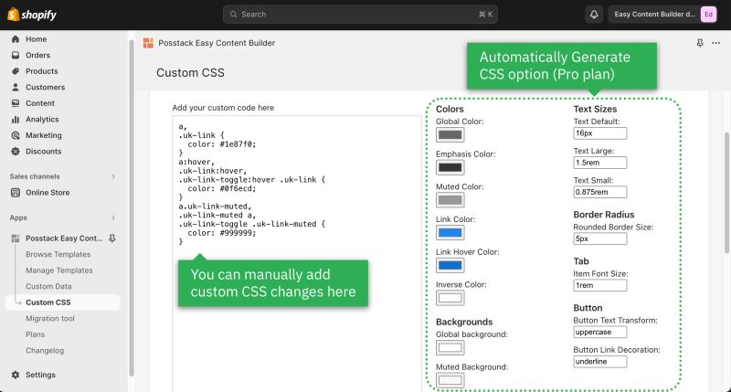
*Learn how to customize your Shopify themes (change your font size, button, background, border radius, etc.) with Custom CSS using Easy Content Builder: [https://www.youtube.com/watch?v=gN20FiUvVZc 5-min video tutorial]. | |||
:{{Note|For Pro plan: In addition to the standard Custom CSS feature, you have an '''Automatically Generate CSS''' option - a handy way to customize your theme '''without coding'''. [[Custom CSS|Learn more]]. |reminder}} | |||
:[[File:Ecb-custom-css.jpg|border|frameless|800x800px]] | |||
Latest revision as of 04:55, 26 February 2024
Create a Section Settings
What is Section Settings
Section Settings is a special block that Easy Content Builder provides to determine your ideal layouts (1-column, 2-column, 3-column, 4-column, or hierarchical layouts) and global configurations (full-width layout, mask color, mask image, background video, parallax animation, etc.) within the section itself.

Create a new Section Settings
Step 1: Create a template
You can follow one of the guides below to create the first template, depending on which type of page you want to customize:
- Create a template for Multiple pages (Perfect for a group of products, pages, or articles that use the same template layout)
- Create a template for a single page (Perfect for a unique landing page, lookbook, or long-form product page.)
- Create a template for standard pages (homepage, collection pages, etc.)
- Or create a metaobject template (Handy for building pages with fully custom data like Cooking Recipes, FAQs, Specs, Artist profile pages, etc.). If you're new to Shopify metaobject, check out what metaobject is and when to use it here
After creating a template, you should be redirected to the Theme Editor. Here, you can add a Section Settings block to the template you created.
Each template can have many sections. In each section, you can create a Section Settings block to control the layout for that specific section.
Step 2: Create a Section Settings
- From your Shopify admin, click Apps > Easy Content Builder.
- From the Easy Content Builder dashboard, click Manage Templates. Find the template that you want to edit, and then click Customize.
- From the theme editor, click + Add Section in the sidebar.
- Tips: While using the preview inspector, you can also add sections to the template directly from the preview window.
- Scroll down the list of available blocks prebuilt by the Easy Content Builder and click Section settings.
- Next, click on Section settings to open the section setting panel and configure the layout to your needs. The section settings will appear on the sidebar. Click Save to apply any changes you might make.


- After adding a Section Settings, a blank section is added in the theme preview mode; however, no specific content is visible. Once you add the first content block (Add block > Apps > Select a section from the list), the new content block will appear in the preview.
- Note: To learn more about the configurations in the Section Settings, please refer to section ECB Block Settings > Block: Section Settings.
Step 3: Add content blocks
Now you can add many content blocks to the section you've created. These content blocks will be displayed in different positions within the section, depending on the Desktop/Mobile Layouts you configure.

Multi-column Layout Setup
The layout basics
Easy Content Builder lets you specify the column layout at the section level. You can combine one-column, two-column, three-column, four-column, or hierarchical grid layouts on the same page.
Section Settings is used to determine the column layout of each section. Then, you add multiple content blocks to each column and configure the margin/padding and the gap between columns/rows to create your desired layout.
The screenshot below illustrates how you can create a layout with three sections - each section comes with its own column layout:
- A full-width Heading section
- Three-column content section
- Two-column content section
1-col boxed layout
How it looks on the storefront:

Here are the configuration steps:

- Step 1: Add Section Settings block and configure Desktop Layout as One Column (you can play around with other configurations of the Section Settings block as you wish).
- If you're new to the Easy Content Builder app, learn how to add a section and add a block.
- Step 2: Add any pre-built content block you want. In the example above, we added two Image With Text blocks.
1-col with Background Image
How it looks on the storefront:

Here is the list of content blocks and associated configurations for this layout option:

Step 1: Add Section Settings block and configure as follows:

- Desktop Layout: Two Columns
- Selecting the Two Columns value lets you display the main content block (Text, CTA button) on the left side of this section. This way, you can easily control the width of your main content block using the Main Column Width setting.
- If you need to (1) display the main content block (Text, CTA button) on the right side, or (2) add multiple elements in the main content block (Text, extra spacing, multiple CTA buttons), follow this step-by-step guide.
- Main Column Width: By default, you can start with a 50/50 layout for image and text elements or change this ratio by changing the Main Column Width value.
- Background image: Upload your background image (Max background image width x height: 2500 x 1406 px. Learn more about recommended image dimensions.)
- Parallax Animate: -300 (this setting is optional and available for the Pro plan only)
- Mask Image: Add a mask layer over the background image (this setting is optional and available for the Pro plan only). You can download mask images here.
- Text Color: #FFFFFF
- Padding top: 50px
- Padding bottom: 300px
Step 2: Add a Section Title block

- Fill in the Title, Tagline, Description, and button style as you wish.
Note: The Image With Text block comes with one default CTA button. Use the Image With Text and Button blocks if you need multiple CTA buttons. Check out Use case 3: Hero banner with 3 CTAs buttons for more details.
- Background color: #5d3f3d (change to your desired color)
- Animate on scroll: Fade (this setting is optional and available for the Pro plan only)
- Margin: Medium
- Padding: Medium
2-col with Flexible Col Width
Below is a 2-column section we built on our Nutrition template demo:

Here is the list of content blocks and associated configurations for this 2-col section:

Step 1: Add Section Settings block and configure as follows:

- Desktop Layout: Two Col: First Block Left, Others Right.
- 'First Block Left' refers to the main content block you want to show on the left column. Drag any block you want to reorder on top of other blocks to keep it in the First Block position.
- 'Others Right' means all other blocks will be displayed on the right column.
- Mobile Layout: One Column
- Main Column Width: By default, you can start with a 50/50 layout for image and text elements or change this ratio by changing the Main Column Width value.
- Background color: Use the Gradient color picker or enter the value of the new color in the CSS Code field.
- Padding top: 50px
- Padding bottom: 50px
Step 2: Add Image With Text block with the configurations below:

- Card Style: Overlay - No Mask
- Card Size: Default
- Box Shadow: No Shadow
- Image: upload your own image
- Image width: enter your actual image width here (our demo width is 1024)
- Image height: enter your actual image height here (our demo height is 768)
- Margin: Default
Step 3: Add the first Section Title block and fill in the Title, Tagline, and Description as you wish.

Step 4: Add the second Section Title block and fill in the Tagline as per our demo (You can enter other content as you wish).

Step 5: Add the Icon With Text block with the configurations below:
- Image Position: Left
- Text Alignment: Left
- Item Margin: Small
- CSS Classes: image-width-24
- Items per row on Desktop: 2
- Then, fill in the Item Settings with Title and SVG icons.
Step 6: Add a Button block with the configurations below:

- Text Alignment: Left
- Fill in the Button label, style, URL, and size.
- Margin: Large
2-col with Blank Sections
Check out this step-by-step video guide to create a 2-column section on your Shopify pages. This section will include two rows, each comes with a blank column.
How it looks on the storefront:

Here is the list of content blocks and associated configurations for this 2-col section:

Step 1: Add Section Settings block and configure as follows:

- Desktop Layout: Two Column
- Main Column Width: By default, you can start with a 50/50 layout for image and text elements or change this ratio by changing the Main Column Width value.
- Background image: Upload your background image (Max background image width x height: 2500 x 1406 px. Learn more about recommended image dimensions.)
- Padding top: 100px
- Padding bottom: 100px
Step 2: Add Custom HTML block

Add a Custom HTML block and leave all configuration fields blank (no need to add any custom HTML code here).
The primary purpose of this step is to use this Custom HTML block as a blank column on the left of the first row of this section.
- The right column: an empty column (created by the Custom HTML block)
- The left column: displays the text block.
Step 3: Add the first Section Title block and fill in the Title, Description as you wish.

Step 4: Add the first Section Title block and fill in the Title, Description as you wish.
Step 5: Add another Custom HTML block as you did in Step 2.
The primary purpose of this step is to use this Custom HTML block as a blank column on the right of the 2nd row of this section.
Step 6: Add the 3rd Custom HTML block (to create a blank column on the 3rd row of this section).
Step 7: Add the 3rd Section Title block and fill in the Title, Description as you wish.
Hierarchical grid
Below is a hierarchical grid (type 4) we built on our Hierarchical Grid demo:

Here is the list of content blocks and associated configurations for this hierarchical grid layout:

Step 1: Add Section Settings block and configure as follows:
- Desktop Layout: Hierarchical Grid 4
- Learn more about all Hierarchical Grid options that Easy Content Builder provides here.
- Mobile Layout: One Column
- Main Column Width: By default, you can start with a 50/50 layout for image and text elements or change this ratio by changing the Main Column Width value.
- Column Gap: 20
- Row Gap: 20
- Padding top: 50px
- Padding bottom: 50px
Step 2: Add Image With Text block with the configurations below:

- Card Style: Overlay - No Mask
- Card Size: Default
- Box Shadow: Small
- Image: upload your own image
- Image width: enter your image width here (our demo width is 800)
- Image height: enter your image height here (our demo height is 800)
- Margin: No Margin
Step 3: Add the first Section Title block with the configurations below:

- Fill in the Image, Title, Description, and Button as you wish.
- Margin: No Margin
- Padding: No Padding
Step 4: Add two Custom HTML blocks (This is an optional step)

Add two Custom HTML blocks and leave all configuration fields blank (no need to add any custom HTML code here).
The primary purpose of this step is to use these Custom HTML blocks as a blank row within the right column of this section.
Step 5: Add the second Section Title block with the configurations below:

- Fill in the Image, Title, Description, and Button as you wish.
- Margin: No Margin
- Padding: Medium
Step 6: Add the third Section Title block with the configurations below:

- Fill in the Image, Title, Description, and Button as you wish.
- Margin: No Margin
- Padding: Medium
Collection Grid
Below is an example of using four Image With Text blocks and a Hierarchical grid to create a featured collection/subcollection section (view demo).

Here is the list of content blocks and associated configurations for this 2-col section:

Step 1: Add a Section Settings block and configure as follows:

- Desktop Layout: Hierarchical Grid 4
- Learn more about all Hierarchical Grid options that Easy Content Builder provides here.
- Mobile Layout: One Column
- Main Column Width: By default, you can start with a 50/50 layout for image and text elements or change this ratio by changing the Main Column Width value.
- Column Gap: 20
- Row Gap: 20
- Padding top: 50px
- Padding bottom: 50px
Step 2: Add Image With Text block with the configurations below:

- Card Style: Overlay - No Mask
- Card Size: Default
- Box Shadow: Small
- Image Position: Bottom
- Image: upload your image
- (Image Settings) Image width: Enter your image width here (our demo width is 800).
- (Image Settings) Image height: Enter your image height here (our demo height is 600).
- (Text Settings) Text Alignment: Left
- (Button Settings) Button Text: Enter your text here
- Margin: No Margin
Step 3: Add three other Image With Text blocks similar to Step 2 above and configure each block your way.
Customization FAQs
Set the Text color
Learn how to set the Text color here.
Set the Background color
Learn how to set the background color (applied to the whole section) here.
Set the Container Background color
Learn how to set the Container Background color (applied to the background of the content area instead of the full-width background) here.
Adjust the padding/margin of each section
- Learn how to adjust the padding/margin of each section here
Adjust the font size, border radius, background color
- Learn how to adjust the font size, border radius, background color here
Overlapping Image and text
- Learn how to create an overlapping image and text section: here.
Custom CSS
- Learn how to customize your Shopify themes (change your font size, button, background, border radius, etc.) with Custom CSS using Easy Content Builder: 5-min video tutorial.
- For Pro plan: In addition to the standard Custom CSS feature, you have an Automatically Generate CSS option - a handy way to customize your theme without coding. Learn more.
